Note : this is not bar chat it is scatter char, some solutions are given here but they do not work, I have categories on one axis
ax=df_a.plot(y='y', x='x' , kind='scatter',  color='#FF7F50', figsize=(7,4), label='a')
df_b.plot(y='y', x='x'  , kind='scatter',ax=ax, label='b' )
#plt.legend(loc='upper left');
plt.show()

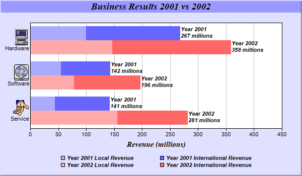
I want to have separate blue and orange line for each category like in multiple barcharts like this
Reproducible example
    data  = [['tom', 10], ['tom', 15], ['juli', 14],['juli', 16],['tom', 30] ]
    data1 = [['tom', 15], ['tom', 34], ['juli', 25],['juli', 15],['juli', 19] ]

    df1= pd.DataFrame(data, columns = ['month', 'val'])
    df2= pd.DataFrame(data1, columns = ['month', 'val'])
    ax =plt.figure(figsize=(14,10))


    ax=df1.plot(y='month', x='val' , kind='scatter', color='#FF7F50', figsize=(12,6), label='df1')
    df2.plot(y='month', x='val'  , kind='scatter', ax=ax, label='df2' )