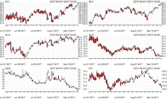
I would really really appreciate it if you guys can point me to where to look. I have been trying to do it for 3 days and still can't find the right one. I need to draw the chart which looks as the first picture's chart and I need to display the dates on the X axis as it gets displayed on the second chart. I am complete beginner with seaborn, python and everything. I used lineplot first, which only met one criteria, display the dates on X-axis. But, the lines are actually sharp like in the second picture rather than smooth like in the first picture. Then, I kept digging and found implot. With that, I could get the design of the chart I wanted (Smoothed chart). But, the problem is when I tried to display the dates on the X-axis, it didn't work. I got an error could not convert string to float: '2022-07-27T13:31:00Z'.
Here is the code for implot, got the wanted plot design but date can't be displayed on X-axis
import numpy as np
import pandas as pd
import seaborn as sns
import matplotlib.pyplot as plt

T = np.array([ "2022-07-27T13:31:00Z",
      "2022-08-28T13:31:00Z",
      "2022-09-29T13:31:00Z",
      "2022-10-30T13:31:00Z",])
power = np.array([10,25,60,42])

df = pd.DataFrame(data = {'T': T, 'power': power})

sns.lmplot(x='T', y='power', data=df, ci=None, order=4, truncate=False)
If I use the number instead of date, the output is this. Exactly as I need
Here is the code with which all the data gets displayed correctly. But, the plot design is not smoothed.
import seaborn as sns
import numpy as np
import scipy
import matplotlib.pyplot as plt
import pandas as pd
from pandas.core.apply import frame_apply

years = ["2022-03-22T13:30:00Z",
      "2022-03-23T13:31:00Z",
      "2022-04-24T19:27:00Z",
      "2022-05-25T13:31:00Z",
      "2022-06-26T13:31:00Z",
      "2022-07-27T13:31:00Z",
      "2022-08-28T13:31:00Z",
      "2022-09-29T13:31:00Z",
      "2022-10-30T13:31:00Z",
      ]


feature_1 =[0,
      6,
      1,
      5,
      9,
      15,
      21,
      4,
      1,
     ]

data_preproc = pd.DataFrame({
    'Period': years,
#     'Feature 1': feature_1,
#     'Feature 2': feature_2,
#     'Feature 3': feature_3,
#     'Feature 4': feature_4,
    "Feature 1" :feature_1
   })

data_preproc['Period'] = pd.to_datetime(data_preproc['Period'],
                        format="%Y-%m-%d",errors='coerce')

data_preproc['Period'] = data_preproc['Period'].dt.strftime('%b')

# aiAlertPlot =sns.lineplot(x='Period', y='value', hue='variable',ci=None,
#              data=pd.melt(data_preproc, ['Period']))

sns.lineplot(x="Period",y="Feature 1",data=data_preproc)


# plt.xticks(np.linspace(start=0, stop=21, num=52))
plt.xticks(rotation=90)
plt.legend(title="features")
plt.ylabel("Alerts")
plt.legend(loc='upper right')
plt.show()


