I have a list of elements of varying height and want to lay them out such that the full screen width gets filled (but not overflown with a horizontal scrollbar):
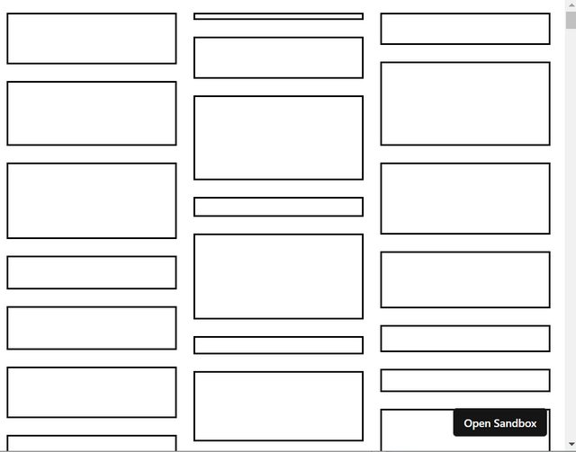
How can I accomplish this via CSS? I cannot simply switch to flex-direction: row as there would be large gaps between rows due to the varying heights of the elements.
Here is my hacky attempt via JS: https://codesandbox.io/s/dreamy-joliot-9n3woy?file=/src/App.js
import React, { useState, useEffect } from "react";

const BOX_WIDTH = 200;
const boxHeights = [...Array(500)].map(() => Math.random() * 100);

export default function App() {
  const ref = React.useRef();

  const [originalHeight, setOriginalHeight] = useState();
  useEffect(() => {
    if (!originalHeight && ref.current?.clientHeight) {
      setOriginalHeight(ref.current?.clientHeight);
    }
  }, [originalHeight, ref.current?.clientHeight]);

  const [height, setHeight] = useState();
  useEffect(() => {
    if (originalHeight && ref.current?.clientWidth) {
      setHeight(
        originalHeight / Math.floor(ref.current?.clientWidth / BOX_WIDTH) / 0.9
      );
    }
  }, [ref.current?.clientWidth, originalHeight]);

  return (
    <>
      <div
        ref={ref}
        style={{
          display: "flex",
          flexDirection: "column",
          flexWrap: "wrap",
          ...(height && { height })
        }}
      >
        {[...Array(500)].map((_, i) => (
          <div
            style={{
              border: "solid",
              width: BOX_WIDTH,
              height: boxHeights[i],
              margin: "10px"
            }}
          />
        ))}
      </div>
    </>
  );
}