2

I'm using some code found at codepen with a Stepper Control. I'm not vey skilled with CSS and I'm having an issue not presented in codepen, so I assume is another CSS class defined in a very long stylesheet that is shared with other team mates. The problem I tried to fix is that the line defined in the class .progressbar li:after remains above the class .progressbar li:before, that defines the circles.

li:after initially came with a z-index: -1 and li:before didn't have the z-index property, but the lines didn't appear, they were hidden behind a div, so I had to modify it and that's what is shown in the snippet. Although this z-index: -1 works in the snippet, is not working where I want to be implemented.

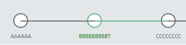
This first image shows the result of the CSS Stepper, taken directly from codepen to my page with z-index:-1

Issue with z-index:-1

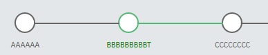
This other image shows the result after trying to adjust the z-index property:

Issue with z-index: 1

This is the desired output:

Desired output

Here's the snippet:

.container {
      width: 600px;
      margin: 100px auto; 
      z-index: -1;
  }
  .progressbar li {
      list-style-type: none;
      width: 25%;
      float: left;
      font-size: 12px;
      position: relative;
      text-align: center;
      text-transform: uppercase;
      color: #666666;
  }
  .progressbar li:after {
      width: 100%;
      height: 2px;
      content: '';
      position: absolute;
      background-color: #666666;
      top: 15px;
      left: -50%;
      display: block;
      z-index: 1;
  }
  .progressbar li:before {
      width: 30px;
      height: 30px;
      content: '';
      line-height: 30px;
      border: 2px solid #666666;
      display: block;
      text-align: center;
      margin: 0 auto 10px auto;
      border-radius: 50%;
      background-color: white;
      z-index: 999999;
  }
  .progressbar li:first-child:after {
      content: none;
  }
  .progressbar li.active {
      color: green;
  }
  .progressbar li.active:before {
      border-color: #55b776;
  }
  .progressbar li.active + li:after {
      background-color: #55b776;
  }
<div class="container">
      <ul class="progressbar">
          <li >aaaaaa</li>
          <li class="active">bbbbbbbbbt</li>
          <li>cccccccc</li>
          <li>ddddddddd</li>
  </ul>
  </div>

¿Could I get some help to solve this problem, or where could I start looking?

I think it's all said, but please, if I left something, I'll try to complete the post.

Thanks in advance,

Ruben
  • 114
  • 12
  • Have you used your browser's devtools inspect facility to see exactly what CSS is being applied (and where it comes from)? – A Haworth May 09 '22 at 08:31
  • whats your desired output? what do you want the final result to look like? – Sigurd Mazanti May 09 '22 at 08:32
  • I've edited the post with the desired output, Sigurd. Haworth, I'm not very skilled. I've tried some playing with the dev tools, marking and demarking some properties, but I still don't know why is showing the lines above the circles. I thought it had to do with the z-index properties, but I've also failed trying to fix it that way., – Ruben May 09 '22 at 08:37
  • CBroe, that was my fault. I was taking screenshots, and left the code with the incorrect value for z-index. The problem is z-index:-1 doesnt work for me, maybe because of a conflict with another css. – Ruben May 09 '22 at 08:44

2 Answers2

2

You just need to reduce the z-index of .progressbar li:after like this (no other changes required):

.progressbar li:after {
  width: 100%;
  height: 2px;
  content: '';
  position: absolute;
  background-color: #666666;
  top: 15px;
  left: -50%;
  display: block;
  z-index: -999999;
}

You can see it working below:

.container {
  width: 600px;
  margin: 100px auto;
  z-index: -1;
}

.progressbar li {
  list-style-type: none;
  width: 25%;
  float: left;
  font-size: 12px;
  position: relative;
  text-align: center;
  text-transform: uppercase;
  color: #666666;
}

.progressbar li:after {
  width: 100%;
  height: 2px;
  content: '';
  position: absolute;
  background-color: #666666;
  top: 15px;
  left: -50%;
  display: block;
  z-index: -999999;
}

.progressbar li:before {
  width: 30px;
  height: 30px;
  content: '';
  line-height: 30px;
  border: 2px solid #666666;
  display: block;
  text-align: center;
  margin: 0 auto 10px auto;
  border-radius: 50%;
  background-color: white;
  z-index: 999999;
}

.progressbar li:first-child:after {
  content: none;
}

.progressbar li.active {
  color: green;
}

.progressbar li.active:before {
  border-color: #55b776;
}

.progressbar li.active+li:after {
  background-color: #55b776;
}
<div class="container">
  <ul class="progressbar">
    <li>aaaaaa</li>
    <li class="active">bbbbbbbbbt</li>
    <li>cccccccc</li>
    <li>ddddddddd</li>
  </ul>
</div>
Aneesh
  • 1,720
  • 4
  • 14
  • 1
    Aneesh, this one is working too. Although the changes are minor, I think Sigurd's approach is cleaner., but yours is also useful, thanks :) – Ruben May 09 '22 at 09:04
1

You must give the element a position-value in order to use z-index. Just apply position: relative; to the .progressbar li:before-element:

.container {
  width: 600px;
  margin: 100px auto;
}

.progressbar li {
  list-style-type: none;
  width: 25%;
  float: left;
  font-size: 12px;
  position: relative;
  text-align: center;
  text-transform: uppercase;
  color: #666666;
}

.progressbar li:after {
  width: 100%;
  height: 2px;
  content: '';
  position: absolute;
  background-color: #666666;
  top: 15px;
  left: -50%;
  display: block;
}

.progressbar li:before {
  width: 30px;
  height: 30px;
  content: '';
  line-height: 30px;
  border: 2px solid #666666;
  display: block;
  text-align: center;
  margin: 0 auto 10px auto;
  border-radius: 50%;
  background-color: white;
  position: relative;
  z-index: 1;
}

.progressbar li:first-child:after {
  content: none;
}

.progressbar li.active {
  color: green;
}

.progressbar li.active:before {
  border-color: #55b776;
}

.progressbar li.active+li:after {
  background-color: #55b776;
}
<div class="container">
  <ul class="progressbar">
    <li>aaaaaa</li>
    <li class="active">bbbbbbbbbt</li>
    <li>cccccccc</li>
    <li>ddddddddd</li>
  </ul>
</div>
Sigurd Mazanti
  • 2,098
  • 1
  • 8
  • 24
  • Sigurd, that worked! Could I get some more detailed info about this? Why must I have define a position value in order to use z-index? – Ruben May 09 '22 at 08:57
  • 1
    You don't necessarily need to specify a `position`-value, but `z-index` behaviour works relatively to a parent - so let's say you have 3 elements that all share the same parent, you don't need to specify a `position`-value in order to change their `z-index`, because they share the same stacking context. But because `.progressbar li:before` is a pseudo-element, there needs to be a new stacking context. This topic has been discussed for years, so if you want to get in depth with it, theres many great resources out there to explain it better than myself! – Sigurd Mazanti May 09 '22 at 09:04
  • 1
    Pseudo-element z-index: https://stackoverflow.com/a/10822168/14776809 Mozilla docs on z-index: https://developer.mozilla.org/en-US/docs/Web/CSS/z-index Mozilla docs on stacking context: https://developer.mozilla.org/en-US/docs/Web/CSS/CSS_Positioning/Understanding_z_index/The_stacking_context – Sigurd Mazanti May 09 '22 at 09:05
  • 1
    Sigurd, You made your point perfectly clear. Thanks a lot for this detailed answer, I really appreciate it :) I'll take a look to the docs you've linked me, – Ruben May 09 '22 at 09:05