9

How can we achieve this in jetpack compose

enter image description here

I'm doing something like this

Button(
    elevation = ButtonDefaults.elevation(
        defaultElevation = 0.dp,
        pressedElevation = 8.dp,
        disabledElevation = 0.dp
    ),
    onClick = { onClick },
    shape = RoundedCornerShape(28.dp),
    modifier = modifier
        .fillMaxWidth()
        .shadow(0.dp),
    contentPadding = PaddingValues(15.dp),
    colors = ButtonDefaults.buttonColors(backgroundColor = Color.White),
    border = BorderStroke(1.dp, Color.Grey)
) {
    Box(modifier = modifier.fillMaxWidth(),
        contentAlignment = Alignment.Center) {
        Icon(
            imageVector = imageVector,
            modifier = Modifier
                .size(18.dp),
            contentDescription = "drawable icons",
            tint = Color.Unspecified
        )
        Spacer(modifier = Modifier.width(10.dp))
        Text(
            text = buttonText,
            color = Color.Black,
            textAlign = TextAlign.Center
        )
    }
}

enter image description here

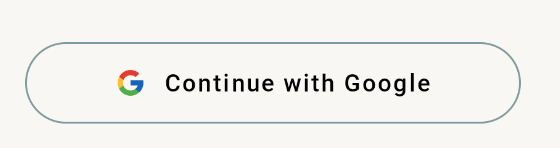
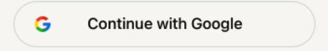
So as you can see the Google logo is just left of the text I need it at the start of the box so how can I do this.

Gabriele Mariotti
  • 320,139
  • 94
  • 887
  • 841
Dheeraj Gupta
  • 405
  • 1
  • 4
  • 12

5 Answers5

7

As suggested in other answers you can wrap the content with a Box.
As alternative you can simply use the RowScope of the Button without any container.

Just apply a weight(1f) modifier to the Text and an offset(x=- iconWidth/2).

Something like:

Button(
   //....
) {

    Icon(
        imageVector = imageVector,
        modifier = Modifier.size(iconWidth),
        contentDescription = "drawable icons",
        tint = Color.Unspecified
    )
    Text(
        text = "Button",
        color = Color.Black,
        textAlign = TextAlign.Center,
        modifier = Modifier
            .weight(1f)
            .offset(x= -iconWidth/2) //default icon width = 24.dp
    )
}

enter image description here

If you want to use a Box, remove the contentAlignment = Alignment.Center in the Box and use:

 Box(modifier = Modifier.fillMaxWidth()) {
        Icon( /* ..... */ )
        Text(
            modifier = Modifier.fillMaxWidth(),
            text = "buttonText",
            textAlign = TextAlign.Center
        )
 }

enter image description here

Gabriele Mariotti
  • 320,139
  • 94
  • 887
  • 841
6
@Composable
fun GoogleButton(
    modifier: Modifier = Modifier,
    imageVector: ImageVector,
    buttonText: String,
    onClick: (isEnabled: Boolean) -> Unit = {},
    enable: Boolean = true,
    backgroundColor: Color,
    fontColor: Color,
) {
    Button(
        onClick = { onClick(enable) },
        modifier = modifier
            .fillMaxWidth()
            .shadow(0.dp)
            .noInteractionClickable(enabled = false) { onClick(enable) },
        elevation = ButtonDefaults.elevation(
            defaultElevation = 0.dp,
            pressedElevation = 0.dp,
            hoveredElevation = 0.dp,
            focusedElevation = 0.dp
        ),
        shape = RoundedCornerShape(28.dp),
        contentPadding = PaddingValues(15.dp),
        colors = ButtonDefaults.buttonColors(
            backgroundColor = backgroundColor,
            contentColor = fontColor
        ),
        border = BorderStroke(1.dp, MaterialTheme.colors.getButtonBorderStroke)
    ) {
        Box(
            modifier = Modifier
                .fillMaxWidth(),
            contentAlignment = Alignment.Center
        ) {
            Row(
                modifier = Modifier
                    .fillMaxWidth()
                    .align(Alignment.CenterStart)
            ) {
                Spacer(modifier = Modifier.width(4.dp))
                Icon(
                    imageVector = imageVector,
                    modifier = Modifier
                        .size(18.dp),
                    contentDescription = "drawable_icons",
                    tint = Color.Unspecified
                )
            }
            Text(
                modifier = Modifier.align(Alignment.Center),
                text = buttonText,
                color = MaterialTheme.colors.loginButtonTextColor,
                textAlign = TextAlign.Center,
                fontSize = 16.sp,
                fontFamily = FontFamily(
                    Font(
                        R.font.roboto_medium
                    )
                )
            )
        }
    }
}
Dheeraj Gupta
  • 405
  • 1
  • 4
  • 12
  • [A code-only answer is not high quality](//meta.stackoverflow.com/questions/392712/explaining-entirely-code-based-answers). While this code may be useful, you can improve it by saying why it works, how it works, when it should be used, and what its limitations are. Please [edit] your answer to include explanation and link to relevant documentation. – Cliff Burton Jul 06 '23 at 08:11
4

You can use align(Alignment.CenterStart) on the Icon's Modifier parameter to center the icon around the start of the Box Composable. This alignment will have priority over the Box's alignment parameter.

You can also delete the Spacer composable because the Box layout children are stacked one on top of the other in the composition order. So the Spacer composable is basically laying below the Text composable in the center.

If you want some space between the Icon and the Text, you could use some padding around the Icon instead.

Try this (It worked for me) :

Box(modifier = modifier.fillMaxWidth(),
        contentAlignment = Alignment.Center) {
        Icon(
            imageVector = imageVector,
            modifier = Modifier
                .size(18.dp)
                .align(Alignment.CenterStart),
            contentDescription = "drawable icons",
            tint = Color.Unspecified
        )
        Text(
            text = buttonText,
            color = Color.Black,
            textAlign = TextAlign.Center
        )
    }
1

Box doesn't provide bounds, so for longer texts, it causes overlapping. Row works better for me. Also, you can use Spacer here which is not possible for Box. In my case, I have used spacedBy as a replacement for Spacer:

Row(
    modifier = Modifier.fillMaxWidth(),
    horizontalArrangement = Arrangement.spacedBy(16.dp),
    verticalAlignment = Alignment.CenterVertically
) {
    Icon(
        painter,
        contentDescription = null
    )
    Box(
        modifier = Modifier.weight(1F),
        contentAlignment = Alignment.Center
    ) {
        Text(buttonText)
    }
}
Szymon Grochowiak
  • 640
  • 1
  • 5
  • 6
-2
Box(contentAlignment = Center){
  Icon(Modifier.align(CenterStart))

  Text()
}
Richard Onslow Roper
  • 5,477
  • 2
  • 11
  • 42