-1

My goal is to detect if a certain frequency is present in an audio recording and output a binary response. To do this, I plan on performing a Fourier transform on the audio file, and querying the values contained in the frequency bins. If I find that the bin associated with the frequency I am looking for has a high value, this should mean that it is present (if my thinking is correct). However, I am having trouble generating my transform correctly. My code is below:

from scipy.io import wavfile
from scipy.fft import fft, fftfreq
from matplotlib import pyplot as plt
import numpy as np
import pandas as pd

user_in = input("Please enter the relative path to your wav file --> ")
sampling_rate, data = wavfile.read(user_in)
print("sampling rate:", sampling_rate)

duration = len(data) / float(sampling_rate)
print("duration:", duration)

number_samples_in_seg = int(sampling_rate * duration)
fft_of_data = fft(data)
fft_bins_from_data = fftfreq(number_samples_in_seg, 1 / sampling_rate)

print(fft_bins_from_data.size)

plt.plot(fft_bins_from_data, fft_of_data, label="Real part")
plt.show()

Trying this code using a few different wav files leads me to wonder whether I am displaying my transform in the time domain, rather than the frequency domain, which I need:

Input: 200hz.wav

Output:

sampling rate: 48000
duration: 60.000375
2880018

plot output 200hz

Input: 8000hz.wav

Output:

sampling rate: 48000
duration: 60.000375
2880018

plot output 8000hz

With these files that should contain a pure signal, I would expect to see only one spike on my plot, where x = 200 or x = 800. One final file contributes to my concern that I am not viewing the frequency domain:

Input: beep.wav

Output:

sampling rate: 48000
duration: 5.061958333333333
24297

plot output beep

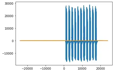
This appears to show the distinct beeping as it progresses over an x-axis of time.

I attempted to clean up the plotting by only plotting the magnitude of the positive values. Unfortunately, I am still not seeing the frequencies isolated on a frequency spectrum:

plt.plot(fft_bins_from_data[0:number_samples_in_seg//2], abs(fft_of_data[0:number_samples_in_seg//2])
plt.show()

beep output updated

I have referred to these resources before posting:

How to get a list of frequencies in a wav file

Python frequency detection

Fourier Transforms With scipy.fft: Python Signal Processing

Calculate the magnitude and phase of a signal at a particular frequency in python

What is the difference between numpy.fft.fft and numpy.fft.fftfreq

A summary of my questions:

  1. Are my plots displaying the time domain or frequency domain of the signal?
  2. Why is the number of samples equal to the number of bins, and should this be the case for frequency domain?
  3. If these plots are indeed the frequency domain, how do I interpret them and query the values in the bins?
  • 1
    The fourier transform of a time-domain signal is in the frequency domain. Other than that, I didn't understand much of what you were trying to ask. – mkrieger1 May 28 '22 at 14:13
  • This is what I thought. I edited my pictures of the plots and that may be helpful. My question to you is: if the transform shows the frequency domain, why are my plots showing what appears to be time on the x axis? appreciate your input. – fishfinder May 28 '22 at 14:22
  • You do apply the transform correctly, your problem likely is with the plotting. Note the order of values in `fft_bins_from_data`, which causes your plot to be drawn right half first, then a ~ horizontal line from the right end to the left, then the left half. Typically people will only plot the first half (where `fft_bins_from_data` is not negative). And also you should plot the magnitude, not the real part. The magnitude is much more informative than only the real part, which will oscillate a lot more. – Cris Luengo May 28 '22 at 14:28
  • I edited my post. However, I am not sure if I did this correctly, as I still do not see the isolated frequencies. Thanks for your help – fishfinder May 28 '22 at 14:52

1 Answers1

0

Try this:

import scipy as sp
import scipy.signal as sig
import numpy as np
from numpy import fft
import matplotlib.pyplot as plt

number_samples_in_seg = len(data)
time_axis = np.arange(0, number_samples_in_seg)/sampling_rate
win = sig.windows.hann(number_samples_in_seg)
windowed_data = win*data
plt.plot(time_axis, windowed_data)

That will plot the signal in the time domain if that's not obvious. I applied a Hann window to the signal, which will reduce artifacts if the start and end of the signal don't match up (as the FFT assumes that the snippet of the signal is periodic).

For the plotting of the FFT:

fft_data = fft.fft(windowed_data)[0:int(np.floor(number_samples_in_seg/2))]
freq_axis = sp.fft.fftfreq(number_samples_in_seg, 1.0/sample_rate)[0:int(np.floor(number_samples_in_seg/2))]
plt.plot(freq_axis, 20.0*np.log10(np.abs(fft_data)))

The square bracket indexing on fft_data and freq_axis are to eliminate the negative frequency portion of the FFT. I generated a 200Hz sine wave in Audacity with a length of 4096 samples (just so that it fit within a power of two for nice FFT-ing) and there is a peak at 200Hz in my plot. Also note the 20*log10(abs(fft_data)) thing for plotting in dB.

The above should answer your question #3. As for question #2, the FFT always has the same number of time and frequency points. Not sure about question #1, but again, the above code should sort that out.

Magdrop
  • 568
  • 3
  • 13