I'm trying to make it so that when I zoom in/out the text in the bottom div is always relative to the size of the div.
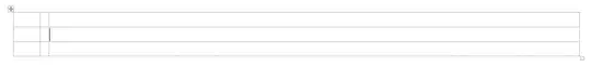
This is how it looks now: Normal:
Zoomed in:
Zoomed out:
.bottom {
  background-color: red;
  width: 100%;
  max-width: 3000px;
  height: 10vh;
  max-height: 200px;
  margin: auto;
  display: flex;
  justify-content: center;
  align-content: center;
  align-items: center;
}

.navBottom {
  overflow: visible;
  display: flex;
  justify-content: center;
  max-height: 5vh;
}

.navBottom a {
  color: white;
  text-align: center;
  padding: 14px 16px;
  text-decoration: none;
  font-size: 1.8vh;
  border-left: 1px solid;
  border-right: 1px solid;
  text-shadow: #000 0px 0px 1px, #000 0px 0px 1px, #000 0px 0px 1px, #000 0px 0px 1px, #000 0px 0px 1px, #000 0px 0px 1px, #000 0px 0px 1px, #000 0px 0px 1px;
}
<div class="bottom">
<div class="navBottom">
<a href="menu/info.html">About</a>
<a href="menu/history.html">History</a>
</div>
</div>And even if the text is good, the borders are too big/small depending on the zoom.