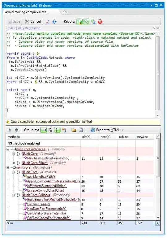
Here I have interactive barplot given by ggplotly. The only issue is that when I move mouse around bars, in the "model" category there is strange number instead of A or B (see the picture). Is it possible to customize plotly popup windows?
   df <- data.frame (model  = c("A", "A","B","B"),
                      year = c("2022","2021","2022","2021"),
                      sale = c(350,170,300,150),
                      change = c(180,NA,150,NA),
                      percent = c(105.8,NA,100,NA),
                      info = c("180, 105.8%",NA,"300,100%",NA)
                      )


#ggplot
plot <- ggplot(df, aes(fill=year, y=model, x=sale)) +
    geom_bar(position="dodge", stat="identity") + geom_text(aes(label=info, x=1.11*max(sale),), fontface='bold')+ xlim(0, 1.2*max(df$sale)) +
 theme(legend.position="bottom")+labs(fill = " ")+
  scale_fill_brewer(palette = "Paired")


ggplotly(plot)


