0

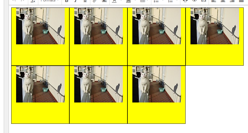
I have seen similar questions and this began by using the answer provided:

.wraptocenter {
  float: left;
  position: relative;
  display: table-cell;
  text-align: center;
  vertical-align: middle;
  width: 200px;
  height: 200px;
  background-color: yellow;
  border: solid black 1px;
}

.wraptocenter * {
  vertical-align: middle;
}
<div class="wraptocenter"><img src="http://www.brunildo.org/thumb/tmiri2_o.jpg" /></div>
<div class="wraptocenter"><img src="https://img.xcitefun.net/users/2015/01/382650,xcitefun-philippines-tour-1.jpg" /></div>
<div class="wraptocenter"><img src="http://www.brunildo.org/thumb/tmiri2_o.jpg" /></div>

It doesn't work as I want. I want my wraptocenter div containers to float one after he other and go down to the next row. If I remove float then they center but all of then squish on one row. When I add float the image is no longer centered vertically.

In the final HTMl I will want to use various images of different dimensions, all of which should be central.

I don't want to use any special elements (like flex grids). Just basic html / css. enter image description here

Andrew Truckle
  • 17,769
  • 16
  • 66
  • 164

2 Answers2

1

Flex is the ideal solution for this. But as that is undesired. A solution would be to remove the static width and height you have set on .wraptocenter and use padding instead.

.wraptocenter {
  float: left;
  position: relative;
  padding: 2em 1em;
  display: table-cell;
  text-align: center;
  vertical-align: middle;
  background-color: yellow;
  border: solid black 1px;
}
<div class="wraptocenter"><img src="http://www.brunildo.org/thumb/tmiri2_o.jpg" /></div>

Flex solution with the static parent height and width. A Fiddle for Andrew

Kameron
  • 10,240
  • 4
  • 13
  • 26
  • Thanks, it works, but, when I introduce other images, like a portrait image in the next container, the size for that one is taller. I want all containers to be grid like. For now, I have opted for not using flex because I am still using a CHtmlView control which won't support it. Eventually I will use WebView2 where a flex could be used. – Andrew Truckle Jun 02 '22 at 18:41
  • 1
    @AndrewTruckle No problem. Can you post an example or link a fiddle to show me what you mean when you have the portrait image and I can give you a solution for that one? Would a `flex` solution be helpful in addition to my current solution for when you use WebView2? Personal opinion - anything that doesn't support `flex` is outmoded. @gmail – Kameron Jun 02 '22 at 18:49
  • I have updated the question by just adding another graphic from a public website. It conveys the idea. I know CHtmlView is now outdated, but WebView2 is new and it has some crippling limitations which, until resolved, mean it is not suitable to use in my live application. – Andrew Truckle Jun 02 '22 at 18:55
  • And yes, a flex solution would be helpful in addition. Eventually I will use WebView2 and I would be able to migrate over to that methodology. I have never used it. – Andrew Truckle Jun 02 '22 at 18:56
  • @AndrewTruckle Do you want the image to render the same size as the other images? Like [this?](https://i.stack.imgur.com/OwyPj.png) or something like [this?](https://i.stack.imgur.com/gafVQ.png) – Kameron Jun 02 '22 at 19:13
  • 1
    @AndrewTruckle Here is the `flex` solution with the **static** parent height and width. [A Fiddle for Andrew](https://jsfiddle.net/kameronmayers/3srygqL0/1/). If you're doing a lot of front-end work I would recommend mastering `flex`. – Kameron Jun 02 '22 at 19:21
  • Those are all useful. Ideally I wanted to end up with ageneric solution because ultimately I am using this to create a worksheet and it will vary from week to week what images are in it. So no matter their dimensions I wanted them to fit into a fixed thumbnail. That was why I used static sizes. Ultimately this HTML output is to be printed and fit on a A4 worksheet. – Andrew Truckle Jun 02 '22 at 19:37
  • This works: https://stackoverflow.com/a/18869078/2287576 – Andrew Truckle Jun 02 '22 at 19:41
  • Let us [continue this discussion in chat](https://chat.stackoverflow.com/rooms/245276/discussion-between-kameron-and-andrew-truckle). – Kameron Jun 02 '22 at 19:52
0

Put these images as background-image for those divs. Btw you can make it responsive like that easily

zxc0e
  • 1