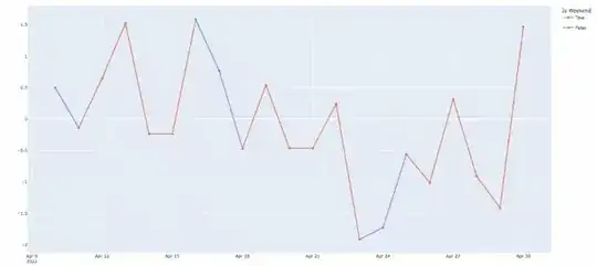
I am trying to distinguish weekends from weekdays by either 1) shading the region 2) coloring points with different colors or 3) setting x-axis label marked different for weekend.
Here I am trying the 2nd option — coloring data points for weekend differently. I first created an additional column (Is_Weekday) for distinguish weekends from weekdays. However, it’s not drawn on the same line, but rather draws two lines with different colors. I would like them to be in one line but with different color for values on weekends.
Here’s my code for reproducible data:
import pandas as pd
from datetime import datetime
import plotly.express as px

np.random.seed(42)
rng = pd.date_range('2022-04-10', periods=21, freq='D')
practice_df = pd.DataFrame({ 'Date': rng, 'Val' : np.random.randn(len(rng))})
practice_df = practice_df.set_index('Date')

weekend_list = []
for i in range(len(practice_df)):
    if practice_df.index[i].weekday() > 4:
        weekend_list.append(True)
    else:
        weekend_list.append(False)

practice_df['IsWeekend'] = weekend_list

fig = px.line(temp_df,
              x=temp_df.index, y='cnt',
              color = 'Is_Weekend',
              markers=True)
fig.show()
What I want to do would look something like this but coloring data points/line for weekends differently.
Edit:
Thanks so much to @Derek_O, I was able to color weekend with my original dataset. But I'd want to color the friday-saturday line also colored as weekend legend, so I set practice_df.index[i].weekday() >= 4 instead of practice_df.index[i].weekday() > 4.
- But would it be possible to have the Friday point to be the same as weekdays.
- Also, is it possible to have a straight line connecting the points, not like stairs?
- Otherwise, it'd also work if we could shade weekend region like the image at the bottom.


