0

I have a dataset that contains multiple groups and exp. conditions. (here represents as group <- c("g1", "g2") and con <- c("A1", "A2", "B1", "B2")) I made a 3x3 plot matrix, and below is a part of one of the plots. a1 in the graph is just a derivative con of A1 and do not need to have a separate background than A1.

example no background bar-chart

What I want is give them different colour background and frames so they are more friendly to readers. (e.g. the following output but fill the entire plating area [colour filled background distinguishing condition A, B, while coloured border differentiates condition 1, 2]) How could I archive this in R?

sample bar-chart with pseudo-background

---- Update ----
As you commented, Here is a demo data that preserves the structure of the original data frame.

(sep = "    ")# I use csv in real data, 
# here is just for better presentation
group    animal_nr    region    con    gene1    gene2    gene3
g1    101    x    A1    10    15    100
g1    102    x    A1    12    15    110
g1    103    x    A1    9    16    90
g1    104    x    A1    11    14    105
g1    201    x    a1    10    15    100
g1    202    x    a1    12    16    110
g1    203    x    a1    9    16    90
g1    204    x    a1    11    14    105
g1    105    x    A2    -8    5    50
g1    106    x    A2    -9    5.5    52
g1    107    x    A2    -8    4    53
g1    108    x    A2    0    6    52.8
g1    205    x    a2    -8    5    50
g1    206    x    a2    -9    5.5    52
g1    207    x    a2    -8    4    53
g1    208    x    a2    0    6    52.8
g1    109    x    B1    2    15    29
g1    110    x    B1    3    15.5    35
g1    111    x    B1    1    16    33
g1    112    x    B1    1.1    14    30
g1    209    x    b1    2    15    29
g1    210    x    b1    3    15.5    35
g1    211    x    b1    1    16    33
g1    212    x    b1    1.1    14    30
g1    113    x    B2    -10    2    10
g1    114    x    B2    -8    3    11
g1    115    x    B2    -9    2    11.1
g1    116    x    B2    -11    4    12
g2    301    x    A1    10    15    100
g2    302    x    A1    12    15    110
g2    303    x    A1    9    16    90
g2    304    x    A1    11    14    105
g2    401    x    a1    10    15    100
g2    402    x    a1    12    16    110
g2    403    x    a1    9    16    90
g2    404    x    a1    11    14    105
g2    305    x    A2    -8    5    50
g2    306    x    A2    -9    5.5    52
g2    307    x    A2    -8    4    53
g2    308    x    A2    0    6    52.8
g2    405    x    a2    -8    5    50
g2    406    x    a2    -9    5.5    52
g2    407    x    a2    -8    4    53
g2    408    x    a2    0    6    52.8

Layout of real plot

grid(r = 3, n = 3)
gene/region    x    y    z
gene1
gene2
gene3

  • It also welcome to give suggestions to use another R package or custom functions!! A lot of thanks for any advice – jimmymcheung Jul 01 '22 at 18:10
  • It would be easier to help you if you provide [a minimal reproducible example](https://stackoverflow.com/questions/5963269/how-to-make-a-great-r-reproducible-example) including the code you tried and a snippet of your data or some fake data. – stefan Jul 01 '22 at 18:14
  • @stefan yes I just added a demo (fake) data frame thanks – jimmymcheung Jul 02 '22 at 12:27

2 Answers2

1

In general you could add some background rectangles using geom_rect. which however requires some data wrangling to get the xmin and xmax values. Basically this involves setting up a dataframe and converting your categories to numeric positions. Also at this stage we also add some columns which could be mapped on fill and color to achieve your desired result. Note that I slightly reduced the rect size to width_rect = .98 to prevent the outlines from overlapping.

library(dplyr)
library(ggplot2)

# Prep data for column and errorbars
df_sum <- df |> 
  group_by(group, con) |> 
  summarise(across(gene3, .fns = list(mean = mean, sd = sd)))

# Set up dataframe for background rectangles
width_rect <- .98
rects <- data.frame(
  con = factor(unique(df$con))
)
rects <- rects |> 
  mutate(con_num = as.numeric(con), 
         con_group = toupper(con)) |> 
  group_by(con_group) |> 
  summarise(xmin = min(con_num) - width_rect / 2, 
            xmax = max(con_num) + width_rect / 2) |> 
  mutate(fill = substr(con_group, 1, 1), 
         color = substr(con_group, 2, 2))

pd <- position_dodge(width = .9, preserve = "single")

ggplot(df_sum, aes(con, gene3_mean, fill = group)) +
  scale_x_discrete() +
  geom_rect(aes(xmin = xmin, xmax = xmax, fill = fill, color = color, ymin = -Inf, ymax = Inf), 
            data = rects, inherit.aes = FALSE, size = 1, alpha = .3) +
  geom_col(position = pd) +
  geom_errorbar(aes(ymin = gene3_mean - 1.96 * gene3_sd, 
                    ymax = gene3_mean + 1.96 * gene3_sd), 
                width = .1, position = pd) +
  scale_color_manual(values = c("red", "blue"))

enter image description here

EDIT Instead of using substr you could of course use an ifelse or ... to assign the categories to fill and color:

rects <- rects |> 
  ...
  mutate(fill = ifelse(con_group %in% c("A1", "A2"), "A", "B"), 
         color = ifelse(con_group %in% c("A1", "B1"), "1", "2"))
stefan
  • 90,330
  • 6
  • 25
  • 51
  • I saw you use the first or the second letter in constructing the rects, But my real grouping is not one-letter+1dig coding but the letter or digit here `c('A', 'B') || c(1, 2)` would be 1 or 2 dig code e.g. `('A', 'AB') || c('C', 'CD')` and `A` vs `a` in real data is `A` vs `prefix-A`. My question is how should I reflect this? – jimmymcheung Jul 08 '22 at 17:08
  • There is of course no need to use `substr`. You could always use an `ifelse` or `case_when` in more general cases. See my edit. – stefan Jul 09 '22 at 08:25
  • So I can also use nested `if` `else`? – jimmymcheung Jul 09 '22 at 10:35
  • with ifelse I still get an error: `prefix-A/1`, `prefix-AB/1`, `prefix-A/11` etc has value `fill = AB colour = 11` (every condition with `prefix-`) while the rest has value `fill = A colour = 1` – jimmymcheung Jul 09 '22 at 10:45
  • I think I get what you meant in your update. Correct me if I misunderstood. So the vector you use to filter (with `%in%`) contains only the value that matches the first type of condition (thus `A` or `a`) and you are calling them in the `fill` as `A` and what doesn't matches as `B`, right? – jimmymcheung Jul 10 '22 at 21:02
  • I'm almost there, but geom_rect produce 2 rectangle border instead of one as showing in your demo, I used you code except I did pass `toupper()` because in real data it was not differentiate by capitalisation but by a prefix. – jimmymcheung Jul 12 '22 at 15:22
0

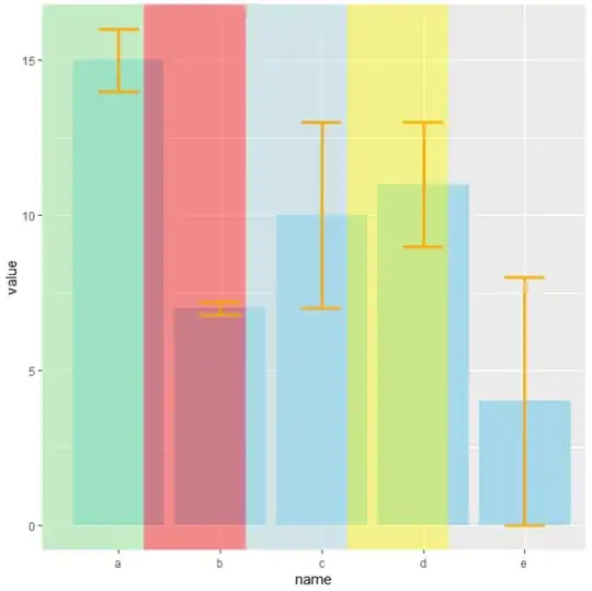
Here you have an example with dummy data and using geom_rec you can select that part of the background that you want to fill with some color, changing xmin and xmax.

library(tidyverse)

# create dummy data
data <- data.frame(
  name=letters[1:5],
  value=sample(seq(4,15),5),
  sd=c(1,0.2,3,2,4)
)

# Plot
ggplot(data) +
  geom_bar( aes(x=name, y=value), stat="identity", fill="skyblue", alpha=0.7) +
  geom_rect(data=NULL,aes(xmin=0.25,xmax=1.25,ymin=-Inf,ymax=Inf),
            fill="lightgreen", alpha=0.1) +
  geom_rect(data=NULL,aes(xmin=1.25,xmax=2.25,ymin=-Inf,ymax=Inf),
            fill="red", alpha=0.1) +
  geom_rect(data=NULL,aes(xmin=2.25,xmax=3.25,ymin=-Inf,ymax=Inf),
            fill="lightblue", alpha=0.1) +
  geom_rect(data=NULL,aes(xmin=3.25,xmax=4.25,ymin=-Inf,ymax=Inf),
            fill="yellow", alpha=0.1) +
  geom_errorbar(aes(x=name, ymin=value-sd, ymax=value+sd), 
                width=0.4, colour="orange", alpha=0.9, size=1.3)

OUTPUT: enter image description here

Isaac
  • 382
  • 2
  • 7
  • But in your demo the width of each colour background is not matching the bar right? – jimmymcheung Jul 02 '22 at 12:00
  • And if I want to make this rectangles in the background (instead of overlaying the actual bar) do I just need to put the bar chart function to the bottom? like this `ggplot(data) + geom_bar( aes(x=name, y=value), stat="identity", fill="skyblue", alpha=0.7) + geom_rect(data=NULL,aes(xmin=1.25,xmax=2.25,ymin=-Inf,ymax=Inf), fill="red", alpha=0.1) + geom_rect(data=NULL,aes(xmin=2.25,xmax=3.25,ymin=-Inf,ymax=Inf), fill="lightblue", alpha=0.1) + geom_rect(data=NULL,aes(xmin=0.25,xmax=1.25,ymin=-Inf,ymax=Inf), fill="lightgreen", alpha=0.1)` – jimmymcheung Jul 02 '22 at 12:30