0

I have two datasets that represent the same, but one from simulated data and other from real data. I want to compare both with boxplots. So far, I did plot them as you can see in the image. The question is, I want each boxplot in a group to have a different color but being the same for both datasets, so it would be only 5 different colors where the simulated data have alpha=0.2. Let say, to compare real 'Dt' 'RFR' with simulated 'Dt' 'RFR' I'd like to have two boxplots with the same color but one "alphaed".

In addition, I don't know how can I show that in a two column legend, one for the real labels and one for the simulated labels (the ones with and 's' at the beggining).

My code for the plot is the following

p <- ggplot()+geom_boxplot(data=simulation,aes(x=param,y=data, fill=algo), alpha=0.2)+
  geom_boxplot(data=ADCF2param_shuffle,aes(x=param, y = data, fill=algo))+
  geom_point(data =gt_vs_fitted,aes(param, y = data), color='red', size=4, shape=18)
p+scale_fill_brewer(palette="YlGnBu") + theme_classic() + labs(y="CCC", x= "Parameters")

Current plot

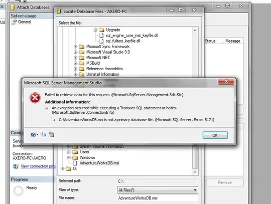
Here some sample data. For each 'algo' I have some data of every 'param'. And the same structure in the simulation data.
Sample data Sample data2

  • please post sample data – AnilGoyal Jul 04 '22 at 08:46
  • @AnilGoyal I've edited the post adding some sample data – Carlos Macarro Jul 04 '22 at 11:05
  • Please do not use images to show us your data. Because - simply - we do not just want to look at it. In many cases we need to use it to show you the solution. It is not impossible but unlikely that you find someone who will copy your data character by character just to answer the question. Please [see here](https://stackoverflow.com/questions/5963269/how-to-make-a-great-r-reproducible-example). – Jan Jul 04 '22 at 18:03

1 Answers1

0

Try this:

library(tidyverse)

# Made-up data
simulation <- tribble(
  ~param, ~data, ~algo,
  "Dt", 1, "GBR",
  "Dt", 1.3, "GBR",
  "Dt", 1.5, "ETR",
  "Dt", 1.7, "ETR",
  "Dv", 1.5, "ETR",
  "Dv", 1.6, "ETR",
  "Dv", 2, "GBR",
  "Dv", 2.1, "GBR"
)

shuffle <- tribble(
  ~param, ~data, ~algo,
  "Dt", 2.1, "GBR",
  "Dt", 2.2, "GBR",
  "Dt", 2.4, "ETR",
  "Dt", 2.6, "ETR",
  "Dv", 2.4, "ETR",
  "Dv", 2.8, "ETR",
  "Dv", 3.2, "GBR",
  "Dv", 2.9, "GBR"
)

fitted <- tribble(
  ~param, ~data, ~algo,
  "Dt", 1.12, "GBR",
  "Dt", 1.54, "ETR",
  "Dv", 1.56, "ETR",
  "Dv", 2.12, "GBR"
)

joined_df <- bind_rows(
  simulation = simulation,
  shuffle = shuffle,
  .id = "dataset"
)

# Plot
joined_df |> 
  ggplot(aes(param, data, fill = algo)) +
  geom_boxplot(aes(alpha = dataset, linetype = dataset), 
               data = joined_df |> filter(dataset == "simulation")) + 
  geom_boxplot(aes(alpha = dataset, linetype = dataset), 
               data = joined_df |> filter(dataset == "shuffle")) + 
  geom_point(data = fitted, color = "red", size = 2, shape = 18) +
  scale_fill_brewer(palette = "YlGnBu") + 
  scale_alpha_manual(values = c(1, 0.2)) +
  theme_classic() + 
  labs(y = "CCC", x = "Parameters") +
  theme(legend.position = "bottom")

Created on 2022-07-04 by the reprex package (v2.0.1)

Carl
  • 4,232
  • 2
  • 12
  • 24
  • Thank you for your answer. It is a good approach, however, it's useful for me to show the plots the way I posted so the simulatoion and real data comparation is done in the same "column" and not side by side. Is there a way to mantain that structure and have the same colors as you did? – Carlos Macarro Jul 04 '22 at 10:55
  • I need something like the second approach you proposed but notice that, for every parameter (Dt, Dv, etc) I have a group of 5 boxplots, one for each 'algo'. In you example, you've created the data so 'Dt' goes with 'GBR' and 'Dv' goes with 'ETR', but 'GBR' should also have 'Dv' and 'ETR' should also have 'Dt'. – Carlos Macarro Jul 04 '22 at 17:43