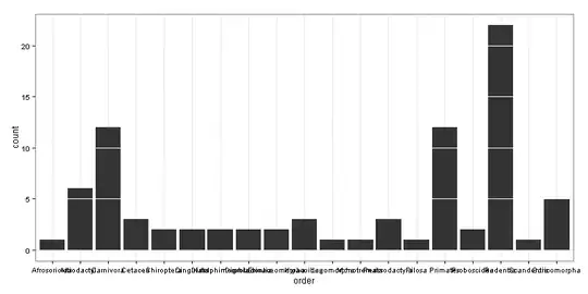
I am new to creating histograms with Matplotlib. I would like to create a histogram similar to this
As you can see, there are different size ranges (e.g. the first bar is only 50bp and the second is 400) but they are equally distributed. How can I do this?
The one I am doing looks like this
I know the first histogram has been developed with seaborn but I cannot install seaborn in the HPC I am using. Can I do this with matplotlib?
My code is
fig =figure(figsize =(16,6))

bins = [50,500,1000,10000,50000,100000,200000,500000,1000000]

patches = plt.hist(loss, bins = bins,
                   rwidth =0.85)

# define minor ticks and draw a grid with them
minor_locator = AutoMinorLocator(2)
plt.gca().xaxis.set_minor_locator(minor_locator)
plt.grid(which='minor', color='white', lw = 0.5)

# x ticks
xticks = [(bins[idx+1] + value)/2 for idx, value in enumerate(bins[:-1])]
xticks_labels = [ "{:.2f}\nto\n{:.2f}".format(value, bins[idx+1]) for idx, value in enumerate(bins[:-1])]
plt.xticks(xticks, labels = xticks_labels)

