I'm on my last leg of frustration.
I have a dataframe resembling this:
from datetime import date
import pandas as pd

data = {'date_start': [date(1948, 12, 1), date(1953, 8, 1), date(1957, 9, 1), date(1960, 5, 1),
                       date(1970, 1, 1), date(1973, 12, 1), date(1980, 2, 1), date(1981, 8, 1),
                       date(1990, 8, 1), date(2001, 4, 1), date(2008, 1, 1), date(2020, 3, 1),
                       date(2022, 1, 1)],
        'length_months': [10, 9, 7, 7, 10, 15, 5, 15, 7, 7, 17, 1, 9],
        'is_green': [0, 0, 1, 1, 1, 1, 1, 0, 0, 1, 1, 1, 1]}

df = pd.DataFrame(data)


    date_start  length_months  is_green
0   1948-12-01             10         0
1   1953-08-01              9         0
2   1957-09-01              7         1
3   1960-05-01              7         1
4   1970-01-01             10         1
5   1973-12-01             15         1
6   1980-02-01              5         1
7   1981-08-01             15         0
8   1990-08-01              7         0
9   2001-04-01              7         1
10  2008-01-01             17         1
11  2020-03-01              1         1
12  2022-01-01              9         1
date_start is a datetime value (but I have tried with objects), and both length_months and is_green are ints.
I am trying to make a histogram, functionally, with date_start as the x ticks / x axis, and the bars being length_months, with the hue of the bars being is_green
I am using the following code:
fig, ax = plt.subplots(figsize = (15,15))

colors = ['#42BB97','#DF4658']

sns.histplot(data = test_test, y = 'date_start', x = 'length_months', palette = sns.color_palette(colors, 2), ax = ax)

plt.show()
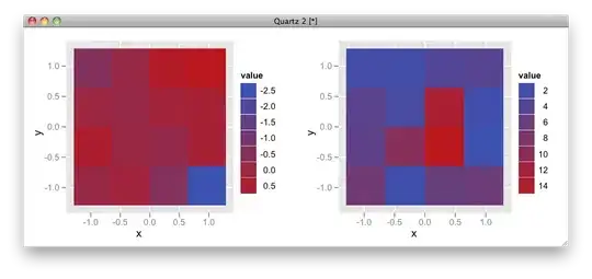
Seaborn, and matplotlib, keep spitting out an incorrect heatmap, or empty charts that I cannot access via fig, or ax, as seen below.
and this, with catplot. (this yields the correct chart, but I cannot access it)
sns.catplot(data = test_test, y = 'date_start', x = 'length_months', palette = sns.color_palette(colors, 2), ax = ax, kind = 'bar')
Does anyhow have any idea what the problem is? The seaborn documentation shows that this should be theoretically correct, so I'm very confused as to what the problem is here.
The desired outcome resembles this:

Thank you!

