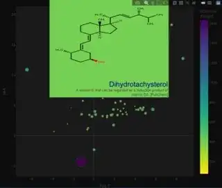
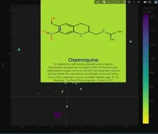
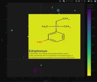
I want to edit the tooltip hover feature in a 3D UMAP I created within plotly. What I want to do is attach a saved image corresponding to a specific 'Sample.Code' and have that image appear when I hover over it in the 3D plotly scatter plot.
This would be similar to the interactive t-SNE/MNIST dataset that is attached in this link: https://dash.plotly.com/dash-core-components/tooltip
However, the above was written out in python not R. Would it be possible to achieve this in R?
I have attached my code below:
    # load ggplot2
library(ggplot2)
library(hrbrthemes)
library(tidyverse)
library(dplyr)
library(wesanderson)
library(RColorBrewer)
library(manipulate)
library(umap)
library(plotly)
library(shiny)
library(leaflet)

#set wd to location where plots will be saved. First step is to upload the initial data.

dt <- read.csv('data.csv')

#Run to the UMAP

df <- as.matrix(dt[, 2:149]) #remember to only set columns which will be used in the UMAP calculation

  custom.config = umap.defaults  #manual settings
  custom.config$n_components = 3
  custom.config$n_neighbors = 8
  custom.config$min_dist = 0.6

data_umap <-umap(df, config = custom.config)

data_raw<-as.data.frame(data_umap$layout)

data_plot <- cbind(data_raw, dt)

  #running graphics script. Make sure to change color and size to appropriate labels
  #This is the visual that will get manipulated playing around with the UMAP parameters

UMAP_plot <- ggplot(data_plot, aes(x = V1, y = V3, color = Dataset)) +
    labs(title = '2D UMAP') +
    geom_point(alpha = 0.7, shape =19 ) +
    theme_light() +
    theme(axis.text.y = element_text(size = 15),
          axis.text.x = element_text(size = 10),
          axis.title = element_text(size = 15),
          plot.title = element_text(size = 17),
          legend.text = element_text(size=15)) +
    scale_radius(range=c(4, 10))

colors <- c('#4AC6B7', '#1972A4', '#965F8A', '#FF7070', 'darkolivegreen')

UMAP_2D <- plot_ly(data_plot, x= ~V1, y= ~V3, color = ~Dataset, colors=colors,  type = "scatter", mode = "markers", text = ~paste('Sample.Code:', Sample.Code))

UMAP_3D <- plot_ly(data_plot, x= ~V1, y= ~V2, z= ~V3, type="scatter3d", mode="markers", color = ~Dataset, colors=colors, text = ~paste('Sample.Code:', Sample.Code))

UMAP_3D <- UMAP_3D %>% layout(title = '3D UMAP',
                             paper_bgcolor = 'grey',
                             plot_bgcolor = 'black')

UMAP_3D.update_layout(legend=dict(
  yanchor="top",
  y=0.99,
  xanchor="left",
  x=0.01
))

#Eventually add fingerprints to hover based on this code here: https://anchormen.nl/blog/data-science-ai/images-in-plotly-with-r/


print(UMAP_plot)
print(UMAP_2D)
print(UMAP_3D)
