0

I am making a series of plots from a point pattern (PPP) with the density (kernel) function. I would like that the maximum plotted number is 200 in all cases and just the heatmap accordingly (two of the images only go up to 100). I have not been able to find a solution to this problem using the R base plot.

    Microglia_Density <- density(Microglia_PPP, sigma =0.1, equal.ribbon = TRUE, col = topo.colors, main = "")
plot(Microglia_Density, main = "Microglia density")

Astrocytes_Density <- density(Astrocytes_PPP, sigma =0.1, equal.ribbon = TRUE, col = topo.colors, main = "")
plot(Astrocytes_Density, main = "Astrocytes density")

Neurons_Density <- density(Neurons_PPP, sigma =0.1, equal.ribbon = TRUE, col = topo.colors, main = "")
plot(Neurons_Density, main = "Neuronal density")

I would appreciate recommendations. Regards

Figure 1

Figure 2

Figure 3

Gregor Thomas
  • 136,190
  • 20
  • 167
  • 294
  • It's easier to help you if you provide a [reproducible example](https://stackoverflow.com/questions/5963269/how-to-make-a-great-r-reproducible-example) with sample input that can be used to test and verify possible solutions. – MrFlick Aug 08 '22 at 15:13
  • 1
    Could you make a small reproducible example? You tagged your question `spatstat` and mentioned that your data are PPPs... but I'm not sure what subpackages are being used. Looks like `density.ppp` is in the `spatstat.core` package and it returns a `density.ppp` object so the next function to find is the `plot.density.ppp` function... – Gregor Thomas Aug 08 '22 at 15:14

1 Answers1

2

Since we don’t have access to your data I simulate fake data in a square. There are several options to do what you want. First you should know that density() is a generic function, so when you invoke it on a ppp like Microglia_PPP actually the function density.ppp() is invoked. This function returns an im object (effectively a 2-d “image” of values). You plot this with plot() which in turn calls plot.im(), so you should read the help file of plot.im(), where it says that the argument col controls the colours used in the plot. Either you can make a colour map covering the range of values you are interested in and supply that, or if you know that one of the images has the colour map you want to use you can save it and reuse for the others:

library(spatstat)
set.seed(42)
Microglia_PPP <- runifpoint(100)
Neurons_PPP <- runifpoint(200)
Neurons_Density <- density(Neurons_PPP, sigma = 0.1)
Microglia_Density <- density(Microglia_PPP, sigma = 0.1)
my_colourmap <- plot(Neurons_Density, main = "Neuronal density", col = topo.colors)
plot(Microglia_Density, main = "Microglia density", col = my_colourmap)

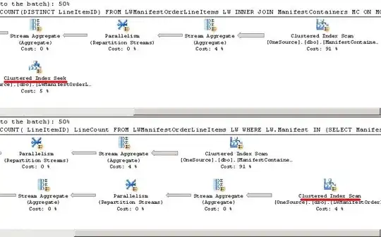
Notice the colour maps are the same, but it only covers the range from approximately 80 to 310. Any values of the image outside this range will not be plottet, so they appear white.

You can make a colour map first and then use it for all the plots (see help(colourmap)):

my_colourmap <- colourmap(topo.colors(256), range = c(40,315))
plot(Neurons_Density, main = "Neuronal density", col = my_colourmap)

plot(Microglia_Density, main = "Microglia density", col = my_colourmap)

Finally another solution if you want the images side by side is to make them an imlist (image list) and use plot.imlist() with equal.ribbon = TRUE:

density_list <- as.imlist(list(Neurons_Density, Microglia_Density))
plot(density_list, equal.ribbon = TRUE, main = "")

Ege Rubak
  • 4,347
  • 1
  • 10
  • 18
  • I really appreciate your support. That was the solution I was looking for. It worked perfectly establishing a colormap as you suggested. Thank you for your feedback. – Daniel Manrique Aug 09 '22 at 18:17
  • I'm glad to hear that. Please go ahead and accept the answer by pressing the checkmark so the question appears as solved for future searches. – Ege Rubak Aug 10 '22 at 04:47