4

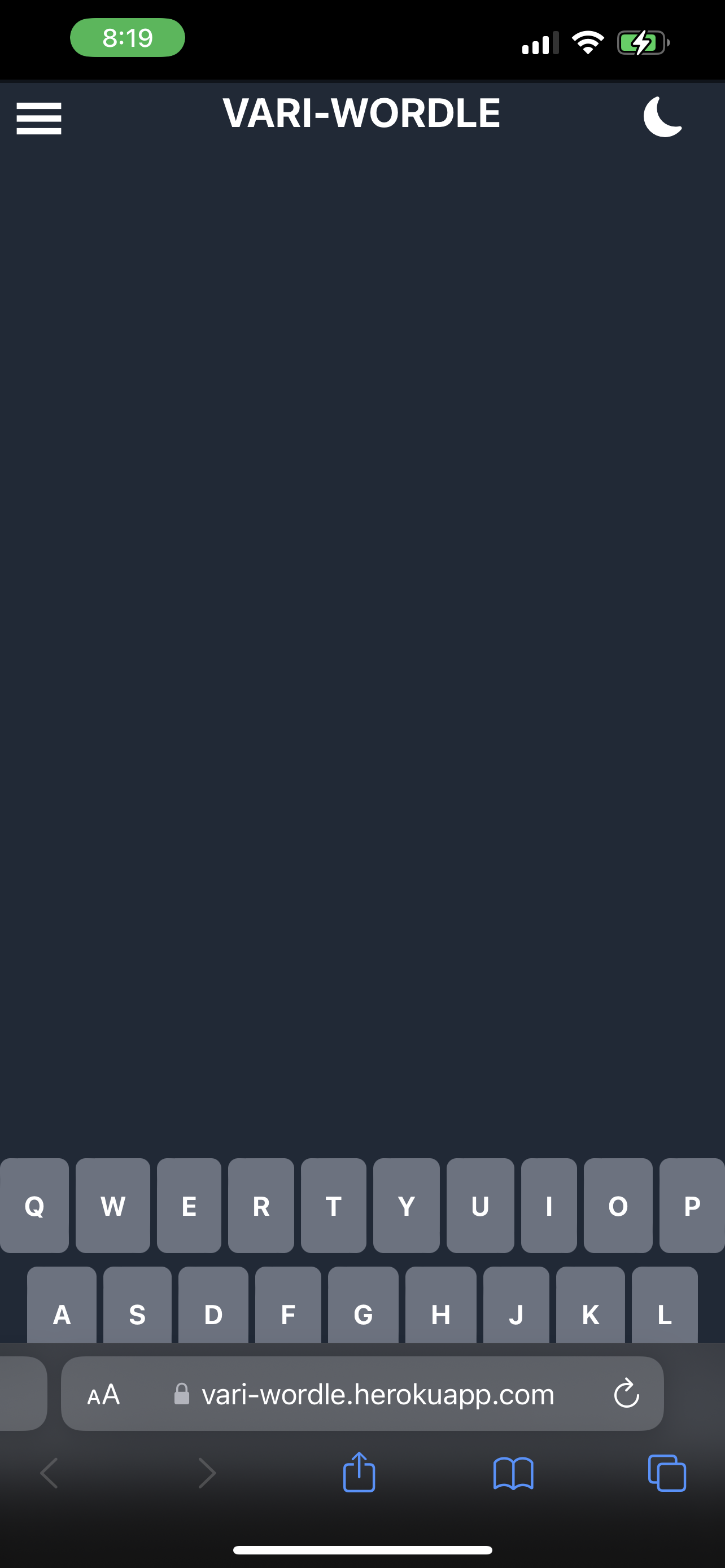
I'm trying to get my website to fit inside my phone screen. I have tried many variations of env(safe-area-inset-bottom) and constant(safe-area-inset-bottom) but both always return 0px (I've been using an app called Inspect to debug CSS on my iPhone 13).

Here's a link to the github repo. All code that relates to this issue should be in /src/app.tsx. Here is a link to the live site if you want to see the problem yourself.

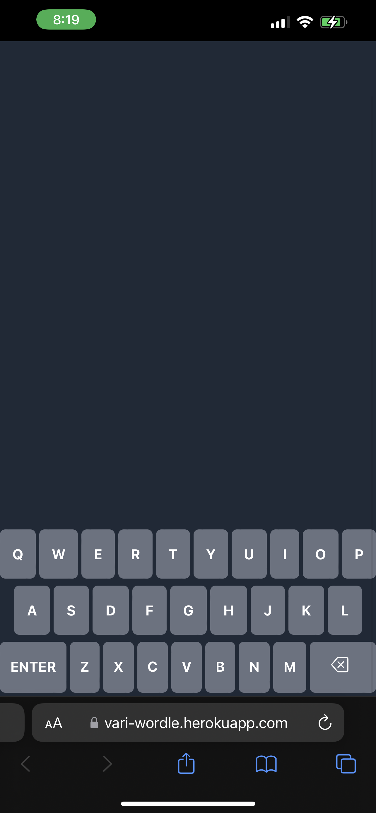
UPDATE: I've been doing some testing and have found that in portrait mode, safe-area-inset-* is ALWAYS 0px, but in landscape mode it works as expected. Does this mean that safe-area-inset-* isn't the correct solution for ios 15 safari? Clearly the url bar obscures the 'safe area' in portrait mode...

I've made sure to add <meta name="viewport" content="width=device-width, initial-scale=1.0, viewport-fit=cover" /> to my head tag but this has no effect. Could someone please explain how I can ensure that my site doesn't go past the bottom URL bar on ios 15 Safari? I've attached screenshots from my phone showing the problem: Keyboard goes past URL bar What I want the keyboard to look like

Nolan Gelinas
  • 53
  • 1
  • 8
  • try putting body 100vh or 100%. see if this helps your viewport also on your meta tag initial-scale 1. Read here this might help you. https://developer.mozilla.org/en-US/docs/Web/HTML/Viewport_meta_tag – Crystal Aug 15 '22 at 01:17
  • @Crystal I already added in the meta tag; I forgot to mark the HTML as code in the originally posted question so it didn't show up. I also currently have min-height set to 100vh (I'm using tailwindcss, so the class I added is min-h-screen). I also have tried padding-bottom: max(env(safe-area-inset-bottom), .25em) set in the main container and this has no effect either; the padding is always 0.25em on my desktop and phone. – Nolan Gelinas Aug 15 '22 at 02:10
  • add your code so we can look at it. its very hard to see whats going on on your site if we dont have a link or any code you can provide. – Crystal Aug 15 '22 at 02:14
  • @Crystal I added a link to my repo, as well as a link to the live site so you can see the issue yourself if you have an iPhone. – Nolan Gelinas Aug 15 '22 at 02:54
  • try to put @media only screen and (max-width:479px){body, html {height: 100vh; margin; auto; padding:0px;}} See if this will work on your end. if 100vh doesnt do it try to lower the view to 98vh to adjust – Crystal Aug 15 '22 at 03:19
  • @Crystal I want it to fit exactly on every device and browser though... I feel like I should be able to use safe-area-inset but I just tried this https://stackoverflow.com/questions/47112393/getting-the-iphone-x-safe-area-using-javascript console.log() the safe area on my iPhone and it says 0px... Why does safe area inset not work in safari? – Nolan Gelinas Aug 15 '22 at 03:29
  • I am not sure why it acts that way on your phone, so media screen call didt work? how about setting safe-area-inset-bottom of the body and html did you try that like bottom:max(16px, env(safe-area-inset-bottom)); – Crystal Aug 15 '22 at 03:37
  • @Crystal I've updated the post with more info. Safe area straight up does not work when my phone is in portrait mode. Works as expected in landscape but that isn't very helpful to me... – Nolan Gelinas Aug 15 '22 at 03:40
  • try to call it at max-width 479px. if you are saying that its working for landscape try to add and call the safe-area-inset-bottom on (max-width:479px); – Crystal Aug 15 '22 at 03:47
  • I added in your suggested css and also wrapped the css variables for consol.logging the safe area insite @media only screen and max-width: 479px and nothing changed. Now I get 0px in portrait and no value in landscape. – Nolan Gelinas Aug 15 '22 at 03:58
  • what meta you have? try to add this – Crystal Aug 15 '22 at 04:16
  • @Crystal I've added all of that data to my meta viewport tag and noticed no changes. – Nolan Gelinas Aug 15 '22 at 17:06

2 Answers2

3

I think I made it work using -webkit-fill-available the other day which respects safe area.

body {
    min-height: -webkit-fill-available;
}
pronebird
  • 12,068
  • 5
  • 54
  • 82
  • I tried changing min-height: 100vh; to min-height: -webkit-fill-available; and it produces the exact same issue on safari but now the height does not work at all on my desktop. – Nolan Gelinas Aug 15 '22 at 17:04
  • 1
    EDIT: I removed my body css and the -webkit-fill-available works on the phone now! But I still cannot get it to work on my desktop. I plan to use useEffect to detect if the device is mobile and change styling based on that. Is there a better way to do switch between -webkit-fill-available and 100vh in css only? – Nolan Gelinas Aug 15 '22 at 17:15
  • 1
    how about you just call it on media query and use webkit-fill-available?. If @Rob Zombie says he made it work you should prob try media call on it just for mobile since thats your issue – Crystal Aug 15 '22 at 17:16
  • @NolanGelinas I can think of using media query against iOS specific CSS attribute, see here: https://stackoverflow.com/a/47818418/351305 Should be no need to use JS for that. – pronebird Aug 16 '22 at 12:46
0

If you are getting 0px from env(safe-area-inset-bottom) then the browser is probably reporting its safe area as expected. Safari on iOS has this bottom navigation bar that animates in and out as the user scrolls. Also if the user taps on something within the bottom safe-area, the browser scrolls up the page (showing the navigation bar) to make that area of the page available, so the user can tap again. It's wonky. I believe that the 0px reported by Safari is indeed the safe area that you, the developer, are expected to handle in this context (none).

If you have a .webmanifest file with the display="standalone" option, and tap the share/export button within Safari to "Add to Home Screen", you can open and view the page without browser UI. From testing on the iOS 14 and 15 simulators, in this context I am getting 34px for the bottom safe area.

pejalo
  • 923
  • 11
  • 24