-1

I'm working with a dataset where I have one continous variable (V1) and want to see how that variable differs depending on demographics such as sex, age group etc.

I would like to do one graph that contains multiple boxplots - so that V1 is on the Y-axis and all my demographic variables (sex, age groups etc.) are on the x-axis with their corresponding p-values. Anyonw know how to do this in R?

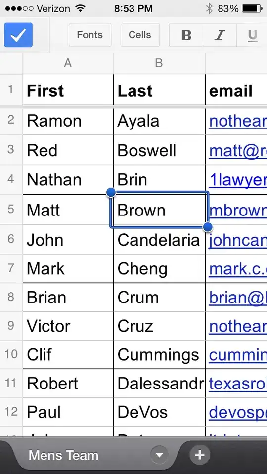
I've added two photos to illustrate my dataset and the output I want.

Thanks!

Output example 1

Data example

2

Adam Quek
  • 6,973
  • 1
  • 17
  • 23
Gerda
  • 1
  • Hi Gerda, welcome to SO! A few ideas to get you started. First, please add your data and as much code as you can as a reproducible example with `dput` https://stackoverflow.com/help/minimal-reproducible-example Second, I think it is typical to have separations in the x-axis when you have the same data plotted different ways... you could set them very close by without having a continuous x... this may be by creating many boxplots and arranging them (i like the package **patchwork** for that).. – Michael Roswell Aug 16 '22 at 18:52
  • The **tidyverse** here is a bit out of date but is this getting at what you're looking for? https://stackoverflow.com/q/32103434/8400969 – Michael Roswell Aug 16 '22 at 18:53

1 Answers1

0

It would be nice to have actual data and the code you already have so we can replicate what you have and work what you want. That being said, this link might be what you are looking for:

https://statisticsglobe.com/draw-multiple-boxplots-in-one-graph-in-r#example-2-drawing-multiple-boxplots-using-ggplot2-package

Scroll down about half way to Example 4: Drawing Multiple Boxplots for Each Group Side-by-Side

amanwebb
  • 380
  • 2
  • 9