I'm working on a simple example that utilizes the CSS object-fit: cover property on a video element that is wrapped inside a div with specified width and aspect ratio.
HTML
<!DOCTYPE html>
<html lang="en">
  <head>
    <meta charset="UTF-8" />
    <meta http-equiv="X-UA-Compatible" content="IE=edge" />
    <meta name="viewport" content="width=device-width, initial-scale=1.0" />
    <link rel="stylesheet" href="style.css" />
    <title>CSS Test</title>
  </head>
  <body>
    <div id="container">
      <video
        autoplay
        playsinline
        muted
        loop
        src="https://media.istockphoto.com/videos/slow-motion-rock-on-the-midzor-peak-video-id1248422582"
      ></video>
    </div>
  </body>
</html>
CSS
* {
  box-sizing: border-box;
}
html,
body {
  margin: 0;
  padding: 1rem;
  width: 100%;
  height: 100%;
}
#container {
  width: 500px;
  overflow: hidden;
  aspect-ratio: 1/1;
  border: 1px solid red;
}
video {
  width: 100%;
  height: 100%;
  object-fit: cover;
}
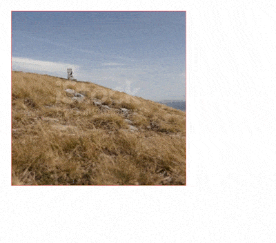
I noticed that upon loading the page in Safari, the video initially displays at a smaller scale within the div, before jumping to its intended scale and position. I attached a GIF below to show this behavior:
The same code works perfectly well in Chrome and Firefox. I tried specifying the object-position property without success.
Any ideas as to what might be causing this behavior in Safari specifically?