I have build a small game that run on canvas.
I want the game to run on full screen.
I follow the example given in this very helpful guide. https://code.tutsplus.com/tutorials/full-screen-web-apps--mobile-7509
But on Safari/ iPhone when I rotate the device to landscape mode part of the display get cut off by address bar.
The way I go to full screen is by selecting the "Hide Toolbar" option.
This is how it looks when I don't hide the tool bar and goes to landscape mode

This is how it looks when I hide the tool bar and goes to landscape mode from portrait mode
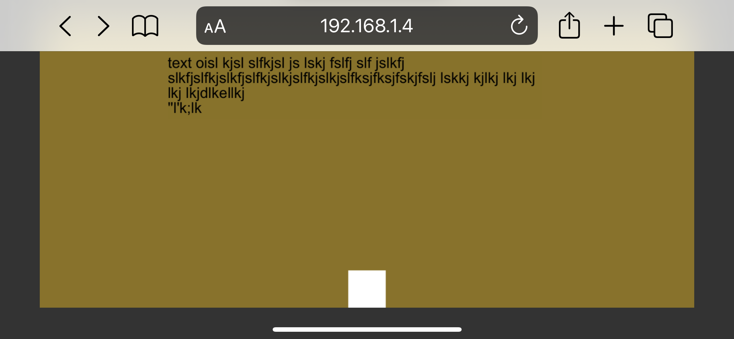
You can see part of the canvas get cut-off by the tool bar
Now if I hide the tool bar in landscape mode it does look correct. But if I go to portrait mode and come back to landscape mode screen again get cutoff.
Following is the code I used
  <div id="canvasHolder" style="width: 100%; height: 100%;background-color: transparent;">
  <canvas id="GameCanvas" oncontextmenu="event.preventDefault()" tabindex="0"></canvas>
  </div>

<script>

function hideAddressBar()
{
  if(!window.location.hash)
  {
      if(document.height < window.outerHeight)
      {
          document.body.style.height = (window.outerHeight + 50) + 'px';
      }

      setTimeout( function(){ window.scrollTo(0, 1); }, 50 );
  }
}

window.addEventListener("load", function(){ if(!window.pageYOffset){ hideAddressBar(); } } );
window.addEventListener("orientationchange", hideAddressBar );

</script>
I have seen many post regarding similar issues. But I can't seems to get it to work in my case.
Can anyone provide some advice on how to fix this issue ?