1

I am trying to create responsive table with space for a row details section inside a card using react bootstrap.

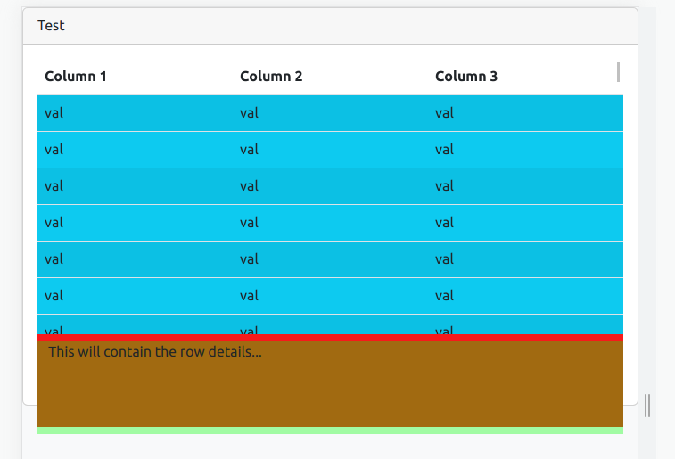
I have coloured the different sections in different colours so it is easier to see what is going on. For some reason the card body overflows the card by a little. If I remove the Card.Body height it becomes even worse as it starts scrolling the page as well.

EDIT: Here is the sandbox: https://codesandbox.io/s/kind-allen-qn90pz?file=/src/App.tsx

Here is a simplified version of my code:

import { Card, Col, Container, Row, Table } from "react-bootstrap";

function App() {
  return (
    <Card className="h-50 d-flex flex-column">
      <Card.Header>Test</Card.Header>
      <Card.Body className="h-100">
        <Container fluid className="h-100 bg-danger">
          <Row className="flex-column h-75 bg-info">
            <Col className="p-0" style={{ overflow: "auto" }}>
              <Table
                style={{
                  tableLayout: "fixed",
                }}
                striped
                hover
                size="md"
              >
                <thead
                  className="bg-white"
                  style={{ position: "sticky", top: 0 }}
                >
                  <tr>
                    <th>Column 1</th>
                    <th>Column 2</th>
                    <th>Column 3</th>
                  </tr>
                </thead>
                <tbody>
                  {[...Array(100)].map((x, i) => (
                    <tr key={i}>
                      <td>val</td>
                      <td>val</td>
                      <td>val</td>
                    </tr>
                  ))}
                </tbody>
              </Table>
            </Col>
          </Row>
          <Row
            style={{ backgroundColor: "rgba(0,255,0,0.35)" }}
            className="mt-2 h-25"
          >
            <Col> This will contain the row details...</Col>
          </Row>
        </Container>
      </Card.Body>
    </Card>
  );
}

export default App;

This gets mounted by react in the index.html which looks like this:

<!DOCTYPE html>
<html class="d-flex h-100 w-100" lang="en">
  <head>
    <meta charset="UTF-8" />
    <meta name="viewport" content="width=device-width, initial-scale=1.0" />
    <title>Title</title>
  </head>
  <body class="bg-light d-flex h-100 w-100">
    <div id="root" class="h-100 d-flex flex-column w-100"></div>
    <script type="module" src="/src/main.tsx"></script>
  </body>
</html>

And here is the result it produces: The result

Any ideas how to fix this?

Slav
  • 147
  • 2
  • 13

3 Answers3

1

The solution posted by @irous was close but never did work quite right for me because of the 80% max height on the card body.

After a few days of trial and error I finally found this StackOverflow answer. Based on the explanation in it as well as @irous's answer I figured I just need to add a style={{minHeight: 0}} on the Card.Body.

This is what the modified code from the OP looks like:

import { Card, Col, Container, Row, Table } from "react-bootstrap";

function App() {
  return (
    <Card className="h-50 d-flex flex-column">
      <Card.Header>Test</Card.Header>
      <Card.Body style={{minHeight: 0}} className="h-100">
        <Container fluid className="h-100 bg-danger">
          <Row className="flex-column h-75 bg-info">
            <Col className="p-0" style={{ overflow: "auto" }}>
              <Table
                style={{
                  tableLayout: "fixed",
                }}
                striped
                hover
                size="md"
              >
                <thead
                  className="bg-white"
                  style={{ position: "sticky", top: 0 }}
                >
                  <tr>
                    <th>Column 1</th>
                    <th>Column 2</th>
                    <th>Column 3</th>
                  </tr>
                </thead>
                <tbody>
                  {[...Array(100)].map((x, i) => (
                    <tr key={i}>
                      <td>val</td>
                      <td>val</td>
                      <td>val</td>
                    </tr>
                  ))}
                </tbody>
              </Table>
            </Col>
          </Row>
          <Row
            style={{ backgroundColor: "rgba(0,255,0,0.35)" }}
            className="mt-2 h-25"
          >
            <Col> This will contain the row details...</Col>
          </Row>
        </Container>
      </Card.Body>
    </Card>
  );
}

export default App;
Slav
  • 147
  • 2
  • 13
0

Problem with border of tag <tr>. You can try off them

Gibloor
  • 143
  • 6
  • Sorry, where do I add this? Can you please show an example or fiddle with the codesandbox? – Slav Sep 10 '22 at 15:57
  • My fault box-sizing doesn't work with table. I has deleted class m-2 from last block and added a little bit in css – Gibloor Sep 10 '22 at 16:30
0

Set CardBody's height/maxHeight around 80% will work.
To avoid ui broken when resizing, setting min width/height with literal pixel value.

<Card className="h-50 d-flex flex-column" style={{minHeight: "200px", minWidth: "200px"}}>
      <Card.Header>Test</Card.Header>
      <Card.Body className="h-80" style={{maxHeight: "80%"}}>
        <Container fluid className="h-100 bg-danger" style={{minHeight: "100px", minWidth: "100px"}}>
          /*...*/

irous
  • 401
  • 3
  • 8