4

I am trying to plot a geom_line figure, combined with a barplot. The barplot will have a reversed y-axis. The final product is expected to be similar to the figure below. I am not sure how to combine the reversed barplot with the line plot.

Also, it would be great if we can have a legend for A, B, and C. Thanks for any help.

library(ggplot2)
Mydata = data.frame(ID=1:14, A=1:14, B=20:7, C=100:113)

ggplot(data = Mydata) + 
geom_line(aes(x=ID, y = A)) +
geom_line(aes(x=ID, y = B))

enter image description here

I have tried the following code. The second y-axis is now reversed from 90 to 130, however, the barplot is still not reversed.

ggplot(data = Mydata) + 
geom_line(aes(x=ID, y = A)) +
geom_line(aes(x=ID, y = B)) + 
geom_bar(stat="identity", aes(x=ID, y = (190-C)/5)) + 
scale_y_continuous(breaks=seq(0,30,5), sec.axis = sec_axis(trans=~190-.*5, breaks=seq(0,130,10)))

enter image description here

Yang Yang
  • 858
  • 3
  • 26
  • 49

3 Answers3

2

Update

If you wanted the appearance like the plot on the left instead of the plot on the right:

enter image description here enter image description here

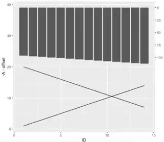
Then all you need is rev() in geom_col:

geom_col(aes(x = ID, y = rev(-(190-C)/5)))

Let me know if I've still misunderstood what you're looking for.


Original answer

If you want the bars to move down, they have to contain negative values.

Some of this you may already know.

When you add a second y-axis, it's really just a visual; none of your traces are actually following that axis. The 'trick' is the transformation.

If you want the bars to be above the lines as if there is a zero axis for the bars at the top and a zero axis on the bottom for the lines, some things need to change.

  1. bars need to be negative to go down; that drives everything else

  2. the lines need to be less than the values in the bars without losing the aspect ratio (for lack of a better term)

The easiest way to transform the y in the lines to ensure that the bars do not overlap is to offset both traces by negating the current y and offset that by the largest value that appears in the bar trace.

First, find that offset value:

offset = max((190 - Mydata$C)/5)  # how much to offset the other traces

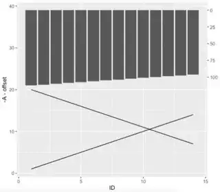
Check out what we've got so far, with the y's negated and offset:

offset = max((190 - Mydata$C)/5)
ggplot(data = Mydata) + 
  geom_line(aes(x = ID, y = -A - offset)) +
  geom_line(aes(x = ID, y = -B - offset)) +
  geom_col(aes(x = ID, y = -(190-C)/5))

enter image description here

Next, we need to fix both y-axes. Starting with the y-axis on the left, we need this to look like we didn't negate everything. To do that, we need to find the actual negative value that reflects the perceived zero on the y-axis.

Since column B has the larger value (at 20), I used it to determine where the bottom is. Additionally, since the lowest value between A and B is 1, we're going to add -1 to get that zero line. To find the bottom or where we want the zero-line, find the minimum of negated column B - offset minus 1.

btm = min(-1 * Mydata$B - offset - 1) # because the min value is 1

Check out where we're at so far:

btm = min(-1 * Mydata$B - offset - 1) # because the min value of B is 1
offset = max((190 - Mydata$C)/5)
ggplot(data = Mydata) + 
  geom_line(aes(x = ID, y = -A - offset)) +
  geom_line(aes(x = ID, y = -B - offset)) +
  geom_col(aes(x = ID, y = -(190-C)/5)) +
  scale_y_continuous(breaks = seq(btm, by = 10, length.out = 5), 
                     labels = seq(0, 40, 10))

enter image description here

It's time to add the secondary y-axis.

I flipped the sign on the transformation and then looked at where the numbers landed on the secondary y.

btm = min(-1 * Mydata$B - offset - 1) # because the min value of B is 1
offset = max((190 - Mydata$C)/5)
ggplot(data = Mydata) + 
  geom_line(aes(x = ID, y = -A - offset)) + 
  geom_line(aes(x = ID, y = -B - offset)) +
  geom_col(aes(x = ID, y = -(190-C)/5)) +
  scale_y_continuous(breaks = seq(btm, by = 10, length.out = 5), 
                     labels = seq(0, 40, 10),
                     sec.axis = sec_axis(~190 + . * 5))  # changed sign!

enter image description here

Next, we need to determine where our perceived zero is at the top on the secondary y-axis. To calculate this, we need the max of column C, when calculated as it is in the plot and transformed as the axis is transformed, then altered by the largest value of C, The largest value of B, and the offset already calculated.

top = max(((190 + (-(190 - Mydata$C)/5) * 5) + offset - btm + max(Mydata$B)))

Note that in this call to create this value:

The Y in the bars is:

-(190 - Mydata$C)/5

The Y in the bars transformed by the sec axis is:

190 + (-(190 - Mydata$C)/5) * 5

And there you go! You can adjust the labels now that it's ready however you see fit. (I'm guessing you have something in mind.)

btm = min(-1 * Mydata$B - offset - 1) # because the min value of B is 1
offset = max((190 - Mydata$C)/5)
top = max(((190 + (-(190 - Mydata$C)/5) * 5) + offset - btm + max(Mydata$B))) 

ggplot(data = Mydata) + 
  geom_line(aes(x = ID, y = -A - offset)) +
  geom_line(aes(x = ID, y = -B - offset)) +
  geom_col(aes(x = ID, y = -(190-C)/5)) +
  scale_y_continuous(breaks = seq(btm, by = 10, length.out = 5), 
                     labels = seq(0, 40, 10),
                     sec.axis = sec_axis(~190 + . * 5,  # changed sign!
                                         breaks = seq(top - 20 * 4, top, by = 20),
                                         labels = seq(100, 0, by = -25)))

enter image description here

Kat
  • 15,669
  • 3
  • 18
  • 51
  • Hi Kat, thank you very much for the detailed answer. In my data, "C" increases from 100 to 113, however, your figure shows that "C" is decreasing. Could you please check? Also, could you include how to add a legend for the figure? Thanks. – Yang Yang Sep 25 '22 at 03:00
  • I thought you wanted the bars reversed, so that appearance is intentional. Your question showed the 2nd y-axis decreasing and you stated you wanted the bars reversed. Can you explain what you are looking for? As far as a legend, What do you want in it? It's usually a key, like red means this and blue means that. Right now, everything is rather faceless. To add a legend entry for each `geom`, within the aes for each, add `color = "What you want to see in the legend"` This will add color, though. (For bars, use fill. It looks better than color.) – Kat Sep 25 '22 at 03:58
  • Hi Kat, thank you for your explanation. In my data, "C" starts at 100 and then increases to 113 (when "ID"=1, "C"=100). However, your figure shows that "C" starts at 113, and then decreases to 100 (when "ID"=1, "C"= 113). This does not match the data. For example, as the second y-axis increases from 0 to 100 (from top to bottom), the length of the barplot for "C" should become larger along the x-axis as well. Could you please check? Thank you. – Yang Yang Sep 25 '22 at 18:19
  • I think I understand what you mean. Check out my updated answer. If I still misunderstood, let me know. – Kat Sep 26 '22 at 01:00
  • Hi Kat, thank you for your reply. I believe the plot on the left makes more sense as "C" increases from 100 to 113 in the original data. – Yang Yang Sep 26 '22 at 14:48
1

You might try base graphics, where this is quite straightforward.

## base plane with the lines
par(mar=c(5, 4, 4, 3) + .1)
matplot(Mydata[2:3], type='o', pch=c(0, 4), col=1, lty=1,
        ylim=c(min(Mydata[2:3]), max(Mydata[2:3]) + 10),
        yaxt='n', xlim=c(.5, nrow(Mydata) + .5),
        xlab='xlab', ylab='ylab', main='main')
axis(2, axTicks(2), axTicks(2), tck=.02, las=2)  ## make nicer west axis
ymax <- par()$usr[4]  ## store north coord
xseq <- seq_len(nrow(Mydata))  ## store x axis
fac <- 1/15  ## define reduction factor for upper barplot
## upper barplot using `rect`
rect(xseq - .25, ymax, xseq + .25, ymax - Mydata$C*fac, 
     col='#139FFF', border=NA)
axis(3, xseq, tck=.02, labels=FALSE)  ## north x axis
ats <- seq.int(0, max(Mydata$C), by=50)  ## east ats
axis(4, y - ats*fac, ats, tck=.02, las=2)  ## east axis
## legend
legend('bottomright', legend=c('foo', 'bar', 'baz'), lty=1,
       lwd=c(1, 1, 5), pch=c(0, 4, NA), col=c(1, 1, '#139FFF'),
       bty='n', horiz=TRUE)

enter image description here


Data:

Mydata <- structure(list(ID = 1:14, A = 1:14, B = 20:7, C = 100:113), class = "data.frame", row.names = c(NA, 
-14L))
jay.sf
  • 60,139
  • 8
  • 53
  • 110
  • Hi Jay, thanks a lot for your help. The figure looks amazing! Is it possible to plot the figure using ggplot? I am curious to know why my codes do not work as expected. Thanks! – Yang Yang Sep 25 '22 at 18:27
  • 1
    @YangYang I have no clue, I don't use it. Obviously the graph wasn't made using that package either, probably not even in R. – jay.sf Sep 25 '22 at 18:35
1

Hadley Wickham answers here (https://stackoverflow.com/a/3101876/19594737) that seperate y axis scales aren't supported by ggplot, because he believes they're fundamentally flawed.

That said, using the gridExtra package, you can get pretty close. Basically you have to make the two charts separately, then attach them in a grid.

Here's the output...

enter image description here

...and here's the input:

library(tidyverse)
library(gridExtra)

Mydata = data.frame(ID=1:14, A=1:14, B=20:7, C=100:113)

lines<-Mydata%>%
  select(-C)%>%
  gather(key=Lines,value=vals,-ID)

bars<-Mydata%>%
  select(ID,C)


b<-ggplot()+
  geom_bar(data=bars,  aes(ID,C),stat="identity",fill='blue')+
  scale_y_reverse()+
  theme_minimal()+
  theme(axis.ticks.x = element_blank(),
        axis.text.x = element_blank())+
  labs(x="",y="Y Axis Label")+
  scale_x_continuous(limits = c(0,15))

l<-ggplot()+
    geom_line(data=lines,aes(ID,vals,color=Lines))+
  theme_minimal()+
  theme(legend.position="bottom")+
  scale_x_continuous(limits = c(0,15))+
  labs(y="Second Y axis Label")

grid.arrange(b,l,nrow=2)