0

I am brand new to coding (thanks for your patience!) and working on a portfolio project for a bootcamp course. I'd like to show headers & copy on the top of my cards with the images aligned underneath. We are using CSS flex. Currently if the text length differs between cards the images end up un-aligned. Here is a screenshot:

Screenshot of uneven card images:

Screenshot of uneven card images

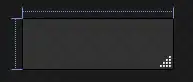
Any suggestions on how I can keep the header + copy at the top but align the images to the bottom of the card?

.card-container {
  display: flex;
  flex-flow: row wrap;
  justify-content: center;
  margin: auto auto 60px auto;
  max-width: 100vw;
  /* 1000px; */
}

.card {
  background-color: #f2f2f2;
  width: 40%;
  margin: 20px;
}

.card a:hover {
  text-decoration: none;
}

.card-copy {
  padding: 0 20px 20px 20px;
}
<section>

  <h2 class="center">Apparel Design</h2>

  <div class="card-container">
    <!--Card 1-->
    <div class="card">
      <a href="">
        <div class="card-copy">
          <h3 class="margin-bottom_five">Design Process</h3>
          <p class="margin-top_zero">Copy here about my design process overview</p>

        </div>
        <img src="https://via.placeholder.com/400">

      </a>
    </div>

    <!--Card 2-->
    <div class="card">
      <a href="">
        <div class="card-copy">
          <h3 class="margin-bottom_five">Professional Work</h3>
          <p class="margin-top_zero">Copy here about my most recent professional work</p>

        </div>
        <img src="https://via.placeholder.com/400">

      </a>
    </div>

    <!--Card 3-->
    <div class="card">
      <a href="">
        <div class="card-copy">
          <h3 class="margin-bottom_five">Exploratory Projects</h3>
          <p class="margin-top_zero">Copy here about my recent stretch projects</p>

        </div>
        <img src="https://via.placeholder.com/400">

      </a>
    </div>
  </div>
</section>
isherwood
  • 58,414
  • 16
  • 114
  • 157
Cobby
  • 1

1 Answers1

0

There are several ways to do this. One is to make your anchors flex containers as well, with direction 'column'. You'd then make them full height and spread their child elements with space-between.

You could also apply flex-fill properties to the paragraph to make it expand to fill available space.

See https://css-tricks.com/snippets/css/a-guide-to-flexbox.

.card-container {
  display: flex;
  flex-flow: row wrap;
  justify-content: center;
  margin: auto auto 60px auto;
  max-width: 100vw; /* 1000px; */
}

.card {
  background-color: #f2f2f2;
  width: 40%;
  margin: 20px;
}

.card a {
  height: 100%;
  display: flex;
  flex-direction: column;
  justify-content: space-between;
}

.card a:hover {
  text-decoration: none;
}

.card-copy {
  padding: 0 20px 20px 20px;
}

.card img {
  max-width: 100%;
}
<section>
  <h2 class="center">Apparel Design</h2>

  <div class="card-container">
    <!--Card 1-->
    <div class="card">
      <a href="">
        <div class="card-copy">
          <h3 class="margin-bottom_five">Design Process</h3>
          <p class="margin-top_zero">Copy here</p>
        </div>

        <img src="https://via.placeholder.com/400">
      </a>
    </div>

    <!--Card 2-->
    <div class="card">
      <a href="">
        <div class="card-copy">
          <h3 class="margin-bottom_five">Professional Work</h3>
          <p class="margin-top_zero">Copy here about my most recent professional work</p>
        </div>

        <img src="https://via.placeholder.com/400">
      </a>
    </div>
  </div>
</section>
isherwood
  • 58,414
  • 16
  • 114
  • 157