The problem
I have some code that creates a map with numerous points, annotated with some stats, on a monthly basis. This worked fine until I updated ggplot2 to 3.3.6, after which the plots have broken and I've not been able to figure out the solution. As far as I can tell, the issue lies in the ggsave() call, but I don't know what has changed and how to fix it.
There are two main issues that have come up. But to illustrate, I will attach below comparison images of the "good" and "bad" versions (click links to see full-size).
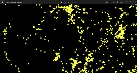
Good points
Bad points
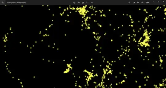
The good version has uniformly coloured points/squares while the latter has strange points coloured irregularly.
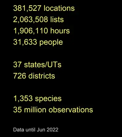
Good text
Bad text
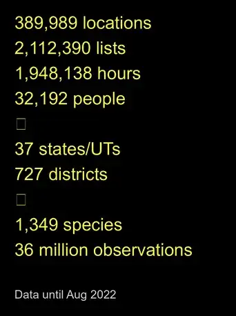
The non-breaking space is formatted properly in the good version, while it appears as a box in the bad version.
Debugging attempts
One potential cause I noted for the irregular points was some updates in the works for the "size" parameter (see this blog post). Such things have happened in the past as well (see this for example). However, this update is claimed to be for the next release, and moreover like I said, I have a hunch the issue I'm facing has something to do with ggsave(). And regardless, I already tried tweaking the size and stroke of the geom_point() but haven't been able to recover the old version properly.
The RStudio plot device doesn't indicate any issue with the points, and using the png() method instead of ggsave() to write produces the correct/"good" version.
png(filename = "map_cov_plain.png",
units = "in", width = 8, height = 11, bg = "transparent", res = 300)
print(map_cov_plain)
dev.off()
I tried reverting to ggplot 3.3.5 but this did not fix the issue. Moreover, two others tried the same code on their separate systems, both with ggplot 3.3.6, but only one replicated my issue while the other produced the good version. Nevertheless, the code was certainly working fine until July, only after which I updated several packages and the code broke.
For the record, I have ensured that the issue is not with the data. So, although I have used data until June to illustrate the good version, that same dataset generates the bad maps when the code is run now (i.e., after the updates).
I am hoping someone with a better understanding of the package and the update will be able to figure out what exactly the breaking change was!
Other links
ggsave()doesn't render custom fonts when saving (+workaround)I also posted this as an issue in the
ggplot2repo; apologies for cross-posting, but wasn't sure which one was more appropriate, and felt a SO post might still be useful for future users with the same problem.
Reprex
There are two files required for the reprex below to work:
library(lubridate)
library(tidyverse)
library(glue)

library(magick)
library(scales) # for comma format of numbers
library(grid)


# loading objects
load("reprex.RData")


map_cov_logo <- image_convert(image_read("bcilogo-framed.png"), matte = T)

map_cov_text <- glue::glue("{label_comma()(data_cov$LOCATIONS)} locations
                      {label_comma()(data_cov$LISTS)} lists
                      {label_comma()(data_cov$HOURS)} hours
                      {label_comma()(data_cov$PEOPLE)} people

                      {label_comma()(data_cov$STATES)} states/UTs
                      {label_comma()(data_cov$DISTRICTS)} districts

                      {label_comma()(data_cov$SPECIES)} species
                      {round(data_cov$OBSERVATIONS, 1)} million observations")

map_cov_footer <- glue::glue("Data until September 2022")


### map with annotations of stats and BCI logo ###
map_cov_annot <- ggplot() +
  geom_polygon(data = indiamap, aes(x = long, y = lat, group = group),
               colour = NA, fill = "black")+
  geom_point(data = data_loc, aes(x = LONGITUDE, y = LATITUDE),
             colour = "#fcfa53", size = 0.05, stroke = 0) +
  # scale_x_continuous(expand = c(0,0)) +
  # scale_y_continuous(expand = c(0,0)) +
  theme_bw() +
  theme(axis.line = element_blank(),
        axis.text.x = element_blank(),
        axis.text.y = element_blank(),
        axis.ticks = element_blank(),
        axis.title.x = element_blank(),
        axis.title.y = element_blank(),
        panel.grid.major = element_blank(),
        panel.grid.minor = element_blank(),
        panel.border = element_blank(),
        # panel.border = element_blank(),
        plot.background = element_rect(fill = "black", colour = NA),
        panel.background = element_rect(fill = "black", colour = NA),
        plot.title = element_text(hjust = 0.5)) +
  coord_cartesian(clip = "off") +
  theme(plot.margin = unit(c(2,2,0,23), "lines")) +
  annotation_raster(map_cov_logo,
                    ymin = 4.5, ymax = 6.5,
                    xmin = 46.5, xmax = 53.1) +
  annotation_custom(textGrob(label = map_cov_text,
                             hjust = 0,
                             gp = gpar(col = "#FCFA53", cex = 1.5)),
                    ymin = 19, ymax = 31,
                    xmin = 40, xmax = 53)  +
  annotation_custom(textGrob(label = map_cov_footer,
                             hjust = 0,
                             gp = gpar(col = "#D2D5DA", cex = 1.0)),
                    ymin = 15, ymax = 16,
                    xmin = 40, xmax = 53)

ggsave(map_cov_annot, file = "map_cov_annot.png", device = "png",
       units = "in", width = 13, height = 9, bg = "transparent", dpi = 300)


### plain map without annotations ###
map_cov_plain <- ggplot() +
  geom_polygon(data = indiamap, aes(x = long, y = lat, group = group),
               colour = NA, fill = "black")+
  geom_point(data = data_loc, aes(x = LONGITUDE, y = LATITUDE),
             colour = "#fcfa53", size = 0.05, stroke = 0.1) +
  # scale_x_continuous(expand = c(0,0)) +
  # scale_y_continuous(expand = c(0,0)) +
  theme_bw() +
  theme(axis.line = element_blank(),
        axis.text.x = element_blank(),
        axis.text.y = element_blank(),
        axis.ticks = element_blank(),
        axis.title.x = element_blank(),
        axis.title.y = element_blank(),
        panel.grid.major = element_blank(),
        panel.grid.minor = element_blank(),
        panel.border = element_blank(),
        plot.margin = unit(c(0, 0, 0, 0), "cm"),
        # panel.border = element_blank(),
        plot.background = element_rect(fill = "black", colour = NA),
        panel.background = element_rect(fill = "black", colour = NA),
        plot.title = element_text(hjust = 0.5)) +
  coord_map()

ggsave(map_cov_plain, file = "map_cov_plain.png", device = "png",
       units = "in", width = 8, height = 11, bg = "transparent", dpi = 300)


