0

What is the command to display the chart in https://yahooquery.dpguthrie.com/guide/ticker/historical/

image

I tried this code

import pandas as pd
import matplotlib.pyplot as plt
from yahooquery import Ticker

tickers = Ticker('aapl nflx', asynchronous=True)
df = tickers.history()
df["adjclose"].plot()
plt.xticks(rotation=90)
plt.show()

But it is just showing one series in the chart, like this:

image

How can I create aapl and nflx as two series on the one chart?

2 Answers2

1

The symbol and date are indexes into the dataframe. By plotting the whole dataframe, you are getting both series plotted sequentially.

Here's one way to plot each ticker:

import pandas as pd
import matplotlib.pyplot as plt
from yahooquery import Ticker

tickers = Ticker('aapl nflx', asynchronous=True)
df = tickers.history()
df.query('symbol == "aapl"')["adjclose"].plot()
df.query('symbol == "nflx"')["adjclose"].plot()
plt.xticks(rotation=90)
plt.show()

This uses query to extract each symbol.

craigb
  • 1,081
  • 1
  • 9
  • That's a great way of separating the symbols out. I did know plot() could be called twice to add multiple lines on one chart. I also presume it is performs reasonably well, as the tickers is fetched once over the network, then all the query methods are done locally. To make it more generic could the query and plot be put in a loop, for 5 or so stocks? – Paul Harris Oct 23 '22 at 20:00
1

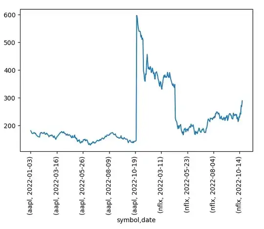
First, get your df into a shape that is easier to digest for plotting methods, using df.pivot:

import pandas as pd
from yahooquery import Ticker

tickers = Ticker('aapl nflx', asynchronous=True)
df = tickers.history()

df_pivot = df.reset_index().pivot(index='date',
                                  columns='symbol', values='adjclose')

symbol            aapl        nflx
date                              
2022-01-03  181.259918  597.369995
2022-01-04  178.959457  591.150024
2022-01-05  174.199142  567.520020
2022-01-06  171.291199  553.289978
2022-01-07  171.460495  541.059998

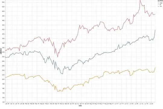
Next, have a look at sns.lineplot:

import matplotlib.pyplot as plt
import matplotlib.dates as md
import matplotlib.ticker as mtick

import seaborn as sns
sns.set_theme()

fig, ax = plt.subplots(figsize=(10,6))

ax = sns.lineplot(data=df_pivot, palette=['r','b'], dashes=False)

# adjust axes for readability
ax.xaxis.set_major_locator(md.WeekdayLocator(byweekday = 1))
ax.set_xlim(df_pivot.index.min(), df_pivot.index.max())
ax.yaxis.set_major_locator(mtick.MultipleLocator(50))

plt.xticks(rotation=90)
plt.tight_layout()
plt.show()

Result:

lineplots

Incidentally, if you want to compare both stocks, it may make more sense to plot the percentages. E.g.:

df_pivot_perc = df_pivot.div(df_pivot.iloc[0,:]).mul(100)
fig, ax = plt.subplots(figsize=(10,6))

ax = sns.lineplot(data=df_pivot_perc, palette=['r','b'], dashes=False)
ax.xaxis.set_major_locator(md.WeekdayLocator(byweekday = 1))
ax.set_xlim(df_pivot.index.min(), df_pivot.index.max())

fmt = '%.0f%%'
yticks = mtick.FormatStrFormatter(fmt)
ax.yaxis.set_major_formatter(yticks)
ax.yaxis.set_major_locator(mtick.MultipleLocator(10))

plt.xticks(rotation=90)
plt.tight_layout()
plt.show()

Result:

lineplots percentages

ouroboros1
  • 9,113
  • 3
  • 7
  • 26
  • Great idea to use `pivot()` which I did not know about, but seems a very intuitive function. I ran it on "" and got the error `ValueError: Index contains duplicate entries, cannot reshape` and it turns out there are some duplicate dates returned by yahoo. I added a `df = df[~df.index.duplicated(keep='first')]` as suggested [here](https://stackoverflow.com/a/34297689/11684064) and that fixed it! – Paul Harris Oct 23 '22 at 20:16
  • Also converting to a percentage was just what I needed, so thanks for adding that. I did also come across this solution from the maker of yahooquery: `df.reset_index().set_index('date').groupby('symbol')['adjclose'].plot(legend=True, xlabel='Date', ylabel='adjclose')`. It returns dataframegroup object and I just could not figure out how to reset each line in that group to be a percentage. I also tried resetting the percentage of the multi indexed dataframe before transformation, but it seems this is quite complicated to do. – Paul Harris Oct 23 '22 at 20:20
  • You're welcome. You write: 'I ran it on "" and go the error', what do you mean by the double quotes? Are you getting that error on this particular request through `Ticker`? – ouroboros1 Oct 23 '22 at 20:23
  • I ran it on "^AXJO AKE.AX", that's what I meant to say... – Paul Harris Oct 23 '22 at 20:29
  • That's a disturbing error to occur through `Ticker`. It gives the last date for `AKE.AX` twice! With same prices, but with different volumes. I've just checked: interestingly, you don't get this error with `import yfinance as yf` and then `ake = yf.Ticker("AKE.AX")` and `hist = ake.history(period="ytd")`. You'll get just 1 entry for `2022-10-21` with the same volume as given through `Ticker` in the penultimate row (so, I suppose `df[~df.index.duplicated(keep='first')]` is the correct fix here). Very curious though that this should happen. – ouroboros1 Oct 23 '22 at 20:37