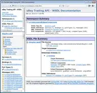
I have the following DF that has hypothetical data on sales of various items in supermarkets across different towns.
Town <- c("Town A","Town B", "Town C")
Vegetables <- c(20, 30, 40)
Fruits <- c(40, 20,30)
Toiletries <- c(30, 20,40)
Given that the real data frame will have 50 as the highest value, I'd like to color code the cells in the data frame with different colors. e.g 10="red", 20="green", 30="blue", 40="yellow" and 50="purple".
The data frame aims to have a similar look as a correlation matrix (see picture) but with the above custom colours.

The table will be rendered in a shiny dashboard.
Please point me to a way how to achieve this.