This answer proposes solution that is not very related to SVG, instead it uses more general approach where perspective transforms from CSS are applied exclusively to HTML elements - some of those may be or may contain SVG images.
First some trivia:
- SVG has no third dimension ("z-axis"), so dimensional transforms or perspective are not possible there, unless you do all the maths yourself. It hasn't even
z-index and layers are just denoted by the source (DOM) order of appearance. SVG in its nature really is just a "flat" two dimensional vector graphic.
- SVG maps many of CSS style properties to its presentational attributes, but since in SVG there is no
rotate3d, translate3d, rotatex() etc, they have no effect.
- CSS in HTML has those.
- In your snippet you are applying CSS transform to a HTML node that is by definition just a rectangle on a flat plane (like everything in the page). That node in your case is a SVG element, but it could be a
<div> with background image or just HTML <img> - in all cases those are just "viewport" rectangles showing (SVG) content within infinite (possibly transformed) plane.
- So you cannot "pop something out of it"; you can only manipulate "planes" constituted by HTML elements.
As I understand it, your use-case is to display marker icons like "sprites" that always face a camera above some tilted image (say a "map"). From your questions is not clear whether distant icons (those farther from the camera) should be smaller and overlapped by closer ones (what feels more natural, but contradicts that "un-inheriting" stance) or be same size each, with undefined overlapping strategy. Let's assume the former.
In "HTML" world you can nest transformed elements and let the children move with parent (with help of transform-style: preserve-3d;) to get them to desired place, and then apply negated transform(s) to their children to make those camera-facing again.
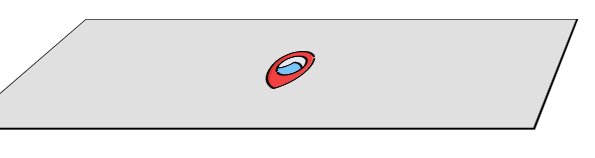
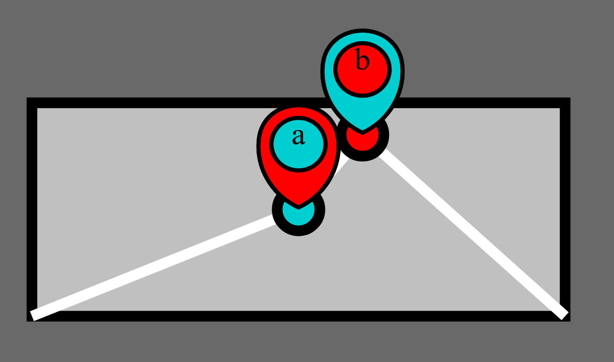
Let's start with baseline pure SVG flat image - "map" overview with two "markers" without transforms:
<svg xmlns='http://www.w3.org/2000/svg' viewBox="0 0 800 400"
stroke-width="10" stroke="black" fill="none">
<g transform="translate(100 100)">
<rect width="500" height="200" fill="silver"></rect>
<path d="M 0 200 L 250 100 L 310 30 L 500 200" stroke="white"></path>
<g transform="translate(250 100)">
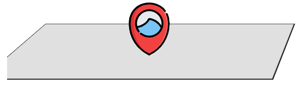
<circle r="20" fill="darkturquoise"></circle>
<image width="80" height="100" transform="translate(-40 -100)" preserveAspectRatio="none" href="data:image/svg+xml;charset=utf-8,%3Csvg xmlns='http://www.w3.org/2000/svg' viewBox='-200 -200 400 516' stroke='black' stroke-width='20'%3E%3Cpath fill='red' d='M187-14c-15-232-359-232-374 0l-1 23c0 131 77 244 188 297A329 329 0 0 0 187-14z'/%3E%3Ccircle fill='darkturquoise' r='127'/%3E%3Ctext font-size='150' text-anchor='middle' stroke='none' %3Ea%3C/text%3E%3C/svg%3E"
></image>
</g>
<g transform="translate(310 30)">
<circle r="20" fill="red"></circle>
<image width="80" height="100" transform="translate(-40 -100)" preserveAspectRatio="none" href="data:image/svg+xml;charset=utf-8,%3Csvg xmlns='http://www.w3.org/2000/svg' viewBox='-200 -200 400 516' stroke='black' stroke-width='20'%3E%3Cpath fill='darkturquoise' d='M187-14c-15-232-359-232-374 0l-1 23c0 131 77 244 188 297A329 329 0 0 0 187-14z'/%3E%3Ccircle fill='red' r='127'/%3E%3Ctext font-size='150' text-anchor='middle' stroke='none' %3Eb%3C/text%3E%3C/svg%3E"
></image>
</g>
</g>
</svg>
(I've extracted image icons to simplified dataURIs and changed positioning to group transforms for better reusability and independence.)
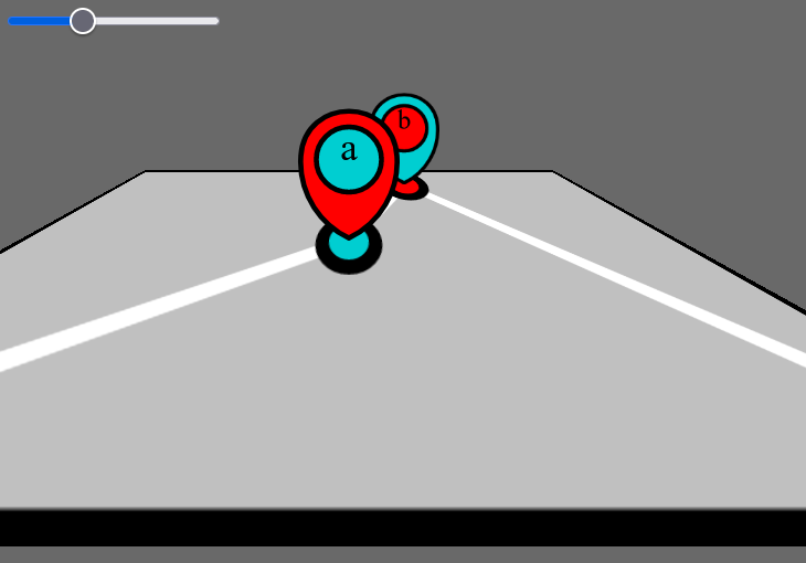
Now let's introduce the slope and icon "sprites".
- SVG is now without icons and icons are separate
<img>.
- Each
<img> is positioned and transformed to corresponding location on the map. Custom properties here help with reusability, but static values could be hardcoded as well.
- Custom property
--slope and calc also ease "automation" and allows alterations initiated from the range input.
.scene {
 position: relative;
 width: 500px;
 height: 200px;
 margin: 50px 10px;
 transform-origin: center center;
 transform-style: preserve-3d; /* this is important */
 --rotx-positive: calc( var(--slope, 30) * 1deg );
 --rotx-negative: calc( var(--rotx-positive) * -1 );
 transform:
  perspective(5em)
  /* slope: */
  rotateX(var(--rotx-positive));
}
img {
 position: absolute;
 top: calc(1px * var(--y));
 left: calc(1px * var(--x));
 transform:
  /* to have the bottom center peak touching the POI: */
  translate(-50%, -100%)
  /* negate the slope: */
  rotatex( var(--rotx-negative) );
 transform-origin: bottom center;
}
/*
 Unrelated hotfix: when the scene is tilted perpendicularly to camera (slope is 90° and) it is invisible, but *obstructs* whole viewport (or something), so there is no way to return back.
 Presumably because the camera happents to be "inside" it (?)  - its bottom edge is behind the camera.
*/
.scene {
 pointer-events: none;
}
Slope:
<input type="range" value="30" min="0" max="90" value="0"
 oninput="s.style.setProperty('--slope', this.value);o.value=this.value">
 <output id="o">30</output>°.

<div class="scene" id="s">
 <svg xmlns='http://www.w3.org/2000/svg' viewBox="0 0 500 200"
  stroke-width="10" stroke="black" fill="none">
  <rect width="500" height="200" fill="silver"></rect>
  <path d="M 0 200 L 250 100 L 310 30 L 500 200" stroke="white"></path>
  <g transform="translate(250 100)">
   <circle r="20" fill="darkturquoise"></circle>
  </g>
  <g transform="translate(310 30)">
   <circle r="20" fill="red"></circle>
  </g>
 </svg>
 <img style="--x: 250; --y: 100;" width="80" height="100" src="data:image/svg+xml;charset=utf-8,%3Csvg xmlns='http://www.w3.org/2000/svg' viewBox='-200 -200 400 516' stroke='black' stroke-width='20'%3E%3Cpath fill='red' d='M187-14c-15-232-359-232-374 0l-1 23c0 131 77 244 188 297A329 329 0 0 0 187-14z'/%3E%3Ccircle fill='darkturquoise' r='127'/%3E%3Ctext font-size='150' text-anchor='middle' stroke='none' %3Ea%3C/text%3E%3C/svg%3E">
 <img style="--x: 310; --y: 30;" width="80" height="100" src="data:image/svg+xml;charset=utf-8,%3Csvg xmlns='http://www.w3.org/2000/svg' viewBox='-200 -200 400 516' stroke='black' stroke-width='20'%3E%3Cpath fill='darkturquoise' d='M187-14c-15-232-359-232-374 0l-1 23c0 131 77 244 188 297A329 329 0 0 0 187-14z'/%3E%3Ccircle fill='red' r='127'/%3E%3Ctext font-size='150' text-anchor='middle' stroke='none' %3Eb%3C/text%3E%3C/svg%3E">
</div>
Should render something like:

For single 3D transform this fits; for multiple simultaneous transforms either more maths should be involved or more nested wrappers for transformations. See example of nested transform layers producing sprite-like "dots" in 3d space in pen using this technique.