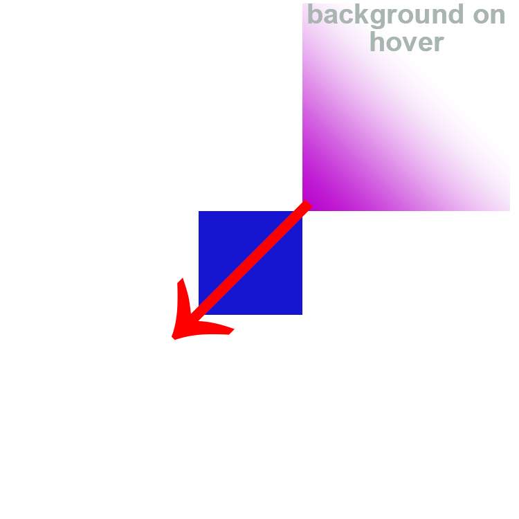
If you really want the pink to start at the top right and move to the bottom left you could use before and after pseudo elements, the before with just the color, the after also with the linear-gradient.
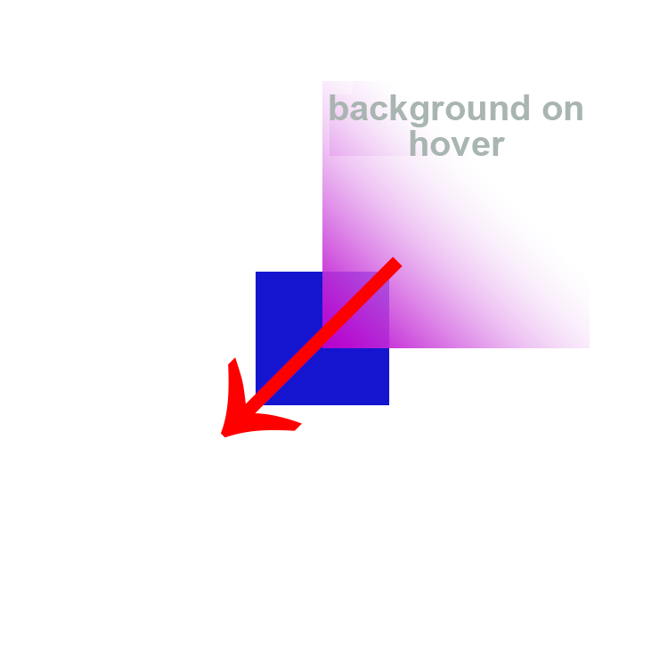
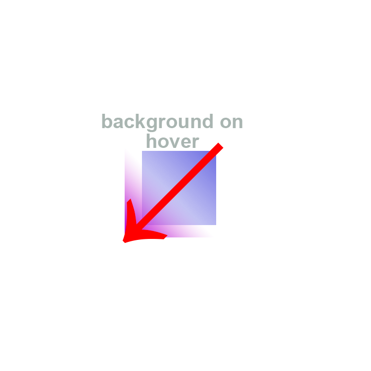
The after pseudo element moves diagonally across to the bottom left on hover of the main element.
.boxstyle {
  width: 150px;
  height: 150px;
  position: relative;
  overflow: hidden;
}

.boxstyle::before,
.boxstyle::after {
  content: '';
  position: absolute;
  z-index: -1;
}

.boxstyle::before {
  background-color: rgba(0, 69, 255, 1);
  width: 100%;
  height: 100%;
}

.boxstyle::after {
  background-image: linear-gradient(to left bottom, rgba(189, 41, 242, 0) 0%, rgba(189, 41, 242, 0) 40%, rgba(189, 41, 242, 0.9) 100%);
  bottom: 100%;
  left: 100%;
  transition: all 1s linear;
  width: 200%;
  height: 200%;
}

.boxstyle:hover::after {
  bottom: -10%;
  left: -10%;
}
<div class="boxstyle">hover it</div>
Old comment: This fits your verbal description of the effect desired, but I suspect it isn't exactly what you intended - did you want it more 'blendy' and subtle, becoming the final picture only at the very end?
UPDATE: Since seeing your images this snippet uses an after that has twice the dimensions of the main element so spreading out the colors more. It 'settles' on a hover a bit beyond the bottom left.