1

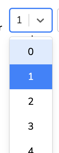
is there a way to change the default hover background color of light blue for options for react select https://www.npmjs.com/package/react-select? Or is it also not possible for the reasons described in this other thread Change Select List Option background colour on hover

react select options hover

  const styles = {
    control: (base: {}, state: {}) => ({
      ...base,
      background: "#1b1d25"
    }),
    menu: (base: {}) => ({
      ...base,
      borderRadius: 0,
      marginTop: 0,
      background: "#1b1d25",
      "&:hover": {
        backgroundColor: "red",
      },
    }),
    menuList: (base: {}) => ({
      ...base,
      padding: 0,
      backgroundColor: "#1b1d25",
      "&:hover": {
        backgroundColor: "#1b1d25"
      },
    }),
  };


  <Select
          options={options}
          value={{ label: currentAnswer, value: currentAnswer }}
          onChange={(e) => handleChange(e.value)}
          styles={styles}
          theme={(theme) => ({
            ...theme,
            borderRadius: 0,
            colors: {
              ...theme.colors,
            },
          })}
        />
user3226932
  • 2,042
  • 6
  • 39
  • 76
  • they have provided the proper docs for it [here](https://react-select.com/home#custom-styles) or you can just use default html and css select for more flexible styling. – UNRIVALLEDKING Nov 20 '22 at 04:20

2 Answers2

1

in React select you can style individual components with custom css using the styles prop. to change the default hover background color of light blue for options to another color you can achieve it like this :

const customStyles = {
    option: (styles, { isFocused, isSelected }) => {
      return {
        ...styles,
        backgroundColor: isSelected ? "blue" : isFocused ? "green" : undefined
      };
    }
  };

this a sample example using codeSandbox

monim
  • 3,641
  • 2
  • 10
  • 25
0

You can include the className and classNamePrefix to the react-select like,

  <Select
    options={options}
    className="select-wrapper"
    classNamePrefix="select"
  />

-> Here className will include the class name for the select box .

-> classNamePrefix will add the name given as prefix to all the classNames under the select.

So you can add css like,

.select-wrapper .select__option:hover {
  background-color: red;
  opacity: 0.8;
}

.select-wrapper .select__option--is-selected {
  background-color: red;
}

Working Example:

Edit romantic-ishizaka-qh8css

Maniraj Murugan
  • 8,868
  • 20
  • 67
  • 116