When I run your code, I don't get a legend for either plot. However, I can at least answer that yes—you could move the title to the top in a roundabout way. However, since your xaxis title is the legend title, you could just make the legend title blank.
If the plot is narrow and the data is long, you could achieve a stacked legend, but it will change with the width of the viewing area. (You could control the size of the viewing area.)
Alternatively, it looks like Plotly added a new feature in the last few months, but Plotly for R isn't using the latest version of Plotly. You could change the dependency and control the width that way (stacking, all that jazz).
However, whether you control the plot viewing size or the legend entry size, it won't split the legends.
One legend...I know there are issues with subplot in Plotly and Shiny. However, it works for me here.
Q1
Since the xaxis is the legend title, you could erase the legend title.
Since I am not getting a legend at all, this also turns it on.
fixLeg <- function(plt){
  plt <- plotly_build(plt)
  nms <- plt$x$layout$xaxis$ticktext
  plt$x$layout$legend$title$text <- ""
  map(1:length(plt$x$data),
      function(k) {
        plt$x$data[[k]]$name <<- nms[[k]]
        plt$x$data[[k]]$showlegend <<- TRUE
      })
  plt
}
I modified the call, to add showlegend, modify y in legend and add the call for fixLeg().
plots <- lapply(Xs, function(x){
  renderPlotly({
    p <-test %>% ggplot(aes_string(x = "DrugSex", y = x)) +
      geom_point(aes(color = Drug, shape = DrugSex))+
      labs(x = paste0("DrugSex"), y = x) +
      scale_shape_manual(values=1:length(unique(test$DrugSex))) +
      guides(colour = guide_legend(title.position="top", title.hjust = 0.5),
             shape = guide_legend(title.position="top", title.hjust = 0.5)) +
      theme(legend.position = 'bottom',
            legend.key=element_blank()) #transparent legend panel
    ggplotly(p) %>% fixLeg() %>%     # <---- add legend/remove legend title
      layout(showlegend = T,
             legend = list(orientation = 'h', xanchor = 'center',
                           x = .5, y = -.3))   # <---- changed y
  })
})

Q2
A stacked legend, whether it originated as one legend or many legends. For this, I'm going to change the Plotly dependency to the latest version of Plotly JS, I'll use a function to do that. This function will allow the parameters of entrywidth and entrywidthmode to work in R.
fixLeg2 <- function(plt){
  plt <- plotly_build(plt)
  # changes to dependency so that entrywidth/entrywidthmode work
  plt$dependencies[[5]]$src$href = "https://cdn.plot.ly"
  plt$dependencies[[5]]$script = "plotly-2.16.1.min.js"
  plt$dependencies[[5]]$local = FALSE
  plt$dependencies[[5]]$package = NULL

  # changes to object
  nms <- plt$x$layout$xaxis$ticktext
  plt$x$layout$legend$title$text <- ""
  map(1:length(plt$x$data),
      function(k) {
        plt$x$data[[k]]$name <<- nms[[k]]
        plt$x$data[[k]]$legendgroup <<- nms[[k]]
        plt$x$data[[k]]$showlegend <<- TRUE
      })
  plt
}
To make sure that Shiny goes to get the CDN from the web, you'll add something else to the user interface (ui). This addition requires the use of htmltools. The Shiny app may work without this addition. However, it will be intermittent at best.
library(shiny)
library(dplyr)
library(ggplot2)
library(plotly)
library(htmltools)

newDep <- htmlDependency(name = "plotly-latest",
                         version = "2.16.1",
                         src = list(href = "https://cdn.plot.ly"),
                         script = "plotly-2.16.1.min.js")
ui <- fluidPage(
  createWebDependency(newDep),
  uiOutput("allplots")
)
Then with the plots, add an entrywidth. Additionally, change the function call for fixLeg to fixLeg2.
By the way entrywidth is the width in pixels of the text component of a legend entry. The symbol, dot, line, or colored part is item in the legend. You can control that size, too. I'm pretty sure that control is fairly new, as well.
plots <- lapply(Xs, function(x){
  renderPlotly({
    p <-test %>% ggplot(aes_string(x = "DrugSex", y = x)) +
      geom_point(aes(color = Drug, shape = DrugSex))+
      labs(x = paste0("DrugSex"), y = x) +
      scale_shape_manual(values=1:length(unique(test$DrugSex))) +
      guides(colour = guide_legend(title.position="top", title.hjust = 0.5),
             shape = guide_legend(title.position="top", title.hjust = 0.5)) +
      theme(legend.position = 'bottom',
            legend.key=element_blank() #transparent legend panel
      )
    ggplotly(p) %>% fixLeg2() %>%     # <------- I'm new
      layout(showlegend = T,
             legend = list(orientation = 'h', xanchor = 'center',
                           x = .5, y = -.3, entrywidth = 100)) # <- entry width
  })
})
This is how it's changed:

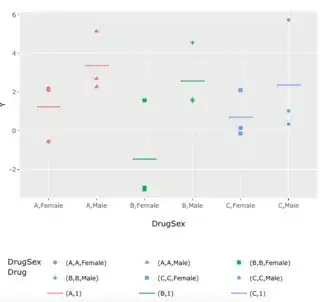
In your question, you had specifically asked about when there is more than one legend, but your plots in this question only have one. I've taken this plot from a previous question. (Where df is extremely similar to test in this question.)
p <- df %>% ggplot(aes(x = DrugSex, y = Y)) +
  geom_point(aes(color = Drug, shape = DrugSex)) +
  geom_segment(data = df_means, aes(x=x-0.25, xend=x+0.25, y=Mean, yend=Mean, color=
                                      color),inherit.aes = F, show.legend = F)+
  theme(legend.position = 'bottom',
        legend.key=element_blank() #transparent legend panel
  )
I have to change the call to change the dependencies a bit, because this plot isn't in Shiny. Really, I've just added one new line (src$file = NULL).
fixLeg3 <- function(plt) {
  # changes to dependency so that entrywidth/entrywidthmode work
  plt$dependencies[[5]]$src$file = NULL
  plt$dependencies[[5]]$src$href = "https://cdn.plot.ly"
  plt$dependencies[[5]]$script = "plotly-2.16.1.min.js"
  plt$dependencies[[5]]$local = FALSE
  plt$dependencies[[5]]$package = NULL
  plt
}
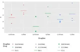
I've added a new parameter entrywidthmode. This is default pixels. However you can use fraction as in a fraction of the plot. If I set it to .3 (so there's still room for the title), No matter how big I make this plot, only three legend entries are going on a single line.
ggplotly(p) %>% fixLeg3() %>%
  layout(legend = list(orientation = "h",
                       y = -.3, entrywidthmode = "fraction",
                       entrywidth = .3))
Q3
When it comes to consolidating the legend, Plotly's subplot can do it for you. However, it won't do it without intervention. That's because you can select a legend item it hides or shows in the plot. You can use legendgroups to get around it. This will still allow entry selection by clicking on a legend item, but it will affect both plots.
To use legend grouping and have a consolidated legend, you have to designate the legend group of each trace, and you have to hide all but one trace within each legend group from the legend. Here's a simpler example. (By the way, hiding it in ggplot does nothing!)
pp1 <- pp2 <- ggplot(test,  # first plot, keep the legend
              aes(x = Drug, y = Y, color = Drug, shape = DrugSex)) +
  geom_point()

p2 <- ggplotly(pp2) # hide the legend in this plot
invisible(lapply(1:length(p2$x$data),
                 function(k) {
                   p2$x$data[[k]]$showlegend <<- FALSE # change in global
                 }))

subplot(ggplotly(pp1), p2) %>%  # put it together
  layout(showlegend = T,
         legend = list(traceorder = "grouped", # <- make sure this is called first!!
                       orientation = "h", x = .5, xanchor = "center",
                       valign = "bottom"))

In Shiny, don't use renderPlotly to show a subplot. Just use renderUI and call subplot like you would in an R script.
If you find that a combined legend won't orient horizontally, make sure that traceorder is called before orientation. It shouldn't matter, but it does.


legend title"` or if you want more space, `"x-axis
legend title"` You can use inline css styling here, as well (i.e., color, boldness, size, etc.). To change the legend title position with JS, you have to modify the SVG significantly. It would lose the ability to dynamically change with the plot size, too. – Kat Dec 16 '22 at 20:34