I am very new to HTML and CSS and have been stuck on this problem for a while. Ideally I'm looking for a solution that is CSS only, but I can try a JavaScript solution if I need to. My code is probably very badly written so please forgive me.
I am trying to create a rotating banner animation effect for my personal website. I have a container that has a background image of a colour wheel, and I have some divs within this container that hold my logo and a subtitle.
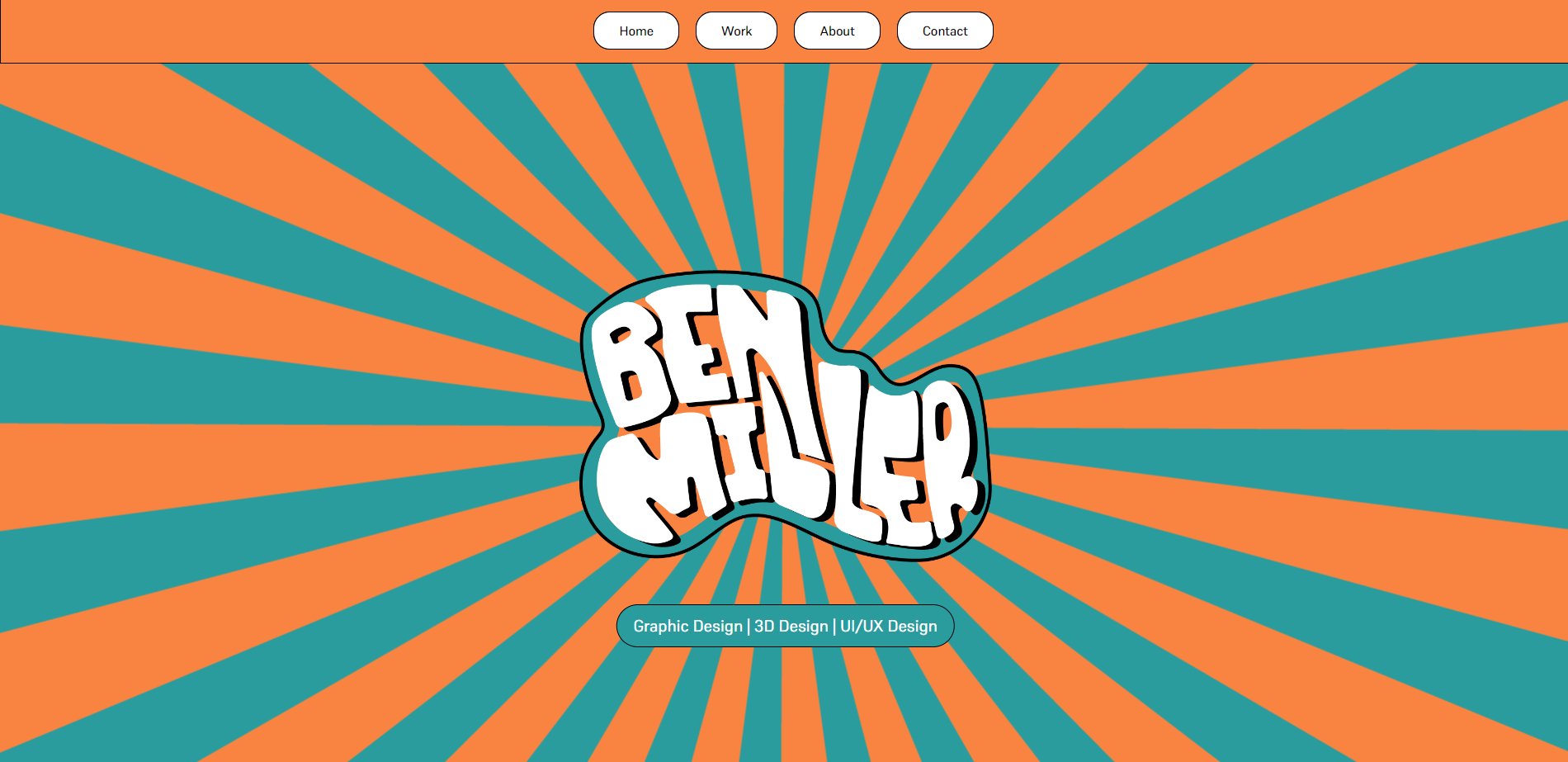
The colour wheel image is just a large circle. I am looking to rotate this image without it rotating the whole container.
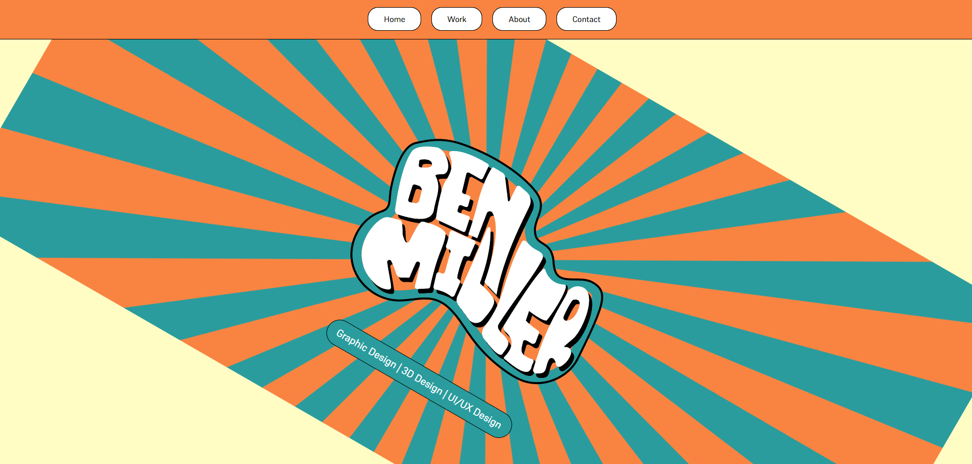
I have tried everything from this post but this just rotates the image once where as I would like to rotate the image continuously: How to rotate the background image in the container?
I have also tried this, which has the animation aspect but also rotates the whole container: https://www.sitepoint.com/community/t/rotate-background-image-constantly/251925/3
Here is my code:
HTML:
  <section id="banner">
      <div class= "banner-container">
        <div class="row">
          <div class="col text-center">
              <img src="images/BenMillerType.png" class="logo"/>
          </div>
        </div>
        <div class="row justify-content-center align-items-center">
          <div class="col-md-10">
            <p class="promo-title text-center"></p>
            <p class="promo-subtitle text-center">
              Graphic Design | 3D Design | UI/UX Design
            </p>
          </div>
        </div>
      </div>
    <div id="work"></div>
  </section>
CSS:
#banner {
  margin-bottom: 100px;
  background-color: #FFFDC4 ;
  border-bottom: 1px solid black;
}

.banner-container{
  overflow: hidden;
  width: 100%;
  height: 95%;
  margin: 0px;
  background-image: url(/images/ColourWheel.png);
  background-position: center;
  margin:0 !important;
}

.promo-subtitle {
  font-size: 20px;
  background-color: rgb(42, 156, 157) !important;
  color: #fff;
  border-radius: 30px;
  border: 1px solid black;
  padding: 10px 20px;
  position: absolute;
  bottom: 100px;
  left: 50%;
  transform: translate(-50%, -50%);
  -ms-transform: translate(-50%, -50%);
}

.logo {
  margin-top: 250px;
  object-fit:contain;
  width: 500px;
  height: auto;
  z-index: 2 !;
}