Here are some basic solutions I can think of:
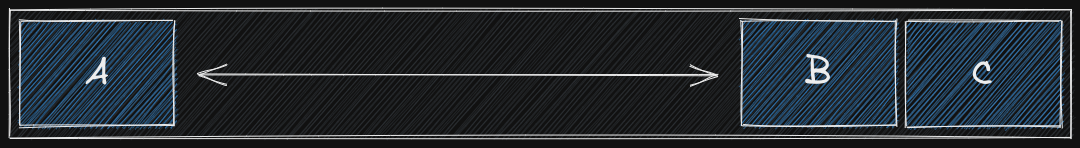
For a flex container, use margin-right: auto on "A".
For a grid container, set grid-template-column: 1fr repeat(2, min-content) so that "A" will be placed at the 1fr column.
Example:
header {
display: flex;
width: 400px;
outline: 3px solid #666;
}
div {
width: 50px;
height: 50px;
background-color: pink;
display: flex;
justify-content: center;
align-items: center;
font-size: x-large;
outline: 2px solid #000;
}
header>div:first-of-type {
margin-right: auto;
}
main {
display: grid;
width: 400px;
outline: 3px solid #666;
grid-template-columns: 1fr repeat(2, min-content);
}
<h3> Flex container</h3>
<header>
    <div>A</div>
    <div>B</div>
    <div>C</div>
</header>
<h3> Grid container </h3>
<main>
<div>A</div>
<div>B</div>
<div>C</div>
</main>
And here are some of everyone's favorite weird solutions I can think of, this example uses pseudo element as a spacer (not recommended, just to show the possibility):
For a flex container, specify order for the pseudo element spacer to have it placed after "A".
For a grid container, specify the pseudo element spacer to take the desired column, so that auto placement can cover the other elements.
Example:
header {
  display: flex;
  width: 400px;
  outline: 3px solid #666;
}

header::before {
  content: "I'm a pseudo spacer";
  display: flex;
  justify-content: center;
  align-items: center;
  font-size: large;
  order: 2;
  flex: 1;
}

div {
  width: 50px;
  height: 50px;
  background-color: pink;
  display: flex;
  justify-content: center;
  align-items: center;
  font-size: x-large;
  outline: 2px solid #000;
}

header > div {
  order: 3;
}

header > div:nth-of-type(1) {
  order: 1;
}

main {
  display: grid;
  width: 400px;
  outline: 3px solid #666;
  grid-template-columns: min-content 1fr repeat(2, min-content);
  grid-auto-flow: row dense;
}

main::before {
  content: "I'm a pseudo spacer";
  display: flex;
  justify-content: center;
  align-items: center;
  font-size: large;
  grid-column: 2 / 3;
}
<h3> Flex but with pseudo element as spacer</h3>
<header>
  <div>A</div>
  <div>B</div>
  <div>C</div>
</header>

<h3> Grid but with pseudo element as spacer</h3>
<main>
  <div>A</div>
  <div>B</div>
  <div>C</div>
</main>