0
<!DOCTYPE html>
<html lang="en">
    <head>
        <meta charset="UTF-8" />
        <meta http-equiv="X-UA-Compatible" content="IE=edge" />
        <meta name="viewport" content="width=device-width, initial-scale=1.0" />

        <!-- To place the footer at the bottom of the page -->
        <style>
            html,
            body {
                height: 100%;
            }

            #root {
                min-height: 100%;
                display: flex;
                flex-direction: column;
            }

            header {
                position: absolute; /* To pull the header out of the document flow */
            }

            main {
                flex: 1;
            }
        </style>

        <title>Document</title>
    </head>
    <body>
        <div id="root">
            <header>
                <h1></h1>
                <nav></nav>
            </header>
            <main></main>
            <footer></footer>
        </div>
    </body>
</html>

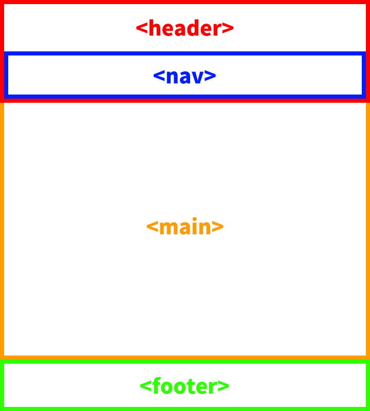
Let's say h1 and nav is placed within header tag and this would look like below:

enter image description here

What I want to achieve is keeping the nav tag on top of the page while the h1 tag is being scrolled as usual:

enter image description here

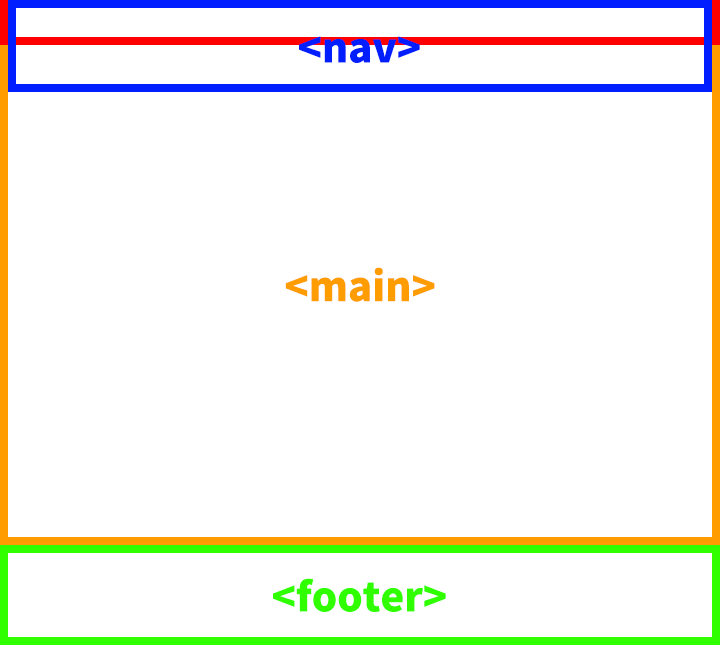
I've tried adding position: sticky; and top: 0;, but it doesn't seem to be working as the nav tag is placed within the header tag.

Should I be using JavaScript to achieve this? or is it possible to solve with plain CSS only?

html,
            body {
                height: 100%;
            }

            body {
                margin: 0;
            }

            #root {
                min-height: 100%;
                display: flex;
                flex-direction: column;
            }

            header {
                position: absolute; /* To pull the header out of the document flow */
                left: 0;
                right: 0;
            }

            header h1 {
                text-align: center;
            }

            nav {
                margin: 0 auto;
                position: sticky;
                top: 0;
            }

            nav > ul {
                margin: 0;
                padding: 0;
                list-style-type: none;
                display: flex;
            }

            nav > ul li {
                margin: 0 10px;
            }

            nav > ul li a {
                color: #000000;
                text-decoration: none;
                font-size: 1.1rem;
                font-weight: 600;
                letter-spacing: 1px;
            }

            nav > ul li a:hover {
                color: #bd8b4f;
            }

            main {
                flex: 1;
                min-height: 1500px;
            }

            footer {
                padding: 40px 0;
                color: #ffffff;
                background-color: #683d29;
                text-align: center;
            }

            footer > div a {
                color: #ffffff;
                text-decoration: none;
            }

            footer > div a:hover {
                color: #683d29;
            }
<!DOCTYPE html>
<html lang="en">
    <head>
        <meta charset="UTF-8" />
        <meta http-equiv="X-UA-Compatible" content="IE=edge" />
        <meta name="viewport" content="width=device-width, initial-scale=1.0" />
        <title>Document</title>
    </head>
    <body>
        <div id="root">
            <header>
                <h1>Test Page</h1>
                <nav>
                    <ul>
                        <li>
                            <a href="#">Nav</a>
                        </li>
                        <li>
                            <a href="#">Nav</a>
                        </li>
                        <li>
                            <a href="#">Nav</a>
                        </li>
                        <li>
                            <a href="#">Nav</a>
                        </li>
                        <li>
                            <a href="#">Nav</a>
                        </li>
                    </ul>
                </nav>
            </header>
            <main></main>
            <footer>
                <div>Copyright 2022. <a href="#">Test</a> All rights reserved.</div>
            </footer>
        </div>
    </body>
</html>
Pogeun
  • 31
  • 6
  • just use position fixed to ` – Kritish Bhattarai Dec 10 '22 at 03:29
  • @KritishBhattarai, tried that as well, but no luck with my example :/ – Pogeun Dec 10 '22 at 03:38
  • @RonnieRoyston, seems like it does (have not yet tested with my code tho..), but would like to know if this is achievable only with a plain CSS code. If not, I am going to use that approach XD! – Pogeun Dec 10 '22 at 03:38
  • @Pogeun there is no js way. Even if you use js,, only thing you are doing is manipulating css property of the element to achieve this. you can check this: https://stackoverflow.com/questions/16879737/position-fixed-is-not-working – Kritish Bhattarai Dec 10 '22 at 05:53

5 Answers5

0

Use

position: fixed;

This makes the position stay the same, no matter how far you scroll

  • tried using `position: fixed;` as well with the combination of `position: absolute;` on `header` tag. As per my understading, this also required a bit of JavaScript to keep the `nav` tag staying underneath the `h1` while the page is on `window.scrollTop()`, but sticks to the top of the page when scrolled. – Pogeun Dec 10 '22 at 03:06
  • No, you can still do it with plain CSS. See [this](https://jsfiddle.net/PandasAreCool/h0opbums/5/) as an example. All you have to do is change the position in the header selector in the CSS file to "fixed". You don't need any JS. – Pandas Are Cool Dec 10 '22 at 14:32
0
<!DOCTYPE html>
<html lang="en">
  <head>
    <meta charset="UTF-8" />
    <meta http-equiv="X-UA-Compatible" content="IE=edge" />
    <meta name="viewport" content="width=device-width, initial-scale=1.0" />

    <!-- To place the footer at the bottom of the page -->
    <style>
      html,
      body {
        height: 1000vh;
      }
      header {
        min-height: 300px;
      }
      nav {
        height: 20px;
        background-color: blue;
        position: sticky;
        top: 0;
      }
      main {
        height: 1000vh;
        background-color: red;
      }
      footer {
        height: 200px;
        background-color: yellow;
      }
    </style>

    <title>Document</title>
  </head>
  <body>
    <div id="root">
      <header>
        <h1></h1>
        <nav></nav>
      </header>
      <main></main>
      <footer></footer>
    </div>
  </body>
</html>

nav elements sticks only until header is in view, but if you want it to stick for the whole page add nav styles to header.

header {
  height: 20px;
  background-color: blue;
  position: sticky;
  top: 0;
 }
Mohammed Shahed
  • 840
  • 2
  • 15
  • Ah, forgot to mention that I only want the `nav` to stick to the page while the `h1` being scrolled. gotta fix the op. – Pogeun Dec 10 '22 at 02:57
  • Can you provide a live example, but if you are adding `postion;sticky` to child element, it will be sticky with respect to its parent to not the entire page. – Mohammed Shahed Dec 10 '22 at 03:02
  • just updated OP for a working example – Pogeun Dec 10 '22 at 03:19
0

like this?

html,
body {
  height: 100%;
}

body {
  margin: 0;
}

#root {
  min-height: 100%;
  display: flex;
  flex-direction: column;
}

header {
  /*  i made changes. */
}

header h1 {
  text-align: center;
}

nav {
  margin: 0 auto;
  position: sticky;
  top: 0;
}

nav>ul {
  margin: 0;
  padding: 0;
  list-style-type: none;
  display: flex;
}

nav>ul li {
  margin: 0 10px;
}

nav>ul li a {
  color: #000000;
  text-decoration: none;
  font-size: 1.1rem;
  font-weight: 600;
  letter-spacing: 1px;
}

nav>ul li a:hover {
  color: #bd8b4f;
}

main {
  flex: 1;
  min-height: 1500px;
}

footer {
  padding: 40px 0;
  color: #ffffff;
  background-color: #683d29;
  text-align: center;
}

footer>div a {
  color: #ffffff;
  text-decoration: none;
}

footer>div a:hover {
  color: #683d29;
}
<!DOCTYPE html>
<html lang="en">

<head>
  <meta charset="UTF-8" />
  <meta http-equiv="X-UA-Compatible" content="IE=edge" />
  <meta name="viewport" content="width=device-width, initial-scale=1.0" />
  <title>Document</title>
</head>

<body>
  <div id="root">
    <!--  i made changes -->
    <header>
      <h1>Test Page</h1>
    </header>
    <nav>
      <ul>
        <li>
          <a href="#">Nav</a>
        </li>
        <li>
          <a href="#">Nav</a>
        </li>
        <li>
          <a href="#">Nav</a>
        </li>
        <li>
          <a href="#">Nav</a>
        </li>
        <li>
          <a href="#">Nav</a>
        </li>
      </ul>
    </nav>
    <!--  i made changes -->
    <main></main>
    <footer>
      <div>Copyright 2022. <a href="#">Test</a> All rights reserved.</div>
    </footer>
  </div>
</body>

</html>
Layhout
  • 1,445
  • 1
  • 3
  • 16
  • In terms of `nav` staying at the top of the page when scrolled, yes and I have also tried that method, but I want the upper part of the `main` to stay behind the `header`. I could change the positioning of the main, but this would break the footer positioning as well and I feel like that is too much of a hardcoding :p – Pogeun Dec 10 '22 at 06:32
  • then you'll need javascript to control the ` – Layhout Dec 12 '22 at 02:03
0

you can try one thing, make position: sticky and then top:0

0

By moving the nav element outside the header element, the position: sticky code works.

html,
body {
  height: 100%;
}

body {
  margin: 0;
}

#root {
  min-height: 100%;
  display: flex;
  flex-direction: column;
}

header {
  position: absolute;
  /* To pull the header out of the document flow */
  left: 0;
  right: 0;
}

header h1 {
  text-align: center;
}

nav {
  margin: 0 auto;
  position: sticky;
  top: 0;
}

nav>ul {
  margin: 0;
  padding: 0;
  list-style-type: none;
  display: flex;
}

nav>ul li {
  margin: 0 10px;
}

nav>ul li a {
  color: #000000;
  text-decoration: none;
  font-size: 1.1rem;
  font-weight: 600;
  letter-spacing: 1px;
}

nav>ul li a:hover {
  color: #bd8b4f;
}

main {
  flex: 1;
  min-height: 1500px;
}

footer {
  padding: 40px 0;
  color: #ffffff;
  background-color: #683d29;
  text-align: center;
}

footer>div a {
  color: #ffffff;
  text-decoration: none;
}

footer>div a:hover {
  color: #683d29;
}
<!DOCTYPE html>
<html lang="en">

<head>
  <meta charset="UTF-8" />
  <meta http-equiv="X-UA-Compatible" content="IE=edge" />
  <meta name="viewport" content="width=device-width, initial-scale=1.0" />
  <title>Document</title>
</head>

<body>
  <div id="root">
    <header>
      <h1>Test Page</h1>
      <!--Move nav element outside the header element but inside the #root element for position: sticky to work.-->
    </header>
    <nav>
      <ul>
        <li>
          <a href="#">Nav</a>
        </li>
        <li>
          <a href="#">Nav</a>
        </li>
        <li>
          <a href="#">Nav</a>
        </li>
        <li>
          <a href="#">Nav</a>
        </li>
        <li>
          <a href="#">Nav</a>
        </li>
      </ul>
    </nav>
    <main></main>
    <footer>
      <div>Copyright 2022. <a href="#">Test</a> All rights reserved.</div>
    </footer>
  </div>
</body>

</html>