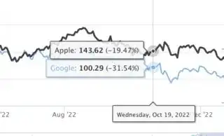
I want to display in the tooltip the % change of the y values. However, I don't want to change the y axis to percentage as in https://www.highcharts.com/stock/demo/compare.
Asked
Active
Viewed 124 times
1
-
You can do all calculations in the `tooltip.formatter`, check API: https://api.highcharts.com/highcharts/tooltip.formatter – magdalena Dec 27 '22 at 17:38
-
@magdalena, could you be more specific? I´ve been trying unsuccessfully for the last few days – Caetano Almeida e Brito Dec 28 '22 at 10:18
-
1It looks like you're new to SO; welcome to the community! If you want great answers quickly, it's best to make your question reproducible. This includes sample data like the output from `dput()` or `reprex::reprex()` and any libraries you use. Check it out: [making R reproducible questions](https://stackoverflow.com/q/5963269). When you pose a question with no code, it's pretty difficult to give you a detailed answer (i.e., how to format tooltips). This formatting depends on elements of your coding and your data and data structure. If you can't share your data, use dummy data. – Kat Dec 29 '22 at 15:27
-
@Kat, can you see my new question: 'How to change y_axis format, when having percent change option?' ? It's now reproducible – Caetano Almeida e Brito Jan 02 '23 at 10:56
1 Answers
1
Update
There doesn't appear to be an option where you include comparison values but plot the stock value built in.
I've plotted 2 stocks in this plot. For each stock, there are two series, one that is not for comparison and one that is. The two series are linked. The comparison series is set to visible = F.
The comparison value is collected from the invisible linked series in the custom tooltip and added to the non-compare series.
library(highcharter)
library(quantmod)

# get data
goo <- getSymbols("GOOG", auto.assign = F)
app <- getSymbols("AAPL", auto.assign = F)
goog <- goo$GOOG.Open
appl <- app$AAPL.Open

highchart() %>%
  hc_chart(zoomType = "x", marginTop = 20) %>%
  hc_rangeSelector(enabled = T) %>%
  hc_navigator(enabled = F) %>%
  hc_scrollbar(enabled = F) %>%
  hc_tooltip(
    formatter = htmlwidgets::JS(
      "function() {
          /* collect name, x (and format it), y, color, compare value, & % diff */
      nm = this.series.name;
      xform = Highcharts.dateFormat('%B %e, %Y', this.x);        /* collect/format date */
      compVal = this.series.linkedSeries[0].dataModify.compareValue; /* 1st val in view */
      col = this.color; y = this.y;                          /* set color and y to vars */
      delta = (y - compVal)/compVal * 100;   /* compute the comparison value as HC does */
      tooltip = `<span>${xform}<br><hr><b><span style='color:${col};'>`; /* create tooltip */
      tooltip += `● ${nm}:</span></b> ${y.toFixed(2)} (${delta.toFixed(2)}%)</span>`;
      return tooltip; /* send back new tooltip */
      }")) %>%
  hc_add_series(goog, name = "Google", id = 'g', compare = F) %>%
  hc_add_series(appl, name = "Apple", id = 'a', compare = F) %>%
  hc_add_series(goog, visible = F, linkedTo = 'g', compare = "percent") %>%
  hc_add_series(appl, visible = F, linkedTo = 'a', compare = "percent") %>%
  hc_xAxis(type = "datetime") %>%    # since it's a line, not stock, format x-axis
  hc_yAxis(opposite = F, tickAmount = 5) # add values to y
Originally Wrote
Your question isn't reproducible, but if you wanted a translation of JS to R for Highcharter specifically, I could do that.
The attribute compare = "percent" will create the delta values for you.
library(highcharter)
library(quantmod)

goo <- getSymbols("GOOG", auto.assign = F) # get Google stock data
app <- getSymbols("AAPL", auto.assign = F) # get Apple stock data
goo <- goo$GOOG.Adjusted # only plotting one feature
app <- app$AAPL.Adjusted


highchart(type = "stock") %>%
  hc_add_series(goo, name = "Google",
                compare = "percent") %>%  # compare the stock data creates % data
  hc_add_series(app, name = "Apple",
                compare = "percent") %>%
  hc_rangeSelector(selected  = 4) %>%
  hc_tooltip(pointFormat = '<span style="color:{series.color}">{series.name}</span>: <b>{point.y}</b> ({point.change}%)<br/>',
             valueDecimals = 2,
             split = T)
Kat
- 15,669
- 3
- 18
- 51
-
Thank you but this doesn't quite solve my problem. Can you see my question: 'How to change y_axis format, when having percent change option?' . I think you will understand my problem better and it is reproducible. Thank you for your help – Caetano Almeida e Brito Jan 03 '23 at 08:33
-
The problem is that when you use the 'compare' attribute, the y_axis changes to % values. I want to remain with the y values – Caetano Almeida e Brito Jan 03 '23 at 08:37
-
I've updated my answer. Let me know if you have questions or run into any problems. – Kat Jan 04 '23 at 17:38


