1

I need to make a re-usable component of a button. I have to make it like this buttons

Now, I don't know :

  1. How to add those two icons( Home and Chevron Right ) inside a clickable button.
  2. Making Button(as a whole clickable) and chevron right clickable so that it could show more option .
  3. Giving them (icons) Different Colors.
krishnaacharyaa
  • 14,953
  • 4
  • 49
  • 88

2 Answers2

1

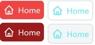
You cann't add icon color to an image, because you have no control of the inner element of the image, So use svg instead.

Here is the working output and example. Change it according to your needs.

Tailwind-play


Output

enter image description here

Code:

<div class="flex gap-4">
  <div class="flex-col gap-4">
    <div class="flex w-fit items-center rounded-2xl bg-red-500 p-4">
      <svg xmlns="http://www.w3.org/2000/svg" class="h-12 w-12 text-white" fill="none" viewBox="0 0 24 24" stroke="currentColor">
        <path
          stroke-linecap="round"
          stroke-linejoin="round"
          stroke-width="2"
          d="M3 12l2-2m0 0l7-7 7 7M5 10v10a1 1 0 001
                  1h3m10-11l2 2m-2-2v10a1 1 0 01-1 1h-3m-6 0a1 
                  1 0 001-1v-4a1 1 0 011-1h2a1 1 0 011 1v4a1
                  1 0 001 1m-6 0h6"
        />
      </svg>
      <div class="pl-4 text-4xl text-white">Home</div>
    </div>
    <div class="mt-4 flex w-fit items-center rounded-2xl bg-red-800 p-4">
      <svg xmlns="http://www.w3.org/2000/svg" class="h-12 w-12 text-white" fill="none" viewBox="0 0 24 24" stroke="currentColor">
        <path
          stroke-linecap="round"
          stroke-linejoin="round"
          stroke-width="2"
          d="M3 12l2-2m0 0l7-7 7 7M5 10v10a1 1 0 001
                  1h3m10-11l2 2m-2-2v10a1 1 0 01-1 1h-3m-6 0a1 
                  1 0 001-1v-4a1 1 0 011-1h2a1 1 0 011 1v4a1
                  1 0 001 1m-6 0h6"
        />
      </svg>
      <div class="pl-4 text-4xl text-white">Home</div>
    </div>
  </div>
  <div class="flex-col gap-4">
    <div class="flex w-fit items-center rounded-2xl border-2  border-gray-300 p-4">
      <svg xmlns="http://www.w3.org/2000/svg" class="h-12 w-12 text-cyan-300" fill="none" viewBox="0 0 24 24" stroke="currentColor">
        <path
          stroke-linecap="round"
          stroke-linejoin="round"
          stroke-width="2"
          d="M3 12l2-2m0 0l7-7 7 7M5 10v10a1 1 0 001
                  1h3m10-11l2 2m-2-2v10a1 1 0 01-1 1h-3m-6 0a1 
                  1 0 001-1v-4a1 1 0 011-1h2a1 1 0 011 1v4a1
                  1 0 001 1m-6 0h6"
        />
      </svg>
      <div class="pl-4 text-4xl text-cyan-300">Home</div>
    </div>
    <div class="mt-4 flex w-fit items-center bg-gray-100 rounded-2xl border-2 border-gray-300 p-4">
      <svg xmlns="http://www.w3.org/2000/svg" class="h-12 w-12 text-cyan-300" fill="none" viewBox="0 0 24 24" stroke="currentColor">
        <path
          stroke-linecap="round"
          stroke-linejoin="round"
          stroke-width="2"
          d="M3 12l2-2m0 0l7-7 7 7M5 10v10a1 1 0 001
                  1h3m10-11l2 2m-2-2v10a1 1 0 01-1 1h-3m-6 0a1 
                  1 0 001-1v-4a1 1 0 011-1h2a1 1 0 011 1v4a1
                  1 0 001 1m-6 0h6"
        />
      </svg>
      <div class="pl-4 text-4xl text-cyan-300">Home</div>
    </div>
  </div>
</div>

Extra:

How to get svg ?

Go to google material's icon and download the svg and use it in your file

enter image description here

krishnaacharyaa
  • 14,953
  • 4
  • 49
  • 88
  • Thank you really so much. but, I really do not know how to you write those svg code. You need to Type them yourself or somewhere you will get? + for everything I need, there is already a svg form of them? – Poshan Baral Jan 16 '23 at 06:19
  • to use it(SVG) in react js, do I need to add some extension or packages? – Poshan Baral Jan 16 '23 at 06:44
  • Use [react-icons](https://react-icons.github.io/react-icons) and style it using [IconProvider](https://stackoverflow.com/questions/56636280/how-to-style-react-icons) Hopefully it should answer all of your questions – krishnaacharyaa Jan 16 '23 at 06:49
  • Yes! I got all I need. Thanks :) – Poshan Baral Jan 16 '23 at 06:51
0

Are you looking for this? For example I've added different icons but you can replace them with yours...you can also use packages like react-icons

for reference in tailwind playground: https://play.tailwindcss.com/hTRgWtHhzM

<button type="button" className="text-white bg-blue-700 hover:bg-blue-800 focus:ring-4 focus:outline-none focus:ring-blue-300 font-medium rounded-lg text-sm px-5 py-2.5 text-center inline-flex items-center dark:bg-blue-600 dark:hover:bg-blue-700 dark:focus:ring-blue-800">
  <span className="text-green-500">
    <svg aria-hidden="true" className="w-5 h-5 mr-2 -ml-1" fill="currentColor" viewBox="0 0 20 20" xmlns="http://www.w3.org/2000/svg"><path d="M3 1a1 1 0 000 2h1.22l.305 1.222a.997.997 0 00.01.042l1.358 5.43-.893.892C3.74 11.846 4.632 14 6.414 14H15a1 1 0 000-2H6.414l1-1H14a1 1 0 00.894-.553l3-6A1 1 0 0017 3H6.28l-.31-1.243A1 1 0 005 1H3zM16 16.5a1.5 1.5 0 11-3 0 1.5 1.5 0 013 0zM6.5 18a1.5 1.5 0 100-3 1.5 1.5 0 000 3z"></path></svg>
    </span>
    Choose plan
    <a href="https://google.com" className="text-red-500">
    <svg aria-hidden="true" className="w-5 h-5 ml-2 -mr-1" fill="currentColor" viewBox="0 0 20 20" xmlns="http://www.w3.org/2000/svg" ><path fill-rule="evenodd" d="M10.293 3.293a1 1 0 011.414 0l6 6a1 1 0 010 1.414l-6 6a1 1 0 01-1.414-1.414L14.586 11H3a1 1 0 110-2h11.586l-4.293-4.293a1 1 0 010-1.414z" clip-rule="evenodd"></path></svg>
    </a>
</button>
buzz
  • 896
  • 2
  • 10
  • 22
  • Yes, something like this, but svg? how can I make a SVG of home or where can I get ? – Poshan Baral Jan 16 '23 at 05:53
  • As i mentioned above...for icons you can take help from packages like `react-icons`. there you'll have many options to choose from https://react-icons.github.io/react-icons/search?q=home – buzz Jan 16 '23 at 06:04