0

I have never posted on stack overflow (or any coding website) so I hope I can ask this well...

I am trying to make a plot showing how corticosterone (a hormone) increases in 30 minutes from baseline (base) to stress-induced (SI) levels in birds.

I captured starlings and took a baseline blood sample (Basecort), then waited 30 minutes and took a second blood sample (SIcort).

I would like to make a plot with each individual bird's Basecort and SIcort connected by lines. (I have been on Google for 2 hours (not an exaggeration) and can't make anything work).

I used the following code to make this plot:

create list of variables

x <- list('Base CORT' = df_adults$Base.cort, 'SI CORT' = df_adults$SI.cort)
x

create plot that contains one strip chart per variable

stripchart(x,
       main = 'Individual Changes in CORT',
       xlab = 'CORT Sample', 
       col = c('#9A8822', '#F5CDB4'),
       pch = 16,
       method = 'jitter',
       vertical = TRUE)

SEE PLOT HERE

I can't get any kind of "group" variable to work.

Does anyone have a clue how to connect the dots by BirdID?

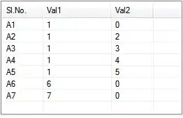
This is what my dataframe looks like: Dataframe

Thank you SO MUCH to anyone who's able to help.

Rachel
  • 1
  • 1
  • 1
    May I suggest a different visualisation. For paired data (which you have), a really much more intuitive way to present your data would be a scatter plot - first measurement on one axis, second measurement on the other. You can find examples of what you want to achieve and what I would suggest in https://stackoverflow.com/questions/70397418/create-a-split-violin-plot-with-paired-points-and-proper-orientation and https://stackoverflow.com/questions/72216683/how-to-connect-grouped-points-in-ggplot-within-groups – tjebo Jan 26 '23 at 14:44
  • also: https://stackoverflow.com/questions/44656299/lines-connecting-jittered-points-dodging-by-multiple-groups/75248051#75248051 – tjebo Jan 26 '23 at 15:13

1 Answers1

0

As per comments, this has been asked in other threads - to help you here a suggestion how to do this on your data (as a wiki, I will close this question thereafter).

Please do your readers (and reviewers!) a favour and plot your data as a scatter plot!

library(tidyr)
library(dplyr)
library(ggplot2)

## I've slightly modified the data from above suggested threads. 
df <- structure(list(BirdID = c("id_1", "id_2", "id_3", "id_4", "id_5", "id_6", "id_7", "id_8", "id_9", "id_10", "id_11", "id_12", "id_13", "id_14", "id_15", "id_16", "id_17", "id_18", "id_19", "id_20"), Basecort = c(9L, 7L, 2L, 2L, 1L, 5L, 6L, 7L, 5L, 9L, 5L, 2L, 9L, 4L, 6L, 10L, 4L, 10L, 7L, 9L), SIcort = c(4L, 1L, 7L, 3L, 5L, 10L, 10L, 9L, 5L, 9L, 5L, 10L, 1L, 3L, 10L, 6L, 4L, 9L, 6L, 8L)), row.names = c(NA, -20L), class = c("tbl_df", "tbl", "data.frame"))

df %>%
  pivot_longer(-BirdID, "type", "value") %>%
  mutate(value = jitter(value), 
         x = jitter(as.integer(factor(type)))) %>%
  ggplot(aes(x, value, group = BirdID)) +
  geom_point() +
  geom_line() +
  ## you will need to change the x axis labels
  scale_x_continuous(breaks = 1:2, labels = c("Basecort", "SIcort"))


## MUCH better
ggplot(df) +
  geom_point(aes(Basecort, SIcort)) +
  ## you can add a line of equality to make it even more intuitive 
  geom_abline(intercept = 0, slope = 1, lty = 2, linewidth = .2) +
  coord_equal()

tjebo
  • 21,977
  • 7
  • 58
  • 94