0

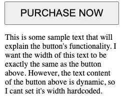
Given the HTML/CSS below, how do I make so that the width of the text below the button is, at maximum, the button's width? (see image below of the desired effect)

.button {
  padding: 10px 30px;
  font-size: 20px;
}
<div style="display: flex; flex-direction: column; align-items: center;">
  <button class="button">
    PURCHASE NOW
  </button>
  <p>
    This is some sample text that will explain the button's functionality. I want the width of this text to be exactly the same as the button above. However, the text content of the button above is dynamic, so I cant set it's width hardcoded.
  </p>
</div>

This is the desired effect, achieved manually setting the width of the paragraph (which is undesired, because the width of the button above it will have dynamic wording):
enter image description here

j08691
  • 204,283
  • 31
  • 260
  • 272
sandre89
  • 5,218
  • 2
  • 43
  • 64

2 Answers2

0

div#myDiv{
    display: flex; 
    flex-flow: column wrap;
    text-align: justify;
    justify-content: center;
    max-width: 0px;
}
.button {      
    padding: 10px 30px;
    font-size: 20px;
    white-space: nowrap;
    text-align: center;
}
<div id="myDiv">
    <button class="button">PURCHASE NOW</button>
    <p>
        This is some sample text that will explain the button's functionality.
        I want the width of this text to be exactly the same as the button above.
        However, the text content of the button above is dynamic, so I cant set it's width hardcoded.  
    </p>
</div>

Actually, I think that you are forced to touch the width of the div to do what you expect.

Clément
  • 29
  • 4
-3

Well, you can achieve this by adding the following styles to the paragraph:

<style>
  .button {      
    padding: 10px 30px;
    font-size: 20px;      
  }
  
  p {
    text-align: center;
    width: 100%;
    max-width: inherit;
  }
</style>

<div style="display: flex; flex-direction: column; align-items: center;">

  <button class="button">
    PURCHASE NOW
  </button>

  <p>
    This is some sample text that will explain the button's functionality.
    I want the width of this text to be exactly the same as the button above.
    However, the text content of the button above is dynamic, so I cant set it's width hardcoded. 
  </p>

</div>

By setting width: 100% and max-width: inherit on the p element, you are telling it to inherit the width of its parent element, which is the div with display: flex. The text-align: center centers the text horizontally within the p element.

Myers
  • 148
  • 8
  • 2
    I just clicked 'Run code snippet' and the paragraph's text is expanding to 100% width of the viewport; it's not being limited to the width of the button above it like the screenshot I provided. – sandre89 Feb 10 '23 at 20:00