1

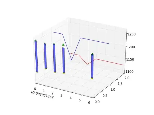
I saw this 3d plot. it was animated and added a new value every day. i have not found an example to recreate it with plotly in python.

enter image description here

the plot should start with the value from the first row (100). The start value should remain (no rolling values). The plot should be animated in such a way that each row value is added one after the other and the x-axis expands. the following data frame contains the values (df_stocks) and Dates to plot. assigning the colors would be a great addition. the more positive the deeper the green, the more negative the darker red.

import yfinance as yf
import pandas as pd

stocks = ["AAPL", "MSFT"]

df_stocks = pd.DataFrame()
for stock in stocks:
    df = yf.download(stock, start="2022-01-01", end="2022-07-01", group_by='ticker')
    df['perct'] = df['Close'].pct_change()
    df_stocks[stock] = df['perct']

df_stocks.iloc[0] = 0
df_stocks += 1
df_stocks = df_stocks.cumprod()*100
df_stocks -= 100 
Derek O
  • 16,770
  • 4
  • 24
  • 43
Alex
  • 999
  • 1
  • 14
  • 31

1 Answers1

1

You can use a list of go.Frame objects as shown in this example. Since you want the line plot to continually extend outward, each frame needs to include data that's one row longer than the previous frame, so we can use a list comprehension like:

frames = [go.Frame(data=

    ## ...extract info from df_stocks.iloc[:i]

for i in range(len(df_stocks))]

To add colors to your lines depending on their value, you can use binning and labels (as in this answer) to create new columns called AAPL_color and MSFT_color that contain the string of the css color (like 'darkorange' or 'green'). Then you can pass the information from these columns using the argument line=dict(color=...) in each go.Scatter3d object.

import yfinance as yf
import numpy as np
import pandas as pd
import plotly.express as px
import plotly.graph_objects as go

stocks = ["AAPL", "MSFT"]

df_stocks = pd.DataFrame()
for stock in stocks:
    df = yf.download(stock, start="2022-01-01", end="2022-07-01", group_by='ticker')
    df['perct'] = df['Close'].pct_change()
    df_stocks[stock] = df['perct']

df_stocks.iloc[0] = 0
df_stocks += 1
df_stocks = df_stocks.cumprod()*100
df_stocks -= 100 

df_min = df_stocks[['AAPL','MSFT']].min().min() - 1
df_max = df_stocks[['AAPL','MSFT']].max().max() + 1

labels = ['firebrick','darkorange','peachpuff','palegoldenrod','palegreen','green']
bins = np.linspace(df_min,df_max,len(labels)+1)
df_stocks['AAPL_color'] = pd.cut(df_stocks['AAPL'], bins=bins, labels=labels).astype(str)
df_stocks['MSFT_color'] = pd.cut(df_stocks['MSFT'], bins=bins, labels=labels).astype(str)

frames = [go.Frame(
    data=[
        go.Scatter3d(
            y=df_stocks.iloc[:i].index, 
            z=df_stocks.iloc[:i].AAPL.values,
            x=['AAPL']*i,
            name='AAPL',
            mode='lines',
            line=dict(
                color=df_stocks.iloc[:i].AAPL_color.values, width=3,
            )
        ), 
        go.Scatter3d(
            y=df_stocks.iloc[:i].index, 
            z=df_stocks.iloc[:i].MSFT.values,
            x=['MSFT']*i,
            name='MSFT',
            mode='lines',
            line=dict(
                color=df_stocks.iloc[:i].MSFT_color.values, width=3,
            )
        )]
    ) 
for i in range(len(df_stocks))]

fig = go.Figure(
    data=list(frames[1]['data']),
    frames=frames,
    layout=go.Layout(
        # xaxis=dict(range=[0, 5], autorange=False),
        # yaxis=dict(range=[0, 5], autorange=False),
        # zaxis=dict(range=[0, 5], autorange=False),
        template='plotly_dark',
        legend = dict(bgcolor = 'grey'),
        updatemenus=[dict(
            type="buttons",
            font=dict(color='black'),
            buttons=[dict(label="Play",
                          method="animate",
                          args=[None])])]
    ),
)

fig.show()

enter image description here

Derek O
  • 16,770
  • 4
  • 24
  • 43
  • 1
    oh great! made my day! I am playing around to make it faster, bringing the lines more in the center and changing the x-axis ticks... – Alex Feb 17 '23 at 19:15
  • @Alex glad to hear my answer was helpful! you can definitely make some aesthetic changes – i believe the frame rate can be controlled using the `"duration"` parameter as shown [here](https://plotly.com/python/animations/?_ga=2.34650913.1095174710.1676255914-1789232123.1675635503#using-a-slider-and-buttons) – Derek O Feb 17 '23 at 19:18
  • @ Derek O. I have separated the colors into a separate data frame and I am trying to loop over the stocks in order to add each with go.Scatter3d. I have more than 10 stocks to add (which would be tedious to do manually). Where should I place the loop in my code? Thank you for your help. – Alex Feb 18 '23 at 16:38
  • @Alex i think you can use a list comprehension inside the `data` argument when you're defining `frames`. something like: `frames = [go.Frame(data=[go.Scatter3d(...use col as needed...) for col in col_names]) for i in range(len(df_stocks))]` – Derek O Feb 18 '23 at 17:34