You can also use ggplot2 itself to get it done:
library(ggplot2)
data <- runif(180,100,1000)
ts.data <- ts(data, frequency = 12, start = c(2003,1))
autoplot(ts.data, xlab="Year", ylab="Number of Tourists") +
geom_vline(xintercept = as.Date(c("2003-01-01", "2010-01-01", "2015-01-01", "2018-01-01") ), color = "blue")+
geom_text(aes(x = as.Date("2007-01-01"), y = 1020, label="train data"))+
geom_text(aes(x = as.Date("2013-01-01"), y = 1020, label="test"))+
geom_text(aes(x = as.Date("2016-07-01"), y = 1020, label="predictions"))

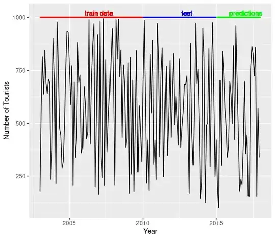
I understand you asked about adding vertical lines, just wonder if it is better to use horizontal lines:
autoplot(ts.data, xlab="Year", ylab="Number of Tourists") +
  geom_segment(aes(x = as.Date("2003-01-01") , y = 1000, xend = as.Date("2010-01-01"), yend = 1000), color = "red") +
  geom_segment(aes(x = as.Date("2010-01-01") , y = 1000, xend = as.Date("2015-01-01"), yend = 1000), color = "blue") +
  geom_segment(aes(x = as.Date("2015-01-01") , y = 1000, xend = as.Date("2018-01-01"), yend = 1000), color = "green") +
  geom_text(aes(x = as.Date("2007-01-01"), y = 1020, label="train data"), color = "red")+
  geom_text(aes(x = as.Date("2013-01-01"),  y = 1020, label="test"), color = "blue")+
  geom_text(aes(x = as.Date("2017-01-01"),  y = 1020, label="predictions"), color="green")