this is the div
<div className={classes.productSection}>
        {data.map((product) =>
        (<Link key={product.id} className={classes.productLink} to={`${product.id}`}>
          <div key={product.id} className={classes.productBox}>
            <h4>{product.name}</h4>
          </div>
        </Link>)
        )}
      </div>
and the current css
.productSection {
    display: grid;
    grid-gap: 1rem;
    grid-template-columns: 20% 20% 20%;
    justify-content: center;
    animation: append-animate .5s linear;
    margin-bottom: 1rem;
  }

  .productLink{
    text-decoration: none;
    color: black;
  }

  .productBox {

    border: 1.5px solid gray;
    padding: 10px;
    overflow: clip;

    border-radius: 12px;
  }

  .productBox p {
    margin: 0;
    padding: 1px;
    font-size: 0.8rem;
  }

  .productBox h4 {
    margin: 0;
    padding: 2px;
    font-weight: 600;
  }
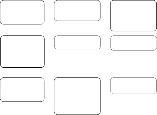
The grid is not space adjusted, the smallest grid is in the line taking the exact same amount of space the biggest one having. but what I need is a space adjusted grid layout. please help ?
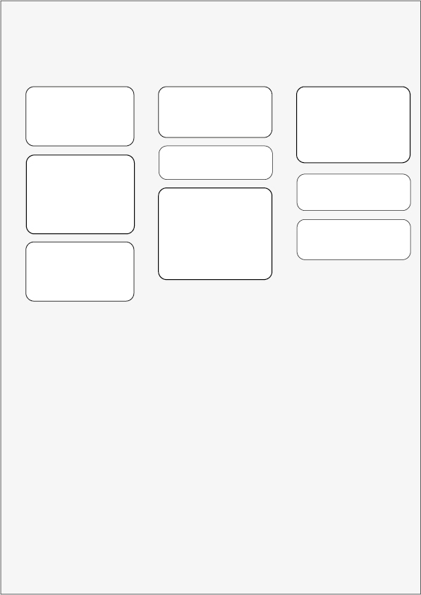
The first grid is the current style, and the second is how it should become.
there will be like unlimited number of data to map, and each will be having different height, the order should be like
123 456 789