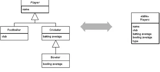
I have the data frame containing the score of a metric in which its columns are the metrics name and row is the categories. I want a x-axis of bar chart to represent categories in each row, and y-axis representing the score, and color of bar chart to represent the metrics' type
The data frame look like this,
          precision recall  f1-score    support
anger       0.6374  0.150138    0.243032    726.0
confusion   0.1666  0.006536    0.012579    153.0
curiosity   0.3333  0.003521    0.006969    284.0
desire      0.8750  0.084337    0.153846    83.0
disgust     0.6250  0.040650    0.076336    123.0
embarrass   0.0000  0.000000    0.000000    37.0
fear        0.6666  0.020408    0.039604    98.0
joy         0.7039  0.354877    0.471875    851.0
love        0.8285  0.573657    0.677931    1154.0
neutral     0.5394  0.371013    0.439655    1787.0
optimism    0.7704  0.252688    0.380567    186.0
pride       0.0000  0.000000    0.000000    16.0
sadness     0.7165  0.240106    0.359684    379.0
surprise    0.6956  0.057554    0.106312    278.0
micro avg   0.6648  0.309667    0.422523    6155.0
macro avg   0.5399  0.153963    0.212028    6155.0
weight avg  0.6377  0.309667    0.391975    6155.0
samples avg 0.3404  0.324519    0.327904    6155.0
How can I use matplotlib or seaborn in python to get a barplot similar to this one

