3

As explained below, this question is NOT a duplicate of this question. Please, read carefully before marking it as duplicate.

I already read carefully this question which is similar, except he wants to select the items of the last row. Here I want to select the last item of each row.

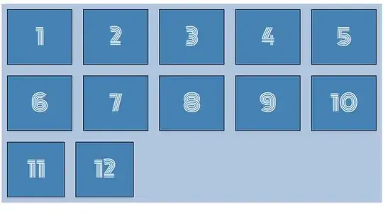
Is there a way to select the last item of each row in a flex arrangement (without JavaScript)? On the following example, I would like a CSS selector that selects div 5 and 10 (and eventually 12).

Flex example

Of course, it has to be responsive.

  • Solutions like :nth-child(5) will not select the right div if the window is resized.
  • Divs have variable widths.

I already read carefully this question which is similar, except he wants to select the items of the last row. Here I want to select the last item of each row.

Since there is no proper solution to the question above, I'm afraid that what I want to do is impossible without JavaScript.

Here is a JSFidle used to generate the above image.

#container {
    background-color: LightSteelBlue;   
    
    width: 100%;
    height: fit-content;
    flex-wrap: wrap;
    display: flex;
    justify-content: space-between; 
    /*justify-content: stretch;*/
}

.child {
    font-family: 'Monoton', cursive;
    
    color: white;
    font-size: 40px;
    display : flex;
    align-items : center;
    justify-content: center;
    
    width: 100px;
    height: 100px;
    margin: 10px;
    background-color: SteelBlue;
    
    border: 1px solid black;
    flex-grow: 1;
}

#container::after {
    /*background-color: red;*/
    content: "";    
    flex-grow: 100;
}
<link rel="preconnect" href="https://fonts.googleapis.com">
<link rel="preconnect" href="https://fonts.gstatic.com" crossorigin>
<link href="https://fonts.googleapis.com/css2?family=Gajraj+One&family=Monoton&family=Righteous&display=swap" rel="stylesheet">

<div id="container">
    <div class="child">1</div>
    <div class="child">2</div>
    <div class="child">3</div>  
    <div class="child">4</div>  
    
    <div class="child">5</div>
    <div class="child">6</div>
    <div class="child">7</div>  
    <div class="child">8</div>  
    
    <div class="child">9</div>
    <div class="child">10</div>
    <div class="child">11</div> 
    <div class="child">12</div> 
</div>
Fifi
  • 3,360
  • 2
  • 27
  • 53
  • The only way without javascript is to use media queries for each window width with the nth-child solution that works within that media query – Pete Mar 20 '23 at 09:45
  • @Pete, since the items may have variable width, it won't work. – Fifi Mar 20 '23 at 09:46
  • 4
    Well then you will need js - it's impossible with css – Pete Mar 20 '23 at 09:52
  • describe what you are trying to achieve which such selection. I am pretty sure there is a solution without the need of a selector – Temani Afif Mar 20 '23 at 09:59
  • @TemaniAfif the divs contains letter or space. I want to remove trailing spaces at the end of each row – Fifi Mar 20 '23 at 10:08
  • 1
    update your question to focus on this requirement instead and show us a real use case. You will have a better chance to get an answer – Temani Afif Mar 20 '23 at 10:13
  • 1
    @TemaniAfif Thx, but I know exactly what I'm doing. This is just my question. If it is not possible, I already have backup solutions with JavaScript or other CSS tricks. I just want to know if such selectors exists. And by the way, this question may also interest other visitors, so I will not complicate it with my overall context – Fifi Mar 20 '23 at 10:29
  • 1
    Who marked this question as duplicate ? This is not a duplicate as I explained in the question. "[...]which is similar, except he wants to select the items of the last row. Here I want to select the last item of each row." – Fifi Mar 20 '23 at 13:26

1 Answers1

-2

you could run something like this:

.wrapper {
  display: flex;
  flex-wrap: wrap;
}

.item {
  width: calc((100% - 2*10px)/5);
  height: 50px;
  margin-right: 10px;
  margin-bottom: 10px;
  padding: 5px;
  box-sizing: border-box;
}

// last item of each row
.elem:nth-child(5n) {
  margin-right: 0;
}

// last 3 items
.elem:nth-last-child(-n+5){
  margin-bottom: 0;
}

In this example you can replace the 5nth for anything you want to specify the amount of elements per row.

DullJoker
  • 42
  • 5
  • Items have variable width, so I can't specify the width this way. The number of items in each is also responsive. – Fifi Mar 20 '23 at 09:55
  • You could still use this setup as a base and use media queries to step down to a different amount of items per row. – DullJoker Mar 20 '23 at 12:50
  • The amount of vagueness in your question is really starting to give me leet code vibes... – DullJoker Mar 20 '23 at 12:53
  • I also said "you could use something *like* this" meaning we only have a limited view on what you're trying to get out of this question. If you want answers that are closer to what you like to get out of it you should rethink your method of asking this question in the first place. – DullJoker Mar 20 '23 at 12:59