3

I'm trying to create an empty div that expands to it's available space using flex: 1 or flex-grow: 1 but keep an aspect ratio using aspect-ratio: 16/9

I've tried lots of examples including the original padding-top: 56.25% hacks. But can't get anything to work correctly.

Here's what I have so far:

.parent {
  display: flex;
  column-gap: 30px;
  row-gap: 30px;
}

.container {
  display: flex;
  background:pink;
  flex-direction: column;
  height: 300px;
  width: 500px;
  align-items: center;
  justify-content: space-between;
}

#container-2 {
  height: 500px;
  width: 300px;
  background: green;
}

.item {
  position: relative;
  flex: 1;
  background: black;
  aspect-ratio: 16/9;
  opacity: 0.5;
  /* max-width: 100%; */ /* doesn't fix with ratio */
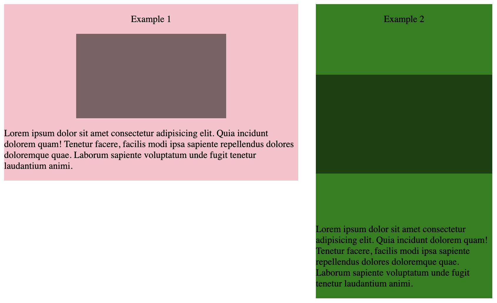
}
<div class="parent">
  <div class="container">
    <p>Example 1</p>
    <div class="item"></div>
    <p>Lorem ipsum dolor sit amet consectetur adipisicing elit. Quia incidunt dolorem quam! Tenetur facere, facilis modi ipsa sapiente repellendus dolores doloremque quae. Laborum sapiente voluptatum unde fugit tenetur laudantium animi.</p>
  </div>

  <div class="container" id="container-2">
    <p>Example 2</p>
    <div class="item"></div>
    <p>Lorem ipsum dolor sit amet consectetur adipisicing elit. Quia incidunt dolorem quam! Tenetur facere, facilis modi ipsa sapiente repellendus dolores doloremque quae. Laborum sapiente voluptatum unde fugit tenetur laudantium animi.</p>
  </div>
</div>

You'll see that the Example 1 works but Example 2 the .item overflows the width to try and get the aspect ratio with the height. I've tried max-width: 100% which stops the overflow but then the item is not 16:9.

Desired output:

enter image description here

Rob
  • 14,746
  • 28
  • 47
  • 65
ptimson
  • 5,533
  • 8
  • 35
  • 53
  • So in the second green example, how do you want the UI to actually look? Because right now, your flexible 16/9 element is stretching vertically to fill the extra space in the green box (since you're using `flex-direction: column`), and the 16/9 ratio is causing it overflow horizontally. If you restrict it horizontally but keep the 16/9 ratio, then your green box is going to have some vertical whitespace somewhere, probably at the bottom. Is that desirable? – Jake Mar 22 '23 at 17:59
  • Hi @Jake great question. Yes I'd probably center align the box between the white space. I'll update with desired output. – ptimson Mar 22 '23 at 18:03

2 Answers2

2

For what it's worth, I also could not figure this out, but did eventually find this post, which I mostly stole to make the snippet below.

.parent {
  display: flex;
  column-gap: 30px;
  row-gap: 30px;
}

.container {
  display: flex;
  background:pink;
  flex-direction: column;
  height: 300px;
  width: 500px;
  align-items: center;
  justify-content: center;
  
}

.flexWrapper{
 flex: 1;
 width: 100%;
 position: relative;
}

#container-2 {
  height: 500px;
  width: 300px;
  background: green;
}

.item {
  background-color: black;
  opacity: .5;
  position: absolute;
  margin: auto;
  left: 0;
  right: 0;
  top: 0;
  bottom: 0;
  max-width: 100%;
  max-height: 100%;
  aspect-ratio: 16 / 9;
}
<div class="parent">
  <div class="container">
    <p>Example 1</p>
    <div class="flexWrapper">
      <div class="item"></div>
    </div>
    <p>Lorem ipsum dolor sit amet consectetur adipisicing elit. Quia incidunt dolorem quam! Tenetur facere, facilis modi ipsa sapiente repellendus dolores doloremque quae. Laborum sapiente voluptatum unde fugit tenetur laudantium animi.</p>
  </div>

  <div class="container" id="container-2">
    <p>Example 2</p>
    <div class="flexWrapper">
      <div class="item"></div>
    </div>
    
    <p>Lorem ipsum dolor sit amet consectetur adipisicing elit. Quia incidunt dolorem quam! Tenetur facere, facilis modi ipsa sapiente repellendus dolores doloremque quae. Laborum sapiente voluptatum unde fugit tenetur laudantium animi.</p>
  </div>

</div>
Jake
  • 862
  • 6
  • 10
  • 1
    Thanks so much @Jake I feel like I tried something like this earlier and couldn't get it working! Exactly what I needed :) – ptimson Mar 22 '23 at 19:53
0

Based on your desired results images, I'd suggest something like this:

.empty {
      aspect-ratio: 16/9;
      background-color: aqua;
      display: inline-flex;
      flex-direction: column;
      height: 280px;
      width: auto;
      margin: 5px;
    }
    
    .container {
      width: 90%;
      margin: 0 auto;
    }
    .image {
      width: 80%;
      margin: 0 auto;
      height: 60px;
      background-color: blue;
    }
<body>
        <div class="container">
          <div class="empty">
            <p>
              Lorem ipsum dolor sit amet. Sed magnam inventore aut repellat tenetur
              aut officiis quisquam sed quae omnis. Sit asperiores explicabo eum
              possimus odio ut reiciendis voluptatibus.
            </p>
            <div class="image"></div>
            <p>
              Ut maxime incidunt qui nihil iusto et necessitatibus odit sit soluta
              totam vel aliquam maxime ut iure nulla aut quaerat soluta? Id
              obcaecati consequatur eum nemo voluptas non similique corrupti cum
              natus voluptas.
            </p>
          </div>
    
          <div class="empty">
            <p>
              Lorem ipsum dolor sit amet. Sed magnam inventore aut repellat tenetur
              aut officiis quisquam sed quae omnis. Sit asperiores explicabo eum
              possimus odio ut reiciendis voluptatibus.
            </p>
            <div class="image"></div>
            <p>
              Ut maxime incidunt qui nihil iusto et necessitatibus odit sit soluta
              totam vel aliquam maxime ut iure nulla aut quaerat soluta?
            </p>
          </div>
        </div>
      </body>

Not hugely sophisticated but seems like the height is the deciding factor here as this determines the length of the content, and not the width. So I chose a fixed height that fit the content and then set the width to auto. The aspect ratio stayed the same when I changed the height.

I assume from your desired results images that you want an image inside the div so I added a placeholder as well.

I put two of the divs with this aspect ratio next to each other as I am not quite sure what you are going for, but maybe you can continue to play around with it. It's already semi-responsive but needs tweaking.

Anna L
  • 21
  • 6