I want to make a cleveland style chart that allows the comparison of the probability of exhibiting behaviors by age compared between males and females. I have a dataset similar to this:
Data <- data.frame(
    skill = c("Writes Name", "Reads 10 Words"),
    age15male = c(5, 10),
    age30male = c(6, 11),
    age45male = c(7, 12),
        age60male = c(8, 13),
    age75male = c(9, 14),
    age90male = c(10, 15),
    age15female = c(4, 9),
    age30female = c(5, 10),
        age45female = c(6, 11),
        age60female = c(7, 12),
    age75female = c(8, 13),
    age90female = c(9, 14)
)
and I can make the strip chart I want, but only displaying one gender at a time using this code:
colors = c("15% - 30%" = "#d8ebf2",
           "30% - 45%" = "#96c6d9",
           "45% - 60%" = "#50a0bf",
           "60% - 75%" = "#025373",
           "75% - 90%" = "#023859")
ggplot(Data) +
#male
  geom_segment(aes(x=skill, xend=skill, y=age15male, yend=age30male, color = "15% - 30%"), linewidth=8) +
  geom_segment(aes(x=skill, xend=skill, y=age30male, yend=age45male, color = "30% - 45%"), linewidth=8) +
  geom_segment(aes(x=skill, xend=skill, y=age45male, yend=age60male, color = "45% - 60%"), linewidth=8) +
  geom_segment(aes(x=skill, xend=skill, y=age60male, yend=age75male, color = "60% - 75%"), linewidth=8) +
  geom_segment(aes(x=skill, xend=skill, y=age75male, yend=age90male, color = "75% - 90%"), linewidth=8) +
 coord_flip()+
 scale_color_manual(values = colors) +
  theme_gray(base_size = 14) +
  theme(axis.title.y =  element_text(margin=margin(t=0,r=10,b=0,l=0)))+
  labs(x = "Milestone", y = "Age (years)", color = "Probability")
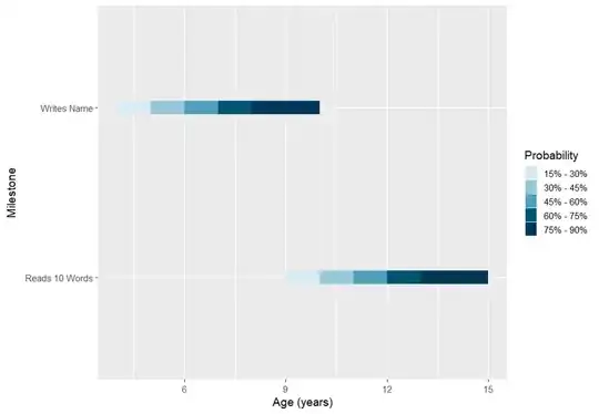
However, I would like to display the values of both genders at the same time, right next to each other for each skill such as in this example:

My first approach was to display all the segments for males and females, but they of course overlap and do not create seperate lines. My Next approach was to offset each geom segment for males to be above by a little and females to be below by a little:
geom_segment(aes(x=skill+0.5, xend=skill+0.5, y=age15male, yend=age30male, color = "15% - 30%"), linewidth=8)
geom_segment(aes(x=skill-0.5, xend=skill-0.5, y=age15male, yend=age30female, color = "15% - 30%"), linewidth=8)
But I got the error "Discrete value supplied to continuous scale". I think that if I could place male segments higher and female segments lower I could display both gender's data. However, I still need a different color gradient and legend for each gender which I don't know how to approach this. Any help, examples, or resources are greatly appreciated. I apologize if there are similar threads, but I could not find anything similar myself.
