0

I'm trying to annotate a ggplot that shows multiple results of the same response on different days. When I plot the data, I set col = day in the aes command. How do I annotate the ggplot with mean values of the response on each day using the same colours that ggplot used to draw the plot and for the legend?

Here's a simple example
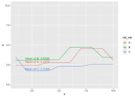
library(ggplot2)

# generate some dummy data - col_var in this example takes the place of day in the real example

data <- data.frame ( col_var = rep(c('A', 'B', 'C'), each = 10), x = rep(1:10, 3), y = rep(rnorm(10, 3, 1), each = 3))

# establish means for each response (y)

data_means <- data.frame ( col_var = unique(data$col_var), means = tapply(data$y,list(data$col_var),mean,na.rm=T))

# plot the data 

p <- ggplot(data, aes(x = x, y = y, col = col_var)) + 
  geom_line()+
  ylim(0, 10)

Here's where I get stuck. I would like to add the mean values, stacked one on top of each other in the same order as they appear in the legend from data_means to the plot and colour them the same as the geom_line for each col_var

p + geom_text(data_means, aes(label = means, col = col_var ), x = 2, y = 5)

p + annotate(data_means, aes(label = means, col = col_var ), x = 2, y = 5)
A.Benson
  • 465
  • 1
  • 6
  • 16
  • For a `geom` the first argument is the `mapping`, whereas `data` is the second. Hence, if you pass your data as the first argument you have to name it, i.e. try `geom_text(data = data_means, ...)`. BTW: `annotate` has no `data` argument and does not allow to pass a mapping via `aes()`. – stefan May 03 '23 at 06:42

2 Answers2

1

Update:

libray(dplyr)
library(ggplot2)

data %>% 
  group_by(col_var) %>% 
  mutate(means = mean(y)) %>%
  ggplot(aes(x = x, y = y, group = means, color = col_var)) + 
  geom_line() +
  ylim(0,10)+
  scale_x_discrete(expand=c(0, 1)) +
  geom_text(data = data_means, aes(label = paste0("Mean ", col_var[1], " = ", round(means[1],2)), x = 4, y=8.5, color = factor(means)[1]))+
  geom_text(data = data_means, aes(label = paste0("Mean ", col_var[2], " = ", round(means[2],2)), x = 4, y=8, color = factor(means)[2]))+
  geom_text(data = data_means, aes(label = paste0("Mean ", col_var[3], " = ", round(means[3],2)), x = 4, y=7.5, color = factor(means)[3]))+
  scale_color_manual(values = c("red", "green", "blue", "red", "green", "blue"))+
  theme(legend.position = "none")

enter image description here

First answer:

Annotating geom_line is not as trivial as one might think. This is discussed and handled very well here: Plot labels at ends of lines

I think in your case directlabels package is appropriate: We first add a column with the means to the data.

library(ggplot2)
#install.packages("directlabels")
library(directlabels)
library(dplyr)


data %>% 
  group_by(col_var) %>% 
  mutate(means = mean(y)) %>%
  ggplot(aes(x = x, y = y, group = means , colour = col_var)) + 
  geom_line() +
  ylim(0,10)+
  scale_x_discrete(expand=c(0, 1)) +
  geom_dl(aes(label = round(means, 3)), method = list(dl.combine("last.points")), 
          position = position_nudge(y = c(0.2, 0, 0))) 

enter image description here

TarJae
  • 72,363
  • 6
  • 19
  • 66
  • 1
    Thanks @TarJae - Is there a way I can manually set the position of the labels? I'd like to create something that looks like the legend but within the plot area. – A.Benson May 03 '23 at 08:12
0

You could do with geom_text(), mapping x, y, and label in aes().

# generate some dummy data - col_var in this example takes the place of day in the real example
set.seed(123)
data <- data.frame(col_var = rep(c('A', 'B', 'C'), each = 10), x = rep(1:10, 3), y = rep(rnorm(10, 3, 1), each = 3))

# establish means for each response (y)

data_means <- data.frame(col_var = unique(data$col_var), 
                          means = tapply(data$y,list(data$col_var),mean,na.rm=T))

# plot the data 
library(ggplot2)
ggplot(data, aes(x = x, y = y, col = col_var)) + 
  geom_line()+
  ylim(0, 10) +
  geom_text(data=data_means, aes(label=paste0("Mean of ", col_var,": ",round(means,4)), 
                                 x = 3,
                                 y = means-0.35,
                                 color = col_var))

Created on 2023-05-03 with reprex v2.0.2

YH Jang
  • 1,306
  • 5
  • 15