The bars which represent precipitation sums of a season ("Frühling") for each year ("Jahr") ended up lumped into one bar per group (30 years in each of the two reference periods "refp"). Actually, they should be displayed as 30 bars next to each other grouped as "refp1" and after a small space or in another box then 30 bars next to each other grouped as "refp2". I have struggled too many hours now and am still totally clueless.
Even though I followed the instructions of https://www.statology.org/grouped-barplot-in-r/, x=refp worked nicely but the fill=Jahr year bars did not appear next to each other.
This is what the middle of my data frame, at the transition between refp1 and refp2, looks like.
A small code to reproduce the relevant columns of this part would be:
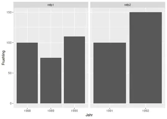
Jahr <- c(1988,1989,1990,1991,1992)
Fruehling <- c(100,75,110,100,150)
refp <- c("refp1","refp1","refp1","refp2","refp2")
refps <- data.frame(Jahr,Fruehling,refp)
- With:
ggplot(refps, aes(fill=Jahr, y=Fruehling, x=refp))+geom_bar(position='dodge',stat='identity')
- With:
ggplot(refps, aes(Jahr,Fruehling,facet_wrap(~refp)))+geom_col()
the two reference periods "refp1" and "refp2" are no longer separated by a space.
- Using this approach:
ggplot(data=refps, aes(factor(refp), y=Fruehling, fill=as.factor(Jahr))) +
     geom_bar(stat="identity", position = "dodge")`
it got closer though I had rather the years beneath the bars instead of individually in the legend and only in one colour per refp group.
I could reduce my expectations and plot everything on its own similar to 2) or use the suggestion shown in 3). But I am really puzzled and would appreciate it a lot if you could explain to me why in 1) with geom_bar the years get lumped in spite of position = 'dodge' and how to get them separate.