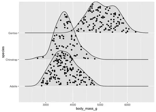
I have built a nice graph that shows daily time patterns per day of the week.
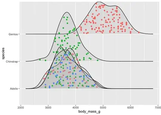
Within each curve for each day of the week I would like to visualise the data by group. Grouping should occur from the column "ID" that I can either set to True/False or A/B or whatever is best. Ideally each graph would then consist of two different colours, showing clearly which group is mostly responsible for certain peaks. Meaning that One group of data points is at the bottom and the other stacked on top.
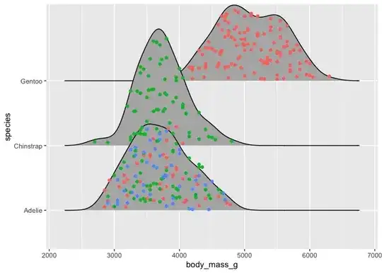
color = ID, fill = ID did not work.
Any idea how i could achieve this?
  ggplot(aes(x = weekdaytime, y = weekday, fill = weekday, group = weekday, height = ..count..)) +
  geom_density_ridges_gradient(stat = "density", scale = 2, rel_min_height = 0.01, bw = 300 ) +
  scale_fill_viridis(name = "", option = "C") +
  scale_x_datetime(date_breaks = "2 hour", date_labels = "%H",
                   limits = as.POSIXct(strptime(c(paste(Sys.Date(), "00:00", sep=" "),
                                                  paste(Sys.Date(), "24:00", sep=" ")),
                                                format = "%Y-%m-%d %H:%M"))) +
  scale_y_discrete(limits=c("Monday", "Tuesday", "Wednesday", "Thursday",
                            "Friday", "Saturday", "Sunday"))+
  theme(
    legend.position="none",
    panel.spacing = unit(0.1, "lines"),
    panel.grid.major = element_line(colour = "grey"),
    panel.grid.minor = element_line(colour = "grey"),

    panel.background = element_blank(),
    strip.text.x = element_text(size = 7)
  )  ```