1

I want to create a plot with two continuous variables (v1 and v2) and one categorical variable (ex levels A,B,C,D). The plot should show a matrix of proportions. The categorical variable should be on the x-axis and each column should have two boxes (v1 and v2) representing the proportion of each continuous variable within that category (Within A, v1/(v1+v2) then v2/(v1+v2)). The width of the columns should represent the proportion of the total that is within that category (v1+v2 for A divided by the sum of all v1 and v2)

It should look like a heatmap but with the variable type (v1 or v2) mapped to color and the height and width of the boxes mapped as described above.

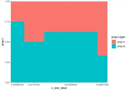
Using a stacked bar graph approach worked well and is close to what I want but there is horizontal space between the bars. Since I'm already using the width aesthetic to map the proportion within each category I wasn't able to eliminate this space.

Stacked Bar Graph Approach

Alternatively I tried to use geom_tile but that suffered from the same space issue and didn't result in all bars with a height of 1.

geom_tile Approach

The closest solution I have found is: ggplot2 heatmap with tile height and width as aes()

However in that example they have a categorical variable on both X and Y axes which is a little different than my case.

Reproducible example for reference:

library(tidyverse)

cat <- c("A","B","C","D")
v1 <- c(1,3,6,2)
v2 <- c(3,3,10,1)
df <- data.frame(cat,v1,v2)

df <- df %>%
  group_by(cat) %>%
  mutate(sum.cat = sum(v1,v2)) %>%
  mutate(prop.v1 = v1/sum.cat) %>%
  ungroup() %>%
  mutate(prop.cat = sum.cat/sum(v1,v2)) %>%
  mutate(sum.tot = sum(sum.cat)) %>%
  mutate(prop.v2 = 1-prop.v1) %>%
  pivot_longer(cols = c(5,8), names_to = "prop.v.type", values_to = "prop.v")

ggplot(df,aes(cat,prop.v, fill = prop.v.type))+
  geom_bar(position = "stack", stat = "identity",aes(width=prop.cat))

ggplot(df,aes(x=cat, y=prop.v, fill = prop.v.type))+
  geom_tile(aes(width=prop.cat,height=prop.v))

Thanks in advance!

Z.Lin
  • 28,055
  • 6
  • 54
  • 94
IanMoran
  • 13
  • 3
  • 1
    Sounds like you might find some ideas here: [How to create a Marimekko/Mosaic plot in ggplot2](https://stackoverflow.com/q/19233365/8449629) (full disclosure: Mine was one of the answers to this question) – Z.Lin May 18 '23 at 10:20

1 Answers1

1

It can be done with a little hack to the x-axis values. What I did is I calculate the x-Axis value based on the prop.cat the assign the cat labels to matched values of each bar position corresponded to each cat. This will make the x-Axis continous values so that the width aes now able to matched Axis values.

library(tidyverse)

cat <- c("A","B","C","D")
v1 <- c(1,3,6,2)
v2 <- c(3,3,10,1)
df <- data.frame(cat,v1,v2)

df <- df %>%
  group_by(cat) %>%
  mutate(sum.cat = sum(v1,v2)) %>%
  mutate(prop.v1 = v1/sum.cat) %>%
  ungroup() %>%
  mutate(prop.cat = sum.cat/sum(v1,v2)) %>%
  mutate(sum.tot = sum(sum.cat)) %>%
  mutate(prop.v2 = 1-prop.v1) %>%
  pivot_longer(cols = c(5,8), names_to = "prop.v.type", values_to = "prop.v")

# Here I calculate the x_axis position for each cat
df_revised <- df |> 
  group_by(cat) |>
  mutate(prop.cat_cumsum = if_else(row_number() == 1, prop.cat, 0)) |>
  ungroup() |>
  mutate(prop.cat_cumsum = cumsum(prop.cat_cumsum)) |>
  mutate(x_axis_value = 0 + prop.cat_cumsum - prop.cat / 2)

# As the cat & the values are well aligned in order so I just extract them
x_asix_breaks <- unique(df_revised$x_axis_value)
x_asix_labels <- unique(df_revised$cat)

# Now I plot them to test if it fit well.
ggplot(df_revised,
       aes(x = x_axis_value, y = prop.v, fill = prop.v.type))+
  geom_bar(position = "stack", stat = "identity",
           aes(width = prop.cat)) +
  scale_x_continuous(breaks = x_asix_breaks, expand = c(0, 0)) +
  scale_y_continuous(expand = c(0, 0))
#> Warning in geom_bar(position = "stack", stat = "identity", aes(width =
#> prop.cat)): Ignoring unknown aesthetics: width

Ok it worked as expected. Now just need to assign the proper cat labels to the x-Axis and add a line border to the bar so it easy to distinct between bars.


ggplot(df_revised,
       aes(x = x_axis_value, y = prop.v, fill = prop.v.type))+
  geom_bar(position = "stack", stat = "identity",
           color = "black", aes(width = prop.cat)) +
  scale_x_continuous(breaks = x_asix_breaks, labels = x_asix_labels,
                     expand = c(0, 0)) +
  scale_y_continuous(expand = c(0, 0))
#> Warning in geom_bar(position = "stack", stat = "identity", color = "black", :
#> Ignoring unknown aesthetics: width

Created on 2023-05-18 with reprex v2.0.2

Sinh Nguyen
  • 4,277
  • 3
  • 18
  • 26