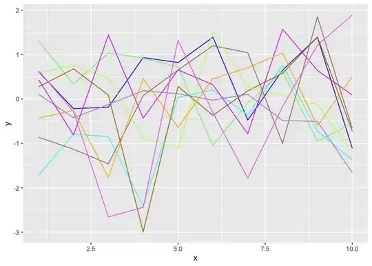
I have time series data for different experiment settings. These experiments were obtained when three parameters were varied. I need to plot these time series as line graph. Each line should have its own color which depends on input parameter values.
I normalized parameter values, and now they look like that

1 means that parameter has its maximal value for this experiment, and 0 - lowest value. I want each line at my plot to be combination of three different colors. I tried this code:
`results$mixed_color <- rgb(results$rescaled_color1, results$rescaled_color2, results$rescaled_color3)
ggplot(data=results , aes(x= step , y= average, group = Scenario , color = mixed_color )) + geom_line(size=1.5)+ scale_color_manual(values = results$mixed_color, labels = unique(results$Scenario)) `

I need to change the code, so I can select my own three colors which will be mixed to plot the lines. Currently, I use the combination of green, red and blue. But I want to replace it by #f0e442,"#0072b2" and "red". How can I do it?