2

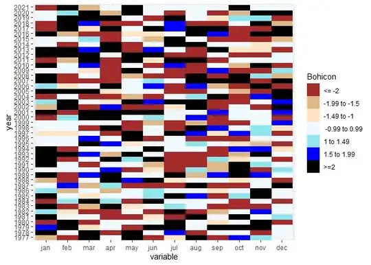
I'd like to plot a geom_raster with colors based on a specific classification: enter image description here

I tried the following code (variable = SPI) but it didn't work:

scale_fill_gradient(colours = c( "brown","burlywood","bisque","aliceblue","cadetblue2","blue"), 
                      breaks=c(-2,-1.5,-1,1,1.5,2), labels = format(c("-2","-1.5","-1","1","1.5","2")))

Example:

year <- seq(1977,2021,1)
jan = runif(45, min=-4, max=4)
feb = runif(45, min=-4, max=4)
mar = runif(45, min=-4, max=4)
apr = runif(45, min=-4, max=4)
may = runif(45, min=-4, max=4)
jun = runif(45, min=-4, max=4)
jul = runif(45, min=-4, max=4)
aug = runif(45, min=-4, max=4)
sep = runif(45, min=-4, max=4)
oct = runif(45, min=-4, max=4)
nov = runif(45, min=-4, max=4)
dec = runif(45, min=-4, max=4)

df = data.frame(year,jan,feb,mar,apr,may,jun,jul,aug,sep,oct,nov,dec)
df <- reshape2::melt(df, id.vars = "year")

df$year <- factor(df$year, levels = (unique(df$year)))
df$variable <- factor(df$variable, levels = (unique(df$variable)))

library(ggplot2)
e1 <- ggplot(df, aes(x = variable, y = year, fill = value)) +
  geom_raster()+
  guides(fill=guide_legend(title="Bohicon"))+
  scale_fill_gradient(colours = c( "brown","burlywood","bisque","aliceblue","cadetblue2","blue"), 
                      breaks=c(-2,-1.5,-1,1,1.5,2), labels = format(c("-2","-1.5","-1","1","1.5","2")))+
  theme(legend.position="bottom")

e1

Many thanks and kind regards!

Konrad Rudolph
  • 530,221
  • 131
  • 937
  • 1,214
Marcel
  • 147
  • 4

2 Answers2

1

You can specify a column that classifies your continues values into different classes and then use it to manually set the colors you want.

df$col <- as.factor(findInterval(df$value, c(-2,-1.5,-1,1,1.5,2), all.inside = T))

ggplot(df, aes(x = variable, y = year, fill = col)) +
  geom_raster() +
  guides(fill=guide_legend(title="Bohicon:")) +
  scale_fill_manual(values  =c( "brown","burlywood","bisque","aliceblue","cadetblue2","blue"),
                    labels = format(c("-2","-1.5","-1","1","1.5","2"))) + 
  theme(legend.position="bottom")

Plot:

enter image description here

Gerald T
  • 704
  • 3
  • 18
1

I may have missed something but I think you may need another break to get the cuts shown in the table. I've also added another colour in the plot on this account. I've not checked that the cuts and labels match.

df$val_cut <- cut(df$value, breaks = c(-Inf, -2, -1.5, -1, 1, 1.5, 2, Inf), 
                  labels = c("<= -2", "-1.99 to -1.5", "-1.49 to -1", " -0.99 to 0.99", "1 to 1.49", "1.5 to 1.99", ">=2"))

library(ggplot2)
#> Warning: package 'ggplot2' was built under R version 4.2.3
ggplot(df, aes(x = variable, y = year, fill = val_cut)) +
  geom_raster()+
  guides(fill=guide_legend(title="Bohicon"))+
  scale_fill_manual(values = c( "brown","burlywood","bisque","aliceblue","cadetblue2","blue", "black")) 

Created on 2023-06-01 with reprex v2.0.2

In response to OP's later question... Yes you could present the data in a bar graph although geom_bar would not be the preferred approach as the data is already summarised. Here is a possible solution using geom_col and facet_wrap just to make the data readable. I've assumed you want to view monthly values by year, but you can adjust the data as suits your requirements.

Also added some formatting to help with legibility.

ggplot(df, aes(y = value, x = variable, fill = val_cut)) +
  geom_col()+
  facet_wrap(~year) +
  guides(fill=guide_legend(title="Bohicon"))+
  scale_fill_manual(values = c( "brown","burlywood","bisque","aliceblue","cadetblue2","blue", "black")) +
  labs(x = NULL) +
  theme_bw() +
  theme(axis.text.x = element_text(angle = 90),
        legend.position = "bottom")

Created on 2023-06-07 with reprex v2.0.2

Peter
  • 11,500
  • 5
  • 21
  • 31